Top 10 Reasons Focused Pages Convert Better Than Busy Pages

Top 10 Reasons Focused Pages Convert Better Than Busy Pages is a practical guide for writers, bloggers, affiliate marketers, product reviewers, and small businesses that want readers to do more than simply read a page. A call to action is not only a button at the bottom of an article. It is the bridge between useful content and a useful next step: comparing a product, downloading a resource, joining a list, trying a platform, or reading a deeper guide. On SenseCentral, where product reviews and comparisons help readers make better decisions, CTAs should feel like guidance rather than pressure. The best CTAs respect the reader’s intent, explain the benefit, and make the next action feel safe and obvious. This article breaks the topic into ten practical lessons, with examples, tables, FAQs, and resource links you can use when improving blog posts, review pages, landing pages, and affiliate promotions.
Quick note: Think of a CTA as a guided next step. The reader should feel, “This is exactly what I need to do next,” not “Why am I being asked to click this?”
Quick Comparison: Weak CTA vs Strong CTA
| CTA Element | Weak Version | Better Version | Why It Helps |
|---|---|---|---|
| Button copy | Submit | Get the checklist | Specific action language explains what happens next. |
| Reader fit | Same CTA for everyone | CTA matched to beginner, comparer, or buyer intent | Visitors feel understood instead of pushed. |
| Microcopy | No explanation | No credit card required. Takes two minutes. | Small reassurance reduces hesitation before the click. |
| Placement | Random button after every paragraph | Button after value, proof, or comparison | The CTA appears when motivation is strongest. |
1. Clear CTAs reduce mental effort
The first job of this point is to make the reader feel oriented. When someone reaches a CTA, they are silently asking whether the next step is worth their attention. In the context of Top 10 Reasons Focused Pages Convert Better Than Busy Pages, the answer should be visible in the surrounding copy, not hidden inside a clever button label. Explain the result in plain language: compare options, download a resource, try a tool, browse a bundle, or read the next guide. The CTA should not ask the reader to guess what happens next. A good habit is to read the button aloud after the paragraph before it. If it feels like a natural continuation, the CTA is probably moving in the right direction.
2. Specific wording sets better expectations
Strong CTA writing begins with reader intent. A beginner may want a checklist, a comparison reader may want a buying guide, and a ready buyer may want a trial or product page. Using the same wording for every stage can make the page feel mechanical. Instead, connect the action to the reader’s current problem. For example, a product review can use “Compare the best options” before a comparison table, while a creator-focused post can use “Start building your digital product.” This makes the action feel useful rather than random.
Practical tip: Before publishing, replace the CTA with a sentence that starts with “I want to…” If the result sounds natural, your action language is probably close to the reader’s motivation. If it sounds awkward, revise the copy until the benefit becomes more specific.
3. Focused actions prevent decision fatigue
Design matters, but design should support meaning. A button can be bright, large, and visually polished, yet still fail if the words are unclear. The strongest conversion paths combine visual contrast with simple language and surrounding reassurance. Use whitespace, button hierarchy, and consistent styling so readers instantly understand which action is primary. Then use copy that explains the benefit. This combination reduces friction because readers do not need to decode the page before deciding.
4. Helpful microcopy lowers perceived risk
A CTA becomes more persuasive when it answers hesitation before the reader has to ask. Small lines of microcopy can do this well: “No credit card required,” “Free guide,” “Takes two minutes,” or “Open in a new tab.” These details may look small, but they remove invisible doubts. They are especially useful when promoting affiliate resources, downloads, or signup forms. The goal is not to force a click; the goal is to make the click feel safe, honest, and aligned with the reader’s expectation.
5. Consistent buttons make pages easier to scan
The destination after the click is part of the CTA experience. If a button promises a guide but sends readers to a confusing homepage, trust drops immediately. Message match matters because readers need continuity. The headline on the next page should reflect the promise of the CTA, and the offer should be easy to identify. For SenseCentral-style review content, this is especially important because readers may be comparing tools, stores, platforms, or bundles. A strong CTA keeps the same promise from paragraph to button to destination page.
Practical tip: Before publishing, replace the CTA with a sentence that starts with “I want to…” If the result sounds natural, your action language is probably close to the reader’s motivation. If it sounds awkward, revise the copy until the benefit becomes more specific.
6. Intent-matched CTAs feel less pushy
The first job of this point is to make the reader feel oriented. When someone reaches a CTA, they are silently asking whether the next step is worth their attention. In the context of Top 10 Reasons Focused Pages Convert Better Than Busy Pages, the answer should be visible in the surrounding copy, not hidden inside a clever button label. Explain the result in plain language: compare options, download a resource, try a tool, browse a bundle, or read the next guide. The CTA should not ask the reader to guess what happens next. A good habit is to read the button aloud after the paragraph before it. If it feels like a natural continuation, the CTA is probably moving in the right direction.
7. Visible next steps protect reader momentum
Strong CTA writing begins with reader intent. A beginner may want a checklist, a comparison reader may want a buying guide, and a ready buyer may want a trial or product page. Using the same wording for every stage can make the page feel mechanical. Instead, connect the action to the reader’s current problem. For example, a product review can use “Compare the best options” before a comparison table, while a creator-focused post can use “Start building your digital product.” This makes the action feel useful rather than random.
8. Benefit-led language makes the action meaningful
Design matters, but design should support meaning. A button can be bright, large, and visually polished, yet still fail if the words are unclear. The strongest conversion paths combine visual contrast with simple language and surrounding reassurance. Use whitespace, button hierarchy, and consistent styling so readers instantly understand which action is primary. Then use copy that explains the benefit. This combination reduces friction because readers do not need to decode the page before deciding.
Practical tip: Before publishing, replace the CTA with a sentence that starts with “I want to…” If the result sounds natural, your action language is probably close to the reader’s motivation. If it sounds awkward, revise the copy until the benefit becomes more specific.
9. Testing reveals what real users prefer
A CTA becomes more persuasive when it answers hesitation before the reader has to ask. Small lines of microcopy can do this well: “No credit card required,” “Free guide,” “Takes two minutes,” or “Open in a new tab.” These details may look small, but they remove invisible doubts. They are especially useful when promoting affiliate resources, downloads, or signup forms. The goal is not to force a click; the goal is to make the click feel safe, honest, and aligned with the reader’s expectation.
10. Strong CTAs turn useful content into measurable outcomes
The destination after the click is part of the CTA experience. If a button promises a guide but sends readers to a confusing homepage, trust drops immediately. Message match matters because readers need continuity. The headline on the next page should reflect the promise of the CTA, and the offer should be easy to identify. For SenseCentral-style review content, this is especially important because readers may be comparing tools, stores, platforms, or bundles. A strong CTA keeps the same promise from paragraph to button to destination page.
Action Language Examples You Can Adapt
| Use Case | Weak Text | Stronger Prompt |
|---|---|---|
| Generic | Submit | Download the free comparison checklist |
| Low intent | Buy now | See what this tool can help you create |
| Review post | Click here | Compare the recommended options |
| Affiliate | Learn more | Try Teachable for your online course idea |
| Digital store | Visit site | Explore ready-made digital product bundles |
Use these examples as starting points, not fixed rules. The best wording depends on your offer, audience, traffic source, and level of trust already built on the page.
Implementation Checklist
Use this checklist when editing blog posts, reviews, product comparisons, and affiliate sections.
- Identify the page’s primary reader intent before writing the CTA.
- Write the promise in plain language before designing the button.
- Use one primary action and make secondary actions visually quieter.
- Place the CTA near proof, comparison, or a useful conclusion.
- Add microcopy when there is price, privacy, signup, or time-related hesitation.
- Check mobile spacing so the CTA is easy to tap.
- Ensure the post-click page matches the CTA promise.
- Track clicks and downstream results, not only button impressions.
Recommended Resource for Website Creators and Digital Sellers
Explore Our Powerful Digital Products: Browse these high-value bundles for website creators, developers, designers, startups, content creators, and digital product sellers. These resources can help you build better landing pages, lead magnets, design assets, templates, startup materials, and content systems faster.
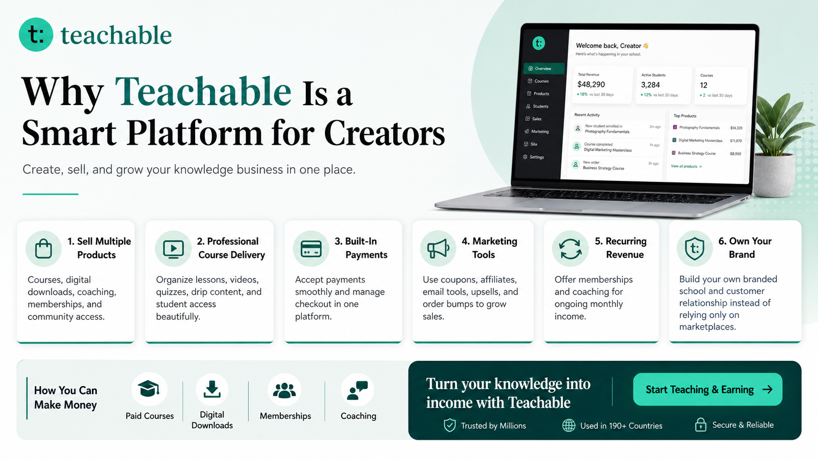
Affiliate Resource: Build and Sell Digital Products With Teachable
Teachable is an online platform that lets creators build, market, and sell courses, digital downloads, coaching, and memberships. It helps educators and entrepreneurs turn their knowledge into a branded digital business without needing complex coding.
Learn more on SenseCentral: How to Make Money with Teachable: A Complete Creator’s Guide
Affiliate disclosure: This post may include affiliate links. If you choose to purchase through a referral link, SenseCentral may earn a commission at no extra cost to you.
Key Takeaways
- A CTA should feel like a helpful next step, not a pushy interruption.
- Specific action language usually works better than vague prompts because it reduces uncertainty.
- The best CTA is supported by clear value, proof, design hierarchy, and post-click message match.
- Microcopy can reduce fear by answering what happens after the click.
- Long-term improvement comes from reviewing the whole conversion path, not only the button.
FAQs
What makes a CTA effective?
An effective CTA makes the next step clear, valuable, and low-friction. It should tell readers what they will get, why it matters, and what happens after they click.
Should every blog post have a CTA?
Most blog posts should have at least one helpful next step, but the CTA should match the article. Some posts need a product link, some need a related guide, and some need a newsletter or resource download.
Is button color the most important CTA factor?
No. Contrast and visibility matter, but the surrounding copy, offer clarity, placement, and reader intent usually matter more than choosing a magical button color.
How many CTAs should a page use?
Use one primary CTA when the page has one main goal. Secondary links can help cautious readers, but they should not compete visually with the main action.
How often should CTAs be tested?
Review important CTAs monthly or after enough traffic has accumulated. Test one meaningful change at a time, such as wording, placement, form length, or supporting microcopy.
Further Reading and Useful Links
Internal links from SenseCentral
- Visit SenseCentral for more product reviews, comparisons, and practical website growth guides
- How to Make Money with Teachable: A Complete Creator’s Guide
Useful external resources
- Nielsen Norman Group: why generic “Get Started” CTAs can create confusion
- Nielsen Norman Group: button states and interaction feedback
- CXL: CTA wording, design, size, and placement considerations
- W3C: WCAG 2.2 target size guidance for clickable elements
- Google Search Central: creating helpful, people-first content