- 1) What “High-Converting” Comparison Pages Do Differently
- They are scannable in 10 seconds
- They prove credibility fast
- They keep the CTA visible without being annoying
- They re-engage exit traffic
- 2) Build the Foundation: Structure + Clarity
- Start with a decision-focused intro
- Use a “Top Picks” jump section (mini index)
- Make the comparison table your hero block
- Use “Best for X” sections instead of one long list
- 3) The Best Widgets to Increase Click-Through (and Where to Place Them)
- 4) A “Widget Stack” Blueprint for Sensecentral Comparison Pages
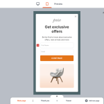
- Step A: Add an Announcement Bar (top sticky)
- Step B: Put a clean comparison table above the fold
- Step C: Add trust right after the table
- Step D: Use a Popup to recover bounces (without annoying everyone)
- Step E: Add urgency only where it’s real
- Step F: Add a chat button for “high-consideration” categories
- 5) How to Add Elfsight Widgets to WordPress (Quick Steps)
- Internal Links (add these inside Sensecentral)
- FAQ
- Do widgets really improve conversion on comparison pages?
- Which widget should I add first?
- Will popups hurt SEO or annoy users?
- What’s a good CTA for affiliate comparison pages?
- Should I use a countdown timer on every page?
- How many products should I include in one comparison?
- Can I use Elfsight with WordPress?
- What if my audience is mostly mobile?
- How do I stay compliant with affiliate disclosure rules?
- Key Takeaways
- References

Affiliate disclosure: This post contains affiliate links. If you click and purchase, I may earn a commission at no extra cost to you. I only recommend tools I genuinely believe help product review sites improve trust and conversions.
Want higher click-through on your comparison pages (without coding)?
Use ready-made widgets like comparison tables, announcement bars, testimonials, countdown timers, popups, and chat buttons to build trust and drive clicks.
Product comparison pages are the engine of a review website. They bring search traffic, help readers decide, and (ideally) earn you affiliate revenue. But most comparison pages leak conversions in predictable places:
- Trust gaps: readers aren’t sure your picks are credible.
- Choice overload: too many options, unclear “best for X.”
- Weak CTAs: buttons are easy to miss or feel pushy.
- Scrolling fatigue: users lose track of what matters.
- No urgency or follow-up: people leave and don’t return.
This guide shows how to fix those issues using conversion-friendly widgets—especially no-code widgets from Elfsight—so your comparison pages earn more clicks while staying helpful and reader-first.
1) What “High-Converting” Comparison Pages Do Differently
High-performing comparison pages don’t “sell harder.” They reduce uncertainty and make decisions easier. That means:
They are scannable in 10 seconds
Readers should instantly understand: top pick, best value, and best for a specific use case. Comparison tables work when they’re consistent and easy to scan (same attributes across products, clear layout, minimal clutter).
They prove credibility fast
Trust signals matter: transparent criteria, real pros/cons, and social proof (testimonials, reviews, “why you can trust us”). If you’re doing affiliate marketing, a clear disclosure actually helps credibility—people prefer honesty.
They keep the CTA visible without being annoying
Smart CTAs appear where readers are ready: after the table, inside “best for” sections, and near the end. A floating button can help on mobile, but only if it doesn’t block reading.
They re-engage exit traffic
A well-timed exit-intent or scroll-based popup can recover readers who were about to bounce—especially when you offer something useful (like “Download the comparison checklist” or “See today’s lowest price”).
Pro tip for Sensecentral: Build one “Comparison Page Template” and reuse it across niches. Your content becomes consistent, faster to publish, and easier to optimize over time.
2) Build the Foundation: Structure + Clarity
Start with a decision-focused intro
Use 4–6 lines answering:
- Who this comparison is for (beginner vs pro, budget vs premium)
- What we tested/compared (criteria)
- Quick picks (Top pick / Best value / Best for X)
Use a “Top Picks” jump section (mini index)
Add quick buttons that jump to each product. This reduces scroll fatigue, especially on mobile.
Make the comparison table your hero block
A comparison table works best when it’s consistent and scannable: same set of attributes across products, simple language, and clear winners. (Avoid “marketing soup.”)
Use “Best for X” sections instead of one long list
When you segment recommendations, readers self-select. Example:
- Best Overall
- Best Budget
- Best Premium
- Best for Beginners
3) The Best Widgets to Increase Click-Through (and Where to Place Them)
Here are the highest-impact widgets for product comparison pages—plus the Elfsight widget that matches each job.
| Widget | What it improves | Best placement | Elfsight option |
|---|---|---|---|
| Comparison Table | Clarity, faster decisions | Above the fold, after intro | Table / Pricing Table |
| Announcement Bar | More clicks to deals, updates | Top sticky bar (sitewide or category) | Announcement Bar |
| Testimonials / Social Proof | Trust + confidence | Near top picks + before final CTA | Testimonials Slider |
| Countdown Timer | Urgency for limited-time deals | In deal sections / bottom CTA block | Countdown Timer |
| Exit-Intent Popup | Recover bouncing visitors | Exit intent / scroll / time-on-page | Popup |
| Chat / WhatsApp Button | Lead capture + questions | Bottom corner on mobile | All-in-One Chat / WhatsApp Chat |
| CTA Button Widget | Cleaner, more consistent CTAs | After each “Best for” section | Button |
| Social Share Buttons | More reach + backlinks | Floating (desktop) / end of post (mobile) | Social Share Buttons |
Why Elfsight works well for comparison pages
Elfsight is a no-code widget platform with a large widget library and fast embedding. The typical workflow is: choose a widget, customize it in a visual editor, copy the embed code, and paste it into your site. This makes it perfect for affiliate sites where speed and iteration matter.
Quick CTA: If you want to improve trust and click-through on Sensecentral comparison pages, start here:
4) A “Widget Stack” Blueprint for Sensecentral Comparison Pages
If you want a repeatable setup, use this widget stack in order. It’s designed to match how people actually read comparison pages: skim → scan → shortlist → click.
Step A: Add an Announcement Bar (top sticky)
Use an Announcement Bar to highlight freshness and relevance, like:
- “Updated January 2026: New picks added + pricing refreshed.”
- “See today’s best deals → (links to your deals section)”
- “New: Compare top 5 options in 30 seconds ↓”
Best practice: keep it short, use one CTA, and don’t hide the page’s main content.
Step B: Put a clean comparison table above the fold
Use a Table / Pricing Table to show the most important attributes only. The goal isn’t to show everything—it’s to help users form a shortlist.
Suggested columns for affiliate comparisons:
- Best for
- Key benefit
- Top feature
- Price range (or “value”)
- CTA (“Check price” / “See details”)
Mobile tip: keep tables compact. If you have many attributes, consider splitting into multiple mini-tables by category (Performance / Ease / Value).
Step C: Add trust right after the table
After readers scan the table, they ask: “Can I trust this?” Add social proof and credibility signals:
- Testimonials Slider (short quotes like “Helped me pick the right X quickly.”)
- Methodology box (“How we choose winners”)
- Disclosure (“We may earn a commission…”)—clear and visible
Step D: Use a Popup to recover bounces (without annoying everyone)
Popups work when they offer value. Instead of “Buy now!”, try:
- “Want the 1-page checklist to pick the right [product]?”
- “Get the updated deals list (weekly).”
- “Not sure which one fits? Tell us your budget → we’ll recommend.”
Best triggers: exit intent, time-on-page, scroll %, or scroll-to-element—so the popup appears only after engagement, not instantly.
Step E: Add urgency only where it’s real
Use a Countdown Timer only when you have a real deadline (seasonal sale, coupon expiry, limited-time offer). Fake urgency damages trust.
Step F: Add a chat button for “high-consideration” categories
For complex purchases (tech, SaaS, appliances), an All-in-One Chat / WhatsApp Chat button can capture questions and convert indecisive users.
5) How to Add Elfsight Widgets to WordPress (Quick Steps)
- Choose the widget you need from Elfsight’s widget library.
- Customize it in the no-code editor (design, layout, triggers, and content).
- Copy the embed code generated by Elfsight.
- In WordPress, open your page/post → switch to Code Editor (or add a Custom HTML block) → paste the code.
- Publish and test on mobile + desktop.
Fast path: Start with just 2 widgets:
- Table / Pricing Table (clarity)
- Testimonials Slider (trust)
Then add popups/announcement bars after you see how users behave.
Ready to upgrade your comparison pages?
Build a cleaner table, add trust widgets, and recover exit traffic—without custom dev time.
Internal Links (add these inside Sensecentral)
Replace the URLs below with your actual Sensecentral pages.
FAQ
Do widgets really improve conversion on comparison pages?
Yes—when they reduce friction. Comparison tables improve scannability, testimonials build trust, and smart CTAs make next steps obvious without feeling salesy.
Which widget should I add first?
Start with a comparison table (Table / Pricing Table). Then add trust (Testimonials Slider). Those two usually give the quickest improvement.
Will popups hurt SEO or annoy users?
They can if overused. Use value-based popups with smart triggers (exit intent, time-on-page, scroll) and limit frequency. Popups should help readers, not block them.
What’s a good CTA for affiliate comparison pages?
Use neutral, helpful CTAs like: “Check today’s price,” “See specs,” “Read user reviews,” or “View on official site.” Avoid aggressive language.
Should I use a countdown timer on every page?
No. Only use it when urgency is real (sale ends, coupon expires). Fake urgency reduces credibility and can lower long-term conversion.
How many products should I include in one comparison?
Usually 3–7 is ideal. Beyond that, readers get overwhelmed. If you have more, create “Best for X” sections or separate comparisons by budget level.
Can I use Elfsight with WordPress?
Yes. Elfsight widgets can be embedded into WordPress pages/posts (commonly via embed code or a Custom HTML block).
What if my audience is mostly mobile?
Prioritize mobile scannability: shorter tables, fewer columns, clearer sections, and visible CTAs. Also test popups carefully—mobile can feel cramped.
How do I stay compliant with affiliate disclosure rules?
Use a clear disclosure near the top of the page and near affiliate-heavy CTAs. Keep it understandable (not hidden) and written in plain language.
Key Takeaways
- Conversion goes up when decision friction goes down. Make comparisons easier to scan and trust.
- Start with the essentials: a clean comparison table + trust signals.
- Use widgets strategically: announcement bar (freshness), testimonials (credibility), popups (recover bounces), timers (real urgency).
- Keep CTAs helpful, not pushy. Place them after the table and inside “Best for X” sections.
- Iterate: add one widget at a time, observe changes, and refine.