
- Table of Contents
- What makes a one-page site work?
- Why Elementor is ideal for one-page website design
- 12 best one-page website designs you can build with Elementor
- The Elementor one-page blueprint (step-by-step)
- Step 1: Pick your goal and primary CTA
- Step 2: Build your sections (recommended order)
- Hero
- Benefits
- Proof
- Offer
- Objections
- Final CTA
- Step 3: Add anchor navigation (Table of Contents style)
- Step 4: Design system (so it looks premium)
- Conversion elements that boost one-page results
- Speed + Core Web Vitals tips for Elementor one-page sites
- SEO for one-page websites (what works, what doesn’t)
- Elementor Cloud vs self-hosted WordPress (quick comparison)
- FAQs
- Key Takeaways
- References
One-page websites are a high-converting format for portfolios, products, agencies, events, and lead-gen funnels—especially when the design is built around a clear story, scroll-based sections, and anchored navigation.
In this guide, you’ll find the best one-page design patterns you can create using Elementor, plus a practical build blueprint you can reuse on any WordPress site.
Format: Scroll sections + anchor navigation
Focus: Design + speed + conversions
Tools: Elementor (Builder) + Elementor Cloud (Optional)
Tip: If you already have WordPress hosting, start with the builder. If you want a faster setup with hosting included, explore Elementor Cloud.
Table of Contents
- What makes a one-page site work?
- Why Elementor is ideal for one-page design
- 12 best one-page website designs (with layouts)
- The Elementor one-page blueprint (step-by-step)
- Conversion elements that boost results
- Speed + Core Web Vitals tips
- SEO for one-page sites (what works, what doesn’t)
- Elementor Cloud vs self-hosted (quick comparison)
- FAQs
- Key Takeaways
- References
What makes a one-page site work?
A great one-page website isn’t “just one long page.” It’s a guided experience with a clear narrative:
you introduce the offer, prove credibility, address objections, then present a strong call-to-action—without forcing visitors to click through multiple pages.
1) A scroll-based story
Your sections should flow logically: Hero → Benefits → Proof → Process → Pricing → FAQ → CTA.
When the order makes sense, visitors keep scrolling—and scrolling increases exposure to your offer.
2) Anchor navigation
One-page sites still need navigation. Anchor links let users jump to specific sections (Pricing, FAQ, Contact),
improving usability and reducing friction for decision-makers.
3) A single conversion goal
One-page sites work best when there’s one primary action: book a call, buy a product, subscribe, or request a quote.
Keep the CTA consistent across sections.
4) Fast performance
Because everything is on one page, performance matters. Lightweight sections, optimized images, and fewer heavy widgets
help you keep speed and SEO intact.
Core Web Vitals for WordPress (Practical Steps).
A one-page layout can be fast—if you design it intentionally.
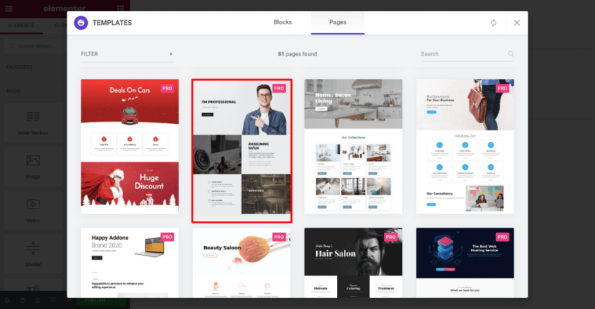
Why Elementor is ideal for one-page website design
Elementor makes one-page design practical because it combines a visual builder, responsive controls, reusable templates,
and design systems—so you can create premium layouts without custom coding.
Try elementor website builder for wordpress
Elementor strengths for one-page sites
- Section + container layouts: Build clean scroll sections with consistent spacing.
- Mobile-first controls: Adjust typography, padding, and visibility per device.
- Templates + kits: Start from a proven structure, then customize quickly.
- Global styles: Set consistent colors, buttons, fonts, and spacing across the entire page.
- Marketing blocks: Add forms, testimonials, pricing, FAQ, and CTAs without rebuilding from scratch.
If your business model relies on landing pages (affiliate content, lead-gen, digital products, agencies),
Elementor can shorten the time from idea → published page dramatically.
12 best one-page website designs you can build with Elementor
Below are proven one-page designs that convert well. For each pattern, you’ll get the best use-case, recommended sections,
and a practical layout structure you can replicate in Elementor.
| Design Pattern | Best For | Recommended Sections (Order) | Elementor Build Notes |
|---|---|---|---|
| 1) Minimal Portfolio | Creators, freelancers, designers | Hero → Work grid → About → Testimonials → Contact | Use a clean hero + gallery grid; keep typography bold |
| 2) Agency One-Pager | Service businesses | Hero → Services → Case studies → Process → Pricing → CTA | Use icons, proof blocks, and a sticky CTA button |
| 3) SaaS / App Landing Page | Software products | Hero → Features → Integrations → Social proof → Plans → FAQ | Use feature cards + screenshots; avoid heavy sliders |
| 4) Product Launch Page | Digital products, courses | Hero → Benefits → What’s inside → Bonuses → Guarantee → Buy CTA | Use pricing table + FAQ accordion + trust badges |
| 5) Event Registration | Webinars, workshops | Hero → Agenda → Speakers → Venue/Online → Tickets → CTA | Add a sticky nav: Agenda / Speakers / Tickets |
| 6) Restaurant / Local Business | Local services | Hero → Menu/Services → Gallery → Reviews → Location → Contact | Embed reviews; keep map lightweight |
| 7) Personal Brand | Consultants, speakers | Hero → Bio → Expertise → Media/Press → Offers → Book call | Use strong headshot + “as seen in” logos row |
| 8) Lead Magnet Funnel | Email list growth | Hero → Promise → Proof → What you get → Form → CTA | Keep form above fold + repeat CTA after proof |
| 9) “Comparison” One-Pager | Affiliate reviews | Hero → Comparison table → Winners → FAQ → CTA | Use a table + jump links to sections |
| 10) One-Page Resume | Job seekers | Hero → Skills → Experience → Projects → Education → Contact | Use timeline blocks + downloadable PDF link |
| 11) Nonprofit / Cause | Donations + awareness | Hero → Mission → Impact → Stories → Donate → FAQ | Keep donation CTA consistent; add impact stats row |
| 12) “Micro-site” for a Tool | Single feature / utility | Hero → How it works → Examples → Pricing → Support → CTA | Use sticky top nav to jump to Examples/Pricing |
12 Best Landing Page Builders in 2026.
The Elementor one-page blueprint (step-by-step)
This is the repeatable blueprint we recommend at SenseCentral for building one-page pages that look modern and convert well.
Use it for a personal site, a product landing page, or even an affiliate comparison hub.
Step 1: Pick your goal and primary CTA
- Choose exactly one primary action: buy, book, subscribe, or download.
- Write your CTA copy so it matches intent (e.g., “Get the template”, “Book a demo”, “Start free trial”).
- Repeat the CTA in 3–5 strategic points: hero, after benefits, after proof, and final section.
Step 2: Build your sections (recommended order)
Hero
One promise + one CTA. Add a short supporting line and a “proof hint” (ratings, clients, installs, or outcomes).
Benefits
3–6 benefit cards, written as outcomes. Avoid feature-only wording; focus on results.
Proof
Testimonials, reviews, client logos, case studies, before/after visuals, or measurable results.
Offer
Pricing, packages, or “what you get.” Add a guarantee, bonus, or risk-reversal if relevant.
Objections
Address common doubts (time, cost, learning curve, support). Use FAQ blocks for speed.
Final CTA
A focused closing section. Keep it simple: recap the promise → CTA button.
Step 3: Add anchor navigation (Table of Contents style)
In Elementor, you can create anchor jumps by placing “anchors” at the top of each section (or using section IDs),
then linking menu items or buttons to those anchors. This lets users jump directly to Pricing, FAQ, or Contact.
If your one-page site is information-heavy, a TOC is worth it.
Step 4: Design system (so it looks premium)
- Typography: 1 heading font + 1 body font. Keep headings bold and spaced.
- Spacing: Use consistent padding per section (e.g., 80px top/bottom desktop, 48px mobile).
- Buttons: One primary style, one secondary. Same radius and hover style everywhere.
- Color: One accent color (links + CTA) and neutral backgrounds.
Conversion elements that boost one-page results
A one-page design can look beautiful and still fail if it doesn’t guide visitors to take action.
Here are conversion elements that consistently improve performance.
High-impact blocks to include
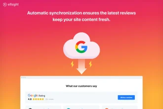
- Social proof: Testimonials, star ratings, or review embeds.
- “As seen in” logos: Credibility boosters for agencies and personal brands.
- Process section: Reduces uncertainty (“How it works in 3 steps”).
- Comparison table: Great for affiliate content and product/service plans.
- FAQ accordion: Handles objections without making the page feel long.
How to Add Google Reviews to Your Website (No Coding).
Mini “Offer Stack” template you can copy
Headline: What you get in one sentence.
Bullets: 5–7 concrete outcomes (not vague features).
Proof: 1–2 testimonials directly under the bullets.
Risk reversal: Guarantee, trial, or “cancel anytime”.
CTA: One primary button repeated below proof.
Speed + Core Web Vitals tips for Elementor one-page sites
One-page sites can become heavy because every section loads together. The solution is not “avoid one-page sites”—it’s to design them for performance.
Use these practical optimizations to stay fast.
Performance checklist
- Optimize images: Use WebP, resize to display size, compress aggressively.
- Avoid sliders above the fold: They often hurt LCP and user focus.
- Limit third-party scripts: Chat widgets, heatmaps, and multiple trackers add delay.
- Reuse sections: Keep design patterns consistent (fewer unique styles = easier rendering).
- Be selective with add-ons: Extra widget packs can increase risk and bloat—use only what you need.
Core Web Vitals for WordPress (Without Guesswork).
SEO for one-page websites (what works, what doesn’t)
One-page SEO works best when the page targets one primary topic and intent (brand, service, or product).
If you need to rank for many unrelated keywords, multiple pages are often better. That said, you can still build
a one-page site that ranks—especially for branded searches, local services, and focused offers.
One-page SEO essentials
- One primary keyword: Align the title, headings, and hero copy around one main intent.
- Use descriptive H2/H3s: Google still relies on structure to understand content sections.
- Add FAQ content: Helpful for matching long-tail questions.
- Internal links: Link to deeper pages (blog posts, case studies, reviews).
- Schema (optional): FAQ schema can help search appearance when implemented correctly.
Example supporting posts you can link from your one-page:
Best Website Widgets to Increase Conversions and
How to Embed an Instagram Feed.
Elementor Cloud vs self-hosted WordPress (quick comparison)
Elementor can be used on your existing WordPress hosting, or you can choose Elementor Cloud if you prefer an all-in-one setup.
Here’s a practical comparison to help you decide.
| Option | Best For | Pros | Watch-outs |
|---|---|---|---|
| Elementor on self-hosted WordPress | People who already have hosting, want maximum flexibility | More control, can choose any host, can run your preferred stack (cache/CDN/plugins), easy to migrate. | You manage updates, performance, and security (or rely on your host). |
| Elementor Cloud | Creators who want a faster, simplified setup | Convenient “all-in-one” approach; fewer moving parts; good for quick launches. | Less “mix-and-match” freedom than a custom hosting stack. |
If you’re unsure, start with the builder on your current WordPress hosting. If setup and maintenance feel like friction, Elementor Cloud is worth testing.
FAQs
Is a one-page website good for SEO?
It can be, when the page targets a single topic or intent and is structured with clear headings, helpful sections, and internal links.
If you want to rank for many different topics, a multi-page site is usually better—use the one-page site as your main “hub” and link to deeper content.
What’s the best one-page layout order?
A strong default structure is: Hero → Benefits → Proof → Process → Pricing/Offer → FAQ → Final CTA.
This matches how people evaluate offers: promise first, proof second, decision support third.
Do one-page sites convert better than multi-page sites?
Often yes for focused offers (lead magnet, webinar, service booking) because there are fewer distractions.
But for complex businesses with multiple services, a one-page site can be the entry point—not the entire site.
Should I use Elementor Cloud or my own hosting?
If you want maximum control and already have hosting, use Elementor on self-hosted WordPress.
If you want a simplified setup and a faster launch path, Elementor Cloud can be a strong option.
How do I add reviews or widgets to an Elementor one-page site?
Many tools provide an embed script you can paste into an Elementor HTML widget. For examples, see SenseCentral’s step-by-step guides on embeds and widgets:
Google Reviews embed and
Conversion widgets.
Key Takeaways
Add anchor navigation for long pages
Build in a “proof → offer → CTA” flow
Keep it lightweight for speed
Support SEO with internal links + FAQs
If your goal is to ship a modern one-page design quickly, Elementor is one of the most practical WordPress options—especially for creators, affiliates, and service businesses.
Start with the builder, and consider Cloud if you want a simpler all-in-one route.


