

- Why widgets matter on review sites
- The best widgets for review websites (stack)
- 1) Star rating + “Verdict” box (Trust + speed)
- 2) Review wall / testimonials slider (Social proof)
- 3) Comparison table (Clicks happen here)
- 4) Sticky CTA / floating button (Friction killer)
- 5) Announcement bar (Deals + updates)
- 6) Exit-intent popup (Second chance conversion)
- 7) Email subscription form (Build an asset)
- 8) FAQ accordion (Objection handler)
- 9) WhatsApp / chat button (Trust + support)
- Placement playbook (where each widget goes)
- Widget comparison table
- Why Elfsight is a strong fit for review sites
- How to add widgets to WordPress (step-by-step)
- Optimization tips: speed, UX, and compliance
- FAQs
- What are the most important widgets for a review website?
- Do widgets slow down my website?
- Is it better to use many WordPress plugins or a widget platform?
- What’s the best widget for increasing affiliate click-through?
- Can I add these widgets to WordPress without coding?
- Is there a free way to test widgets before paying?
- Key Takeaways
- References
If your site earns through product reviews and comparisons, your #1 job is to turn “curious readers” into “confident clickers.”
People don’t click affiliate links because you wrote more words—they click when they trust your recommendation, feel the decision is easy, and believe they won’t regret it.
That’s exactly what the right widgets do. They add social proof, reduce friction, and highlight next steps—without you needing to redesign your whole theme.
In this guide, you’ll get a practical widget stack for review websites, examples of where each widget belongs, and how to implement them fast (with no-code tools like Elfsight).
Want plug-and-play widgets (reviews, popups, chat, forms, social feeds) without coding?
Try Elfsight on your site in minutes:
Try Elfsight
(& affiliate link)
Why widgets matter on review sites
A great review article does three things:
- Builds confidence (proof, transparency, clarity)
- Reduces decision effort (summaries, comparisons, “best for X”)
- Makes the next step obvious (buttons, sticky CTAs, deal reminders)
Widgets help you accomplish those goals in a way that’s visual, repeatable, and consistent across your entire site.
Instead of manually adding the same “trust elements” to every post, you can deploy a widget once and reuse it on:
category pages, product roundups, comparison articles, and even your homepage.
The best widgets for review websites (stack)
Below is the widget stack I recommend for most affiliate-driven review sites.
You don’t need all of them—start with 3–4, then expand based on your traffic and goals.
1) Star rating + “Verdict” box (Trust + speed)
Readers scan before they read. A rating badge + verdict box gives them instant clarity:
who it’s for, what it’s best at, and why it wins. Pair it with:
- Pros / Cons (short, punchy)
- Best for… (single line)
- A clear CTA button
Pro tip: Add the same CTA style across posts to train users’ eyes.
Try Elfsight
(& affiliate link)
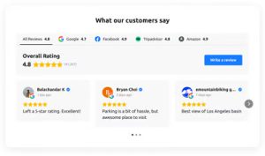
2) Review wall / testimonials slider (Social proof)
A review wall is a “trust amplifier.” It works even if your site is new, because it borrows credibility from:
platform reviews, customer testimonials, or verified feedback from trusted sources.
For niche review sites, the most effective formats are:
- Grid (looks modern, great for long pages)
- Slider (compact, good above “Buy” buttons)
- Badge (minimal, great for headers/sidebars)
If you run local-service reviews (car services, agencies, clinics), embedding Google Reviews can be especially powerful because people recognize it instantly.
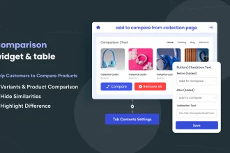
3) Comparison table (Clicks happen here)
For affiliate websites, the comparison table is often the highest click-through section on the page.
Why? Because it turns “research mode” into “decision mode.”
What a high-converting comparison table includes:
- Best for (use-cases, not features)
- Key specs (3–6 max)
- Price range or value label (“Budget / Mid / Premium”)
- Short verdict (“Best overall,” “Best for beginners,” etc.)
- Buttons (consistent CTA text)
Sensecentral internal link idea: Link your table to a dedicated comparisons hub page (example):
Product Comparisons.
(Update the URL to match your category slug.)
4) Sticky CTA / floating button (Friction killer)
On mobile, readers often scroll a lot. A sticky CTA keeps the next step visible without being aggressive.
Use it for:
- “See today’s price”
- “View best deal”
- “Compare top picks”
If you don’t want a sticky bar, a floating button works too (especially for “Contact us” or “Ask a question”).
5) Announcement bar (Deals + updates)
If you update old review posts (as you should), an announcement bar can highlight:
- “Updated for 2026: new top pick added”
- “Limited-time deal: ends Friday”
- “New comparison: Product A vs Product B”
Keep it subtle. One line + one button is enough.
6) Exit-intent popup (Second chance conversion)
Popups get a bad reputation because many sites overuse them.
But a well-designed, polite popup can recover leaving users—especially if it offers something valuable:
- A comparison checklist
- A “Top 3 picks” cheat sheet
- Deal alerts (email opt-in)
Rule: Never block content immediately. Trigger it on exit intent (desktop) or after meaningful scroll depth (mobile).
7) Email subscription form (Build an asset)
Affiliate income is fragile when you rely only on search traffic.
A simple email subscription form lets you:
- Send updated recommendations
- Share new comparisons
- Promote seasonal buying guides
8) FAQ accordion (Objection handler)
Many readers don’t click because they’re stuck on one question:
“Will this work for me?” “Is it worth it?” “What if I choose wrong?”
An FAQ accordion answers objections without adding page bloat.
9) WhatsApp / chat button (Trust + support)
If your niche is high-consideration (software, services, expensive products), a WhatsApp/chat button can boost conversion because it gives reassurance.
Even if you don’t offer full support, you can use it to:
- Answer quick questions
- Collect leads for consulting
- Get feedback on what readers are confused about (future content ideas)
Want these widgets without installing multiple plugins?
Try Elfsight
(& affiliate link)
Placement playbook (where each widget goes)
Use this quick placement playbook to avoid clutter and keep UX clean.
| Page type | Best widgets | Main goal |
|---|---|---|
| Single review post | Verdict box, comparison mini-table, sticky CTA, FAQ accordion | Decision clarity + clicks |
| “Best X” roundup | Comparison table, badges/ratings, announcement bar, email opt-in | Fast comparison + repeat visits |
| Product comparison (A vs B) | Specs table, pros/cons cards, FAQ accordion, CTA buttons | Resolve final objections |
| Homepage | Top categories, “best of” widgets, social proof, email opt-in | Trust + navigation |
| Category page | Filters, featured picks, announcement bar, trust badges | Reduce bounce |
Widget comparison table
| Widget | What it improves | Best used when… | Example implementation |
|---|---|---|---|
| All-in-One Reviews / Review Wall | Trust, time-on-page | You need instant credibility | Embed a review grid near the verdict |
| Google Reviews | Brand reliability | Local services or recognized proof helps | Show rating + selected best reviews |
| Comparison Table | Click-through rate | Roundups and A vs B posts | Add CTA buttons in each row |
| Announcement Bar | Attention, updates | You refresh posts or run seasonal guides | “Updated for 2026” + link to new pick |
| Exit-Intent Popup | Recovered conversions | High bounce pages | Offer a shortlist or checklist |
| FAQ Accordion | Objection reduction | Your niche has lots of “it depends” | Answer 6–10 key buyer questions |
| WhatsApp / Chat Button | Confidence + lead capture | High-consideration purchases | Floating chat button on mobile |
| Email Subscription Form | Returning visitors | You want stable traffic beyond Google | Offer deal alerts or updates |
Why Elfsight is a strong fit for review sites
You can build widgets with plugins, custom code, or a no-code widget platform.
For many review site owners, no-code wins because it’s faster, cleaner, and easier to maintain.
Elfsight benefits for affiliate & review websites
- One platform, many widgets: reviews, social feeds, forms, popups, chats, and more (handy when you don’t want 10 different plugins).
- No-code setup: customize in a visual editor and embed with a simple install code snippet.
- Great for trust widgets: display recognizable review formats (like Google-style reviews), star ratings, and filtered testimonials.
- Scales with you: start small, then add more widgets as your traffic grows.
If you want the fastest path to a “trust-first” review site UX, start with:
Reviews widget + Popup + WhatsApp Chat.
Try Elfsight
(& affiliate link)
How to add widgets to WordPress (step-by-step)
If you’re on WordPress, the simplest universal method is:
- Create your widget in the widget builder (choose a template, customize design, set behavior).
- Copy the installation code provided for your widget.
- In WordPress, open the page/post where you want it.
- Click Add Block → Custom HTML (or use your builder’s HTML block).
- Paste the code and update/publish.
Tip: For sitewide widgets (like trust badges, announcement bars, or floating chat), consider placing them in theme areas (footer/header) or widget areas depending on your theme.
If you want to test the platform quickly before a full rollout, start with one widget on one high-traffic post:
a “Best X” roundup page is usually ideal.
Try Elfsight
(& affiliate link)
Optimization tips: speed, UX, and compliance
Keep the page clean
- Choose one primary social proof widget per page (review wall OR testimonials slider).
- Use one sticky element max (sticky CTA OR floating chat).
- On mobile, reduce extra animations.
Prioritize “decision sections”
The best placements are usually:
- Right after your “Top pick” recommendation
- Inside/under the comparison table
- Near the final verdict (for late-stage readers)
Don’t hide disclosures
If you monetize with affiliate links, keep a short disclosure near the top of the post (and/or near the first affiliate button). This protects trust and aligns with common compliance expectations.
Measure what matters
- Click-through rate on primary CTA buttons
- Scroll depth (are users reaching the comparison table?)
- Exit rate after “pricing” sections
- Popup conversion rate (if used)
FAQs
What are the most important widgets for a review website?
If you’re starting from zero, focus on: (1) comparison table, (2) verdict box with rating, and (3) a trust widget (reviews/testimonials).
These three usually create the biggest improvement in affiliate clicks.
Do widgets slow down my website?
They can if you add too many or stack multiple heavy scripts. Keep your widget stack lean:
one trust widget + one conversion widget + one support widget is usually enough per page.
Also test on mobile and remove anything that doesn’t move clicks.
Is it better to use many WordPress plugins or a widget platform?
Many plugins can increase maintenance overhead (updates, conflicts, performance issues).
A widget platform can be simpler because you manage multiple widgets in one place and embed them where needed.
Choose based on your comfort level and how often you change your site.
What’s the best widget for increasing affiliate click-through?
Most sites see the biggest lift from a well-designed comparison table with clear “best for” labels and consistent CTA buttons.
Readers love shortcuts to the decision.
Can I add these widgets to WordPress without coding?
Yes. In most cases you paste the widget’s install snippet into a WordPress Custom HTML block (or your page builder’s HTML element) and publish.
Is there a free way to test widgets before paying?
Yes—many platforms (including Elfsight) offer a free plan suitable for testing on real pages.
Start with one widget on one post and evaluate impact before scaling.
Key Takeaways
- Widgets increase affiliate clicks by building trust, reducing decision fatigue, and making CTAs obvious.
- Start with a lean stack: Verdict box + Comparison table + Social proof.
- Add an exit-intent popup only after you’ve optimized the main page flow.
- Sticky CTAs are especially effective on mobile for long “Best X” posts.
- If you want quick deployment with minimal maintenance, a no-code platform like Elfsight can replace multiple plugins.
Ready to add trust + conversion widgets to your review site?
Try Elfsight
(& affiliate link)
References
- Elfsight – Official Website
- Elfsight Affiliate Program
- Elfsight Google Reviews Widget
- Elfsight All-in-One Reviews Widget
- How to Add Elfsight Widget to WordPress (Help Center)
More on Sensecentral:
Home ·
Reviews ·
Product Comparisons
Note: Update category URLs to match your WordPress slugs.


