
How to Design Better Calls to Action on Websites
Quick summary: Calls to action do more than ask for a click. They clarify the next step, reduce hesitation, and turn attention into momentum. When a CTA is vague, hidden, or mismatched to intent, even a strong page can underperform.
Why this matters for SenseCentral readers: Clearer UX, better structure, and smarter technical handling help review pages, comparison pages, tutorials, and commercial content convert more consistently.
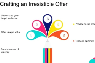
Table of Contents
Why This Matters
- A clear CTA reduces decision friction and tells visitors exactly what happens next.
- Good CTA placement helps users act at the point of highest confidence, not after they get lost.
- Better copy improves motivation because it connects the click to a concrete outcome.
- Strong CTA design increases conversion rate without relying on gimmicks or aggressive popups.
Core Principles
Match the page intent
A product comparison page needs CTAs that help users evaluate and choose, while a landing page may push signups, demos, or purchases.
Use outcome-driven copy
Buttons like “Compare Plans,” “See Pricing,” or “Start Free Trial” outperform generic labels because they explain the benefit.
Create clear visual hierarchy
Primary CTAs should look primary. Reserve your strongest contrast, size, and spacing for the action that matters most.
Reduce anxiety near the click
Microcopy such as “No credit card required” or “Takes 30 seconds” can remove the final objection.
Keep the action specific
Avoid stacking multiple equal-priority buttons in the same visual zone. One decision per moment is usually enough.
Design for accessibility
Every CTA should be keyboard reachable, visible on focus, high contrast, and understandable without context clues.
Step-by-Step Framework
- Start by defining the page’s primary goal: subscribe, compare, request a quote, buy, or continue reading.
- Identify the visitor’s mindset at that stage. Cold traffic usually needs lower-commitment CTAs than returning visitors.
- Rewrite button copy so it names the action and the value. Use verbs plus outcome, not generic filler.
- Place the primary CTA where the user naturally reaches understanding: above the fold, after key proof, and near comparison tables.
- Add support cues such as trust badges, pricing hints, guarantees, or short explanatory text next to the button.
- Test one variable at a time: copy, placement, size, contrast, surrounding proof, or number of competing links.
Explore Our Powerful Digital Product Bundles
Browse these high-value bundles for website creators, developers, designers, startups, content creators, and digital product sellers.
CTA patterns that usually perform better
| Weak Pattern | Better Pattern | Why It Works |
|---|---|---|
| Click Here | Compare the Top Picks | Specific wording signals relevance and sets expectations. |
| Submit | Get My Free Checklist | The outcome is clearer and more motivating. |
| Learn More | See Full Feature Breakdown | The visitor knows what kind of information comes next. |
| Buy Now | See Today’s Best Deal | Works better for review/comparison pages where visitors are still evaluating. |
| Multiple equal buttons | One primary + one secondary CTA | Visual priority reduces hesitation and choice overload. |
Common Mistakes to Avoid
- Using vague labels that could fit any page.
- Putting the main CTA only once, especially far below the fold.
- Making buttons look like decorative blocks instead of obvious controls.
- Overusing urgency or fake scarcity that damages trust.
- Ignoring mobile spacing, tap targets, and scroll behavior.
FAQs
How many CTAs should a page have?
Most pages should have one primary CTA and, if needed, one secondary CTA. Repeating the same primary CTA across the page is often better than introducing new competing actions.
Should CTA buttons always be bright?
Not always. Contrast matters more than loud color. A strong CTA should stand out from its surroundings while still fitting the design system.
What CTA copy works best on review pages?
Comparison-oriented CTAs often work well: “See the Best Option,” “Compare Features,” “Check Today’s Price,” or “Read the Full Review.”
Do CTAs affect SEO?
Not directly as a ranking factor, but better CTA clarity can improve engagement, reduce pogo-sticking, and help more visitors complete your conversion goals.
Key Takeaways
- Good CTAs remove ambiguity and lower friction.
- Specific, benefit-led copy usually beats generic button labels.
- Placement should align with user readiness, not just layout convenience.
- Trust cues near the button can materially improve conversions.
- Test systematically instead of redesigning everything at once.
Useful Resources and Further Reading
Related reading on SenseCentral
- How to Add an Announcement Bar for Deals + Product Comparison Updates
- How to Turn Visitors into Email Subscribers on a Review Blog
- How to Rank Product Review Posts
- How to Make Money Creating Websites
Helpful external resources
References
- Mozilla Developer Network documentation on semantic buttons and accessibility.
- W3C accessibility guidance for interactive controls.
- Practical CRO patterns commonly used on landing pages, comparison pages, and signup flows.
- MDN: <button> element
- W3C Web Accessibility Initiative
Editorial note: This guide is written for publishers, developers, and digital product teams who want pages that work better for users first, then perform better as a result.