Form UX Best Practices That Reduce User Friction
Reduce abandonment and improve completion rates with practical form UX techniques that minimize user friction.
Focus Keyword: form UX best practices
Categories:
Keyword Tags:
Where form friction starts
User friction happens when a form asks for too much effort, too much certainty, or too much patience. It appears in small ways: confusing labels, hidden requirements, vague validation, forced account creation, repeated data entry, and slow feedback. Each one adds hesitation. Together, they push people to abandon the task.
Reducing friction does not mean removing all rules. It means designing a form that respects how people actually complete tasks – quickly, on different devices, often while distracted, and sometimes with incomplete information.
Best practices that reduce friction
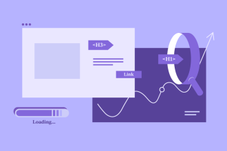
The strongest interfaces are easy to scan because they make structure visible. That means users spend less time interpreting layout and more time completing their goal. The following principles are reliable because they work across websites, apps, dashboards, and conversion-driven landing pages.
Use smart defaults
Preselect sensible defaults when appropriate. This reduces effort without taking control away from the user.
Enable autofill and autocomplete
Let browsers and password managers help. Re-entering known information is unnecessary friction.
Validate at the right time
Use inline validation for high-risk fields and final validation for cross-field logic. Feedback should be timely, not distracting.
Show progress for longer tasks
Users tolerate longer forms better when they know how much remains and what they are working toward.
What pattern fits which situation?
Use the table below as a quick decision framework when choosing patterns or setting rules. It is intentionally practical so your team can turn it into a shared design checklist.
| Friction reducer | Best for | Why it works | Use carefully when |
|---|---|---|---|
| Autofill/autocomplete | Checkout, address fields, account creation | Cuts typing and accelerates completion | Sensitive fields need clearer consent and privacy cues |
| Inline validation | Email, password, username, required formats | Catches issues early and reduces end-of-form frustration | Overly aggressive validation interrupts typing |
| Multi-step progress | Long onboarding or checkout | Makes long tasks feel shorter and more understandable | Poor step labels make the flow feel slower |
| Optional field disclosure | Advanced settings and profile details | Keeps core flows fast and focused | Users may miss optional power features if they are hidden poorly |
Trust, accessibility, and recovery
Good UI decisions become more valuable when they are documented and repeated. The fastest teams do not redesign the fundamentals every week – they agree on a reliable baseline, then iterate where it creates real value.
- Remove fields that do not contribute directly to the goal of the current step.
- Allow pasting into fields such as password confirmations and verification codes.
- Preserve entered data if users navigate back or refresh.
- Avoid punishing formatting errors when the intent is obvious, such as phone numbers with spaces or dashes.
- Make the final confirmation state explicit so users know the task succeeded.
Useful Resource for Creators and Product Teams
Browse high-value bundles for website creators, developers, designers, startups, content creators, and digital product sellers. This is a strong companion resource if you build landing pages, UI systems, lead magnets, templates, or digital product offers.
Common friction traps
Many usability problems come from inconsistency rather than from a single catastrophic decision. These are the mistakes that quietly reduce clarity, conversion, and trust over time.
- Forcing account creation before users can complete a purchase or download.
- Rejecting valid input because of strict but unnecessary formatting rules.
- Displaying generic errors only after full submission.
- Using too many required fields without explaining why the data is needed.
Further Reading from SenseCentral
If you build websites, design systems, landing pages, or digital products, the following SenseCentral resources pair well with this article.
FAQs
What is the biggest source of form friction?
Unnecessary effort. Every extra decision, typed character, or unclear instruction increases the chance of abandonment.
Is inline validation always better?
No. It is helpful when it prevents costly mistakes, but it can feel noisy if every field reacts too early.
Should I ask for confirmation twice, like email or password?
Only when the cost of a mistake is truly high. Otherwise, show/reveal controls and clear validation can be more efficient.
How do I reduce friction without hurting data quality?
Use better field types, clearer instructions, forgiving validation, and confirmation states instead of adding more manual checks.
Key takeaways
- Design structure before styling. Clear organization beats decorative complexity.
- Reduce memory load by keeping labels, guidance, and navigation cues visible when users need them.
- Use consistent patterns across pages so users can transfer what they learn from one screen to the next.
- Treat usability improvements as business improvements – cleaner UI usually improves completion, trust, and retention.
- Support your design decisions with systems: grids, spacing scales, clear labels, and reusable component rules.
Useful External Links
These external resources are helpful for deeper UX, accessibility, and component-level guidance.
- www.nngroup.com/articles/web-form-design/
- www.nngroup.com/articles/errors-forms-design-guidelines/
- www.nngroup.com/articles/required-fields/
- www.w3.org/WAI/WCAG21/Understanding/labels-or-instructions.html