HIPO (Hierarchical Input Process Output) diagram is a combination of two organized method to analyze the system and provide the means of documentation. HIPO model was developed by IBM in year 1970.
HIPO diagram represents the hierarchy of modules in the software system. Analyst uses HIPO diagram in order to obtain high-level view of system functions. It decomposes functions into sub-functions in a hierarchical manner. It depicts the functions performed by system.
HIPO diagrams are good for documentation purpose. Their graphical representation makes it easier for designers and managers to get the pictorial idea of the system structure.
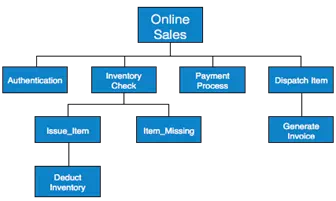
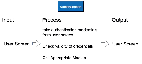
In contrast to IPO (Input Process Output) diagram, which depicts the flow of control and data in a module, HIPO does not provide any information about data flow or control flow.
Example
Both parts of HIPO diagram, Hierarchical presentation and IPO Chart are used for structure design of software program as well as documentation of the same.