
- Key Takeaways
- Table of Contents
- 1) What makes a WooCommerce product page convert?
- 2) Why use Elementor WooCommerce Builder?
- 3) Before you start: setup checklist
- 3.1 Confirm your product data is complete
- 3.2 Reduce plugin conflicts and page bloat
- 3.3 Align on a design system
- 4) The conversion blueprint: best-practice product page layout
- 5) Step-by-step: build a converting product template in Elementor
- 5.1 Create a Single Product template
- 5.2 Build the “above the fold” conversion zone
- 5.3 Add sticky add-to-cart (especially for long pages)
- 5.4 Design benefit blocks that match your product positioning
- 5.5 Add proof where people actually look
- 5.6 Specs: present them like a decision tool
- 5.7 FAQs: answer objections (not trivia)
- 5.8 Finish with a “final CTA” section
- 6) Copy + persuasion: what to write (and where)
- 6.1 Product short description (above the fold)
- 6.2 Benefit sections (mid-page)
- 6.3 Risk reversal blocks
- 7) Trust signals that lift add-to-cart rate
- 8) Speed, Core Web Vitals, and checkout reliability
- 9) Elementor on your host vs Elementor Cloud hosting
- 10) QA checklist before you publish
- FAQ
- Is Elementor WooCommerce Builder good for beginners?
- Do I need Elementor Pro for WooCommerce templates?
- Should I redesign all product pages at once?
- What’s the single most important conversion element?
- Where should I place shipping and returns info?
- Do sticky add-to-cart bars work?
- How do I avoid slowing down my Elementor product pages?
- Is Elementor Cloud hosting better than traditional hosting?
- Should I use extra Elementor add-ons?
- How do I test if my redesign improved conversions?
- References
- Ready to build?
WooCommerce • Conversion • Elementor
Affiliate Disclosure: This post contains affiliate links. If you purchase through these links, SenseCentral may earn a commission at no extra cost to you. We only recommend tools we believe are genuinely useful.
Try elementor website builder for wordpress
Try elementor cloud hosting for wordpress
Quick context: Your product page is your “checkout lobby.” If visitors hesitate here, they rarely recover later. The goal is to reduce friction, build trust fast, and make “Add to cart” feel like the obvious next step.
Key Takeaways
- Design for decisions: Prioritize clarity above the fold (image, price, value, trust, CTA).
- Use sections that sell: Benefits + proof + risk reversal + FAQs + delivery details.
- Reduce friction: Sticky add-to-cart, clear variants, size guides, shipping/returns in plain sight.
- Build trust fast: Reviews, guarantees, security badges, real photos/video, and concise specs.
- Optimize for mobile: Thumb-friendly CTAs, short paragraphs, collapsible sections, fast load.
- Keep it fast: Lightweight layouts, fewer widgets, and a sensible hosting/caching setup.
Table of Contents
- What makes a WooCommerce product page convert?
- Why use Elementor WooCommerce Builder?
- Before you start: setup checklist
- The conversion blueprint: best-practice product page layout
- Step-by-step: build a converting product template in Elementor
- Copy + persuasion: what to write (and where)
- Trust signals that lift add-to-cart rate
- Speed, Core Web Vitals, and checkout reliability
- Elementor on your host vs Elementor Cloud hosting
- QA checklist before you publish
- FAQ
- References
1) What makes a WooCommerce product page convert?
A high-converting product page does three things exceptionally well:
- Clarity: The customer instantly understands what the product is, who it’s for, and why it’s worth the price.
- Confidence: The page proves quality with reviews, guarantees, transparent policies, and real visuals.
- Low friction: Variant selection is easy, CTAs are obvious, the page loads fast, and answers are one scroll away.
Think of conversion as a sequence of micro-yeses:
- “This looks like what I need.”
- “It’s trustworthy.”
- “I’m not taking a risk.”
- “Buying is easy.”
Rule of thumb: If someone lands on your product page and needs to scroll/search to find price, shipping, returns, reviews, or add-to-cart, you’re losing sales.
Related SenseCentral reads (internal):
- Best Website Widgets to Increase Conversions (2026)
- How to Add Google Reviews to Your Website (No Coding)
- How to Add a Countdown Timer for Limited-Time Offers
2) Why use Elementor WooCommerce Builder?
WooCommerce product pages are functional by default—but “functional” doesn’t always mean “optimized.” Elementor WooCommerce Builder is designed for store owners who want to:
- Design product pages visually (without custom PHP templates)
- Create reusable templates for products (and apply conditions by category/tag/product type)
- Improve conversion sections (trust blocks, benefit layouts, sticky CTAs, FAQs, etc.)
- Iterate quickly on layout and content without developer bottlenecks
Shortcut: If you’re serious about conversion testing, a visual builder lets you make weekly improvements instead of quarterly redesigns.
3) Before you start: setup checklist
Conversion design fails when the foundation is weak. Do these first:
3.1 Confirm your product data is complete
- High-res images (multiple angles; include “in-use” photos)
- Clean product title + short description that states the primary value
- Accurate pricing, SKU, stock status, variations (size/color), and attributes
- Shipping/returns policy written in plain language
3.2 Reduce plugin conflicts and page bloat
- Use only essential WooCommerce extensions.
- Avoid stacking multiple “mega add-on” packs unless you truly need them.
- Keep WordPress + theme + plugins updated.
3.3 Align on a design system
- Primary CTA color and button style (consistent site-wide)
- Typography scale (H1/H2/H3 + body size)
- Spacing rules (sections, padding, white space)
Performance foundations (internal):
- Core Web Vitals for WordPress: Practical Steps to Pass
- Best Caching Setup for WordPress (What Works in 2026)
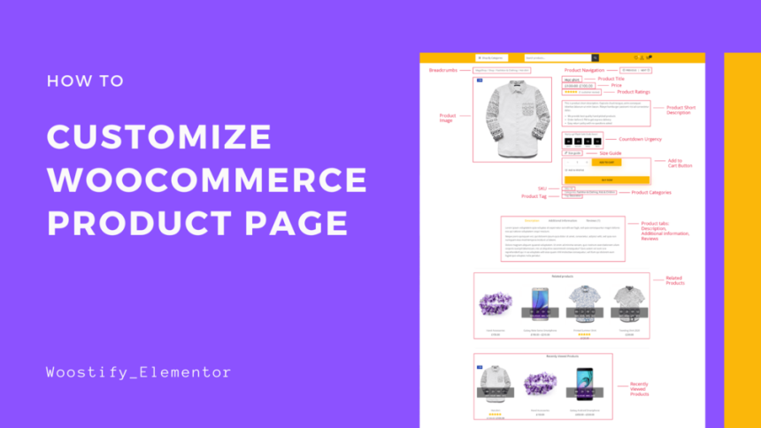
4) The conversion blueprint: best-practice product page layout
Here’s a proven structure for a single product page. You can adapt it for physical goods, digital products, or subscriptions.
| Section | Goal | What to include |
|---|---|---|
| Above the fold | Instant clarity + quick action | Gallery, title, price, rating, 1–2 key benefits, variant selector, primary CTA, delivery/returns snippet |
| Benefit blocks | Sell outcomes (not features) | 3–6 benefit cards, icons, before/after, use-cases |
| Social proof | Reduce risk | Reviews, testimonials, UGC, press mentions, trust badges |
| Details + specs | Answer “will this work for me?” | Specs table, size guide, compatibility, ingredients/materials, warranty |
| FAQ | Remove objections | Shipping times, returns, sizing, usage, support, licensing |
| Cross-sell / Upsell | Increase AOV | Frequently bought together, bundles, add-ons, related products |
Common mistake: Overloading the top section with too many widgets (countdowns, popups, huge sliders). Above the fold should be clean and decision-oriented.
5) Step-by-step: build a converting product template in Elementor
This workflow assumes you have WordPress + WooCommerce installed and at least one product created. The main idea is to build a reusable Single Product template and apply it to the products you want.
5.1 Create a Single Product template
- Go to Elementor → Theme Builder.
- Choose Single Product (WooCommerce).
- Select a starter template (or start from scratch).
- Set Display Conditions: apply to all products, or only specific categories/attributes.
Tip: If you have different product types (e.g., fashion vs electronics), create separate templates per category and conditionally apply them.
5.2 Build the “above the fold” conversion zone
Use a two-column layout (desktop) and stack it cleanly on mobile.
- Left: Product images (gallery + thumbnails). Consider a short product video if you have it.
- Right: Title, rating, price, short benefit bullets, variations, quantity, CTA, delivery/returns snippet.
High-impact microcopy examples:
- Shipping: “Ships in 24 hours • Free delivery over $X”
- Returns: “30-day hassle-free returns”
- Support: “Need help? Chat with us in 2 minutes”
5.3 Add sticky add-to-cart (especially for long pages)
If your page is content-rich (benefits, FAQs, specs), a sticky CTA can reduce scroll friction. Keep it minimal: product name + price + variant + CTA.
5.4 Design benefit blocks that match your product positioning
Create a section with 3–6 cards:
- Benefit headline (Outcome)
- One-sentence proof (How/why it works)
- Optional icon (keep it consistent)
5.5 Add proof where people actually look
Place social proof in two places:
- Near the price/CTA: star rating + review count
- Mid-page: testimonials, photo reviews, or a review highlight grid
Optional (internal): If you want reviews beyond WooCommerce’s default, see:
How to Add Google Reviews to Your Website.
5.6 Specs: present them like a decision tool
Instead of long paragraphs, use a simple spec table. Example:
| Spec | Value | Why it matters |
|---|---|---|
| Material / Build | Example value | Comfort, durability, safety |
| Compatibility | Example value | Avoid purchase mistakes |
| Warranty / Support | Example value | Reduces perceived risk |
5.7 FAQs: answer objections (not trivia)
Place FAQs above your final CTA block. Keep them concise and honest.
5.8 Finish with a “final CTA” section
After the visitor reads benefits + proof + FAQ, reintroduce the CTA with a short “why buy now” message:
- Guarantee / returns
- Fast shipping
- Secure checkout
If you want to iterate faster: Elementor makes A/B-style layout testing practical, because you can adjust sections quickly without rebuilding theme templates manually.
6) Copy + persuasion: what to write (and where)
6.1 Product short description (above the fold)
Use a 1–2 sentence promise + 3 bullets.
- Promise: What outcome do they get?
- Bullets: Fast benefits they can scan in 3 seconds.
6.2 Benefit sections (mid-page)
Use benefit-first headlines. Examples:
- “Comfort that lasts all day”
- “More control, fewer mistakes”
- “Built to withstand daily use”
6.3 Risk reversal blocks
Risk reversal is conversion fuel. Add a block that clearly states:
- Return window
- Warranty
- Support availability
7) Trust signals that lift add-to-cart rate
- Reviews with specifics: highlight “why” the customer liked it (not just “great”).
- Clear policies: shipping, returns, and support must be easy to find.
- Real visuals: lifestyle images, unboxing, short demo videos.
- Security reassurance: mention secure checkout and trusted payment methods.
- Proof near decision points: don’t hide proof at the bottom of the page.
8) Speed, Core Web Vitals, and checkout reliability
A beautiful product page that loads slowly can underperform an “average” page that loads instantly. Keep these principles in mind:
- Keep above-the-fold light: avoid heavy sliders and unnecessary animations.
- Use fewer widgets: every widget can add DOM weight and scripts.
- Optimize images: compressed images, modern formats where possible, proper dimensions.
- Cache correctly for WooCommerce: cart/checkout pages typically need cache exclusions.
Internal guides:
- Best Caching Setup for WordPress (What Works in 2026)
- Best WooCommerce Hosting in 2026 (Performance + Checkout Reliability)
9) Elementor on your host vs Elementor Cloud hosting
You can run Elementor on virtually any decent WordPress host—or choose an all-in-one approach with Elementor Cloud hosting. The “right” choice depends on how much you want to manage yourself.
| Option | Best for | Pros | Watch-outs |
|---|---|---|---|
| Elementor + your hosting | Stores that want maximum flexibility | Choose any host, customize stack, advanced optimization options | You manage hosting, performance tuning, and compatibility |
| Elementor Cloud hosting | Creators who want an “all-in-one” workflow | Streamlined setup, fewer moving parts, faster time-to-launch | Less flexibility than a fully custom hosting stack |
If your priority is speed-to-launch and simplified management: consider Elementor Cloud hosting.
Extra reading (internal): If you’re still evaluating tools, see:
12 Best Landing Page Builders in 2026 (Free & Paid).
10) QA checklist before you publish
- Mobile: CTA visible early, variant selector easy, no layout jumps.
- Speed: test product page load (home vs product vs cart vs checkout).
- Trust: reviews visible, policy links accessible, guarantee clear.
- Images: zoom works, gallery is smooth, images are optimized.
- Checkout path: add-to-cart works, cart updates, checkout completes.
- SEO basics: product title clean, headings structured, no duplicate H1s.
- Analytics: track add-to-cart, checkout started, purchase events.
Pro tip: Publish your new template to a staging environment first, then roll it out category-by-category. This makes debugging much easier.
FAQ
Is Elementor WooCommerce Builder good for beginners?
Yes—especially if you prefer visual editing. Start with a template, keep sections simple, and iterate weekly.
Do I need Elementor Pro for WooCommerce templates?
WooCommerce template building capabilities are typically associated with Elementor’s theme builder features. Check the plan that includes WooCommerce Builder functionality and theme builder access.
Should I redesign all product pages at once?
Usually no. Start with your highest-traffic or highest-margin product category and validate improvements before rolling out.
What’s the single most important conversion element?
Clarity above the fold: strong visuals, price, key benefit bullets, and a clean CTA with low friction.
Where should I place shipping and returns info?
Near the CTA and again near the FAQ section. Visitors want reassurance before and after they scroll.
Do sticky add-to-cart bars work?
Often yes—especially on long pages and mobile. Keep them minimal and avoid clutter.
How do I avoid slowing down my Elementor product pages?
Use fewer widgets, optimize images, avoid heavy sliders, and follow a smart caching/hosting setup.
Is Elementor Cloud hosting better than traditional hosting?
It can be a great fit if you want a simplified, all-in-one workflow. Traditional hosting is better if you want maximum control and custom optimization.
Should I use extra Elementor add-ons?
Only when necessary. Extra add-ons can increase complexity and risk. Choose reputable plugins and keep everything updated.
How do I test if my redesign improved conversions?
Track add-to-cart rate, checkout start rate, and purchase rate before vs after. If you can’t run formal A/B tests, compare time windows and control for seasonality as best as possible.
References
- Elementor Help: Create a single product template for WooCommerce
- Elementor Blog: Customize WooCommerce Product Page Template
- WooCommerce Developer Docs: Template structure
- Elementor: Hosting
Ready to build?
If you want a fast path to a modern, conversion-focused product page, start with Elementor and implement the blueprint above.
Try elementor website builder for wordpress
Try elementor cloud hosting for wordpress


