How to Design Branded Instagram Posts That Look Consistent
Consistency on Instagram is less about making every post look identical and more about making every post feel related. That means repeating the right design signals: typography, spacing, framing, color behavior, icon treatment, and content structure.
Why this matters
A recognizable Instagram brand is built from repeated decisions, not repeated layouts.
For brands, creators, agencies, and in-house teams, better social media design improves readability, brand memory, saves time in production, and increases the odds that the post earns a stop, a save, a click, or a share. The strongest social visuals are built around visual hierarchy, mobile-first layout decisions, and repeatable design rules rather than random inspiration.
Explore Our Powerful Digital Product Bundles. Browse these high-value bundles for website creators, developers, designers, startups, content creators, and digital product sellers.
Core design framework
1. Start with the message before the layout
Before choosing fonts, colors, or imagery, decide what the post needs to do. Every strong social graphic should have a primary action: inform, attract, persuade, or convert. That decision controls headline size, image crop, CTA strength, and how much visual energy the design should carry.
2. Build one obvious focal point
A focal point can be a bold headline, a face, a product shot, a statistic, or a strong shape. The eye should land somewhere instantly. If everything is equally loud, nothing feels important.
3. Make it mobile-readable first
Design the post for the smallest realistic viewing environment. Large type, strong contrast, clean padding, and disciplined spacing matter more than tiny decorative details that disappear in the feed.
4. Keep the system reusable
The best long-term social media design approach uses repeatable layout logic: consistent title zones, safe margins, component blocks, and controlled color usage. This reduces approval friction and speeds up future production.
System vs Sameness in Branded Instagram Design
| Brand Signal | How To Keep It Consistent | What To Avoid |
|---|---|---|
| Typography | Use fixed headline and body styles | Changing fonts every week |
| Color system | Work from 3 to 5 core brand colors | Random trend colors with no rules |
| Layout rhythm | Repeat margins, padding, and title placement | Repositioning everything every post |
| Graphic accents | Reuse shapes, lines, stickers, or badges | Adding new decorative elements constantly |
| Priority | What To Lock In | What Can Vary |
|---|---|---|
| Message | Core hook and promise | Secondary support line |
| Brand | Typography, colors, spacing logic | Photo crop or accent graphics |
| Layout | Main focal point | Supporting modules |
| CTA | One clear action | Button style or placement variant |
Step-by-step workflow
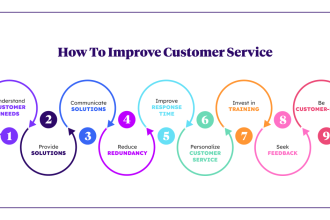
- Step 1: Start with the post goal: awareness, education, promotion, or conversion.
- Step 2: Write the message in one sentence before choosing visuals.
- Step 3: Build the layout around one clear focal point and one support layer.
- Step 4: Preview the design on mobile before exporting final variants.
Mistakes to avoid
- Starting with decoration before the message is clear.
- Adding too many competing elements with equal visual weight.
- Forgetting that the final design is usually viewed on a phone first.
One useful rule: if the post feels crowded in your design file, it will usually feel worse in the live feed. Strip away anything that does not support the main message.
FAQs
Key takeaways
- Build consistency through systems, not sameness.
- Define brand signals before you design more posts.
- Keep enough variation to avoid a repetitive feed.
Further reading on SenseCentral
To expand this topic, these related resources from SenseCentral can help you improve your website visuals, content systems, and digital product strategy:
- Elementor vs Theme Conflicts: Diagnose Layout Issues
- AI Image Generator resources
- Beginner AI Design Tools
- Verify AI Images
- Elementor step-by-step guides
Useful external links
These external resources can help you validate dimensions, contrast, and visual best practices while building better content systems:
- Canva social media sizes guide
- Adobe Express: Instagram sizes
- Adobe Express: Facebook sizes
- Hootsuite social media image sizes guide
- WebAIM contrast checker
References
- Canva social media sizes guide
- Adobe Express: Instagram sizes
- Adobe Express: Facebook sizes
- Hootsuite social media image sizes guide
- WebAIM contrast checker
Publishing note: This post was prepared for SenseCentral (sensecentral.com/) to support readers looking for better product, design, and content decisions.
If you upload the matching image file how-to-design-branded-instagram-posts-that-look-consistent.png to your WordPress Media Library in March 2026, the in-content hero image path in this XML should line up with the standard /wp-content/uploads/2026/03/ structure.