- Table of Contents
- Why this matters
- Step-by-step workflow
- 1. Define your brand palette first
- 2. Start with temperature and white balance
- 3. Reduce distracting colors
- 4. Use overlays with restraint
- 5. Match a set, not just one image
- Quick comparison table
- Common mistakes to avoid
- Key takeaways
- Useful Resource for Creators and Website Owners
- Further reading on SenseCentral
- Useful external resources
- FAQs
- Should every stock photo use the exact same color overlay?
- Can I do this in Canva?
- What if a stock photo has a strong off-brand background color?
- References
How to Edit Stock Photos to Match Your Brand Colors
Quick answer: Adjust temperature, tint, saturation, and selective overlays to gently move stock images toward your brand palette. The goal is consistency, not color distortion.
Even premium stock photos can feel disconnected from your brand if their tone, warmth, saturation, and accent colors do not match the rest of your site. Smart color editing helps you create a more consistent visual identity without making every image look artificial.
For SenseCentral-style content—especially best product roundups, product comparisons, landing pages, and fast-publishing review posts—the smartest image workflow is the one that balances visual polish with speed. That means building repeatable rules for crop, size, compression, overlays, and export so your images support the content instead of slowing production down.
Why this matters
- Brand-aligned imagery makes pages feel more cohesive and intentional.
- Consistent color treatment can make mixed-source stock libraries feel unified.
- Subtle color correction is more professional than extreme filters.
If you are also improving visual publishing speed on your site, you may find Canva AI tag and SenseCentral homepage useful alongside this workflow.
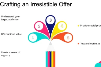
Step-by-step workflow
1. Define your brand palette first
Know your primary, secondary, and accent colors before editing. Otherwise, adjustments become guesswork.
2. Start with temperature and white balance
A small shift warmer or cooler can move an image much closer to your visual identity before you touch anything else.
3. Reduce distracting colors
If a bright off-brand color steals attention, lower its saturation or place a color wash over the image.
4. Use overlays with restraint
A brand-tinted gradient or translucent layer can unify the image while still preserving photographic realism.
5. Match a set, not just one image
When publishing a series, compare edited images side by side to ensure they look like part of the same collection.
One practical rule: create the image for the destination, not for a vague “future use” bucket. That simple decision reduces waste, improves consistency, and helps your posts load and look better.
Quick comparison table
| Adjustment | What It Helps With | Risk if Overdone |
|---|---|---|
| Temperature | Warmer / cooler mood alignment | Skin tones can look unnatural. |
| Saturation | Toning down distracting colors | The image can look flat or fake. |
| Tint / hue shifts | Subtle palette matching | Objects may drift into unrealistic colors. |
| Brand overlay | Fast visual consistency | Heavy overlays can mute detail. |
Use the table above as a fast decision framework. It is not a strict rulebook, but it gives you a clean starting point for publishing product visuals, blog covers, and promotional graphics with fewer mistakes.
Common mistakes to avoid
- Forcing exact brand colors into every part of the photo.
- Over-saturating edited images until they look synthetic.
- Ignoring skin tones when warming or cooling images.
- Using a strong colored overlay that hides important details.
Most quality problems happen because creators rush the last 10 percent of the workflow: exporting too many times, using the wrong size, or forcing one version of an image into too many roles.
Key takeaways
- Subtle edits create the most professional brand consistency.
- Temperature and saturation often solve more than heavy filters.
- Compare multiple images side by side for consistency.
- Protect realism while guiding the image toward your palette.
Useful Resource for Creators and Website Owners
If you want your blog, product pages, and promos to feel visually unified, bundled creative assets can make brand consistency easier to maintain.
Explore Our Powerful Digital Product Bundles
Browse these high-value bundles for website creators, developers, designers, startups, content creators, and digital product sellers.
Further reading on SenseCentral
To keep improving your publishing workflow, explore these related pages on SenseCentral:
Useful external resources
These tools and references are practical complements to the workflow above:
FAQs
Should every stock photo use the exact same color overlay?
Not necessarily. It is better to keep a consistent mood than to force one identical overlay on every image.
Can I do this in Canva?
Yes. Canva’s photo adjustment controls and overlays are enough for many brand-matching workflows.
What if a stock photo has a strong off-brand background color?
Lower its saturation, crop it out, blur it, or use a selective overlay to reduce its dominance.