- Key Takeaways
- Table of Contents
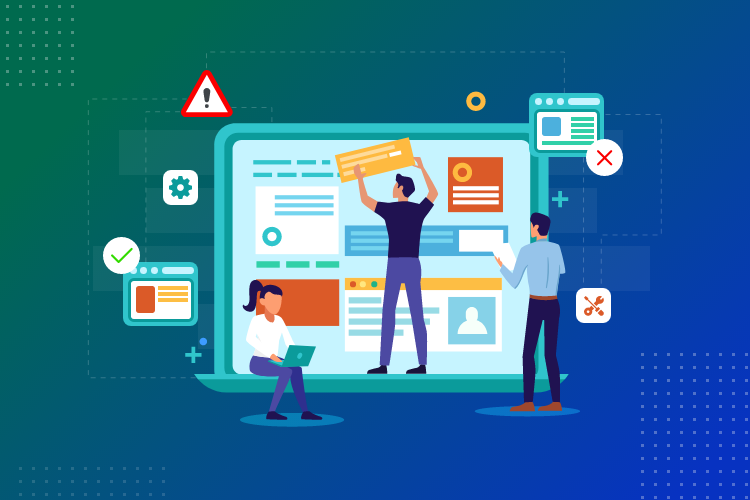
- 1) What “widgets-only conversion optimization” really means
- 2) The 15-minute widgets checklist (fast wins)
- 3) The 5 conversion levers you can pull without redesigning
- Lever #1: Trust (reduce “is this legit?”)
- Lever #2: Clarity (tell visitors what to do next)
- Lever #3: Ethical urgency (act now, not later)
- Lever #4: Lead capture (build an audience you own)
- Lever #5: Help & reassurance (answer last-minute questions)
- 4) A simple widget stack that works for most websites
- 5) How to install Elfsight widgets (WordPress + any website)
- 6) Where to place widgets (so they convert without annoying visitors)
- 7) Widget-only examples for review & comparison sites (SenseCentral-style)
- Example A: “Best X Products” roundup page
- Example B: Individual product review page
- Example C: Deals / coupons / limited-time promo page
- 8) How to measure results (without advanced tracking)
- 9) Will widgets slow your site? (performance + Core Web Vitals)
- FAQs
- References & helpful links
- Ready to boost conversions without redesigning?

Quick promise: you don’t need a full redesign to increase signups, clicks, and sales. In most cases, you need better trust signals, better timing, and clearer micro-actions — and you can do that with widgets in under an hour.
Affiliate disclosure: This post contains affiliate links. If you buy through my link, I may earn a commission at no extra cost to you. I only recommend tools I believe are genuinely useful for SenseCentral readers. You can also read our full disclosure here: Affiliate Disclosure.
Try Elfsight
(widgets go live fast — no redesign needed)
Key Takeaways
- Widget-only CRO improves conversions by adding trust, clarity, urgency, and lead capture — without touching your theme.
- Start with one high-traffic page (your “Best X” roundup or #1 money page) and add a mini widget stack.
- Highest ROI widgets for most sites: Reviews, Social Proof, Popup/Form, and an Announcement Bar.
- Measure impact using email signups, affiliate click-through, scroll depth, and return visits.
- Don’t spam widgets. Aim for 2–4 purposeful widgets per page and watch performance.
Table of Contents
1) What “widgets-only conversion optimization” really means
Most “redesigns” fix the same few problems:
- Trust gap: visitors don’t fully believe the site, the author, or the recommendation.
- Decision friction: users feel unsure, overwhelmed, or don’t know what to do next.
- Timing issues: the offer shows too early (annoying) or too late (missed).
- No retention: people leave and never return — even if they liked your content.
Widgets solve these without changing your theme because they sit on top of your existing pages. Think of widgets as “conversion layers” — tiny modules that add credibility, guide actions, and capture leads.
Elfsight is one of the fastest ways to do this because you can build a widget in minutes, copy the embed code, and paste it into WordPress (or almost any website builder) without hiring a developer.
Try Elfsight (widgets-only conversion boost)
2) The 15-minute widgets checklist (fast wins)
If you’re busy, do this first. It’s the fastest path to “measurable improvement”:
- Pick one page: your highest-traffic “Best X” post, your #1 comparison page, or your homepage.
- Add 1 trust widget: Reviews / Testimonials / Social Proof.
- Add 1 action widget: Popup or Form to capture email subscribers (or a CTA bar to push to your best list).
- Add 1 clarity widget: FAQ accordion or a sticky “What to do next” strip.
- Wait 7 days: compare clicks, signups, and time-on-page vs last week.
Why this works: most conversions don’t fail because your site “looks bad.” They fail because visitors still have unanswered questions right before they act.
3) The 5 conversion levers you can pull without redesigning
Lever #1: Trust (reduce “is this legit?”)
Trust is the #1 silent conversion killer. Even on a well-designed website, people hesitate if they can’t validate credibility quickly. Widgets help because they surface credibility at the moment of doubt.
- Best widgets: Google Reviews, Testimonials, All-in-One Reviews, Social Proof notifications.
- Best placements: above the fold on money pages, near affiliate buttons, and in the “why trust us” section.
Lever #2: Clarity (tell visitors what to do next)
Visitors often enjoy reading… then stop because they’re unsure what action is “safe.” Clarity widgets act like a friendly guide.
- Best widgets: FAQ accordion, announcement bar (“Start here”), floating buttons, “Top Picks” blocks.
- Best placements: after your top recommendation, or where you mention “pricing / plans / alternatives”.
Lever #3: Ethical urgency (act now, not later)
Urgency should be used carefully. You’re not trying to pressure people — you’re helping them avoid procrastination when there’s a real reason to act (limited deals, seasonal promos, product launches).
- Best widgets: Countdown timer, announcement bar, popup with delayed trigger.
- Best placements: deal pages, holiday roundups, “best budget picks” posts.
Lever #4: Lead capture (build an audience you own)
If you run a review site, email subscribers are your conversion multiplier. A widget-only popup or form can turn one-time visitors into repeat buyers.
- Best widgets: Popup, Contact/Form, Subscribe box, exit-intent offer.
- Best placements: after a helpful section, at 50–70% scroll depth, or on exit intent.
Lever #5: Help & reassurance (answer last-minute questions)
Many people abandon because they have one last question: “Is this compatible?” “Can I cancel?” “Is there a free plan?” A widget that answers this at the right time prevents drop-offs.
- Best widgets: FAQ, chat button, WhatsApp button, contact widget.
- Best placements: comparison tables, pricing sections, and near CTAs.
4) A simple widget stack that works for most websites
Here’s a “default” widget stack that improves conversions for most blogs, affiliate sites, and service sites.
| Widget | Primary goal | Best pages | Setup time |
|---|---|---|---|
| Reviews / Testimonials | Trust + credibility | Homepage, “Best X”, About, money pages | 10–20 min |
| Popup / Form | Email leads + returning traffic | High-traffic posts, comparison pages | 10–15 min |
| Announcement Bar | Clarity (guide next action) | Site-wide or category pages | 5–10 min |
| FAQ Accordion | Reduce objections | Pricing/review pages, near CTAs | 10–15 min |
| Social Feed | Freshness + engagement | Homepage, sidebar, footer | 10–20 min |
Best practice: Start with 2 widgets, then add a third only after you see improvement. Too many widgets = noise.
SenseCentral tip: If you’re building a widget stack for affiliate content, start with (1) Reviews + (2) Email popup. This combo boosts trust and retention — the two biggest long-term levers for conversion growth.
5) How to install Elfsight widgets (WordPress + any website)
The Elfsight workflow is simple:
- Create your widget in Elfsight (choose a template and customize text/layout).
- Publish it and copy the embed code.
- Paste it into your site:
- WordPress: Add a Custom HTML block and paste the code.
- Webflow: Use an Embed element.
- Shopify: Use a custom liquid/section area.
- Wix/Squarespace: Use an embed/code block.
Want a deep breakdown of Elfsight (pricing, views, best widgets)? Read our full guide here:
Elfsight Review (2026): 97 No-Code Widgets + Pricing Explained.
6) Where to place widgets (so they convert without annoying visitors)
Placement is everything. A great widget placed badly can lower conversions. Use this simple rule:
Place widgets where doubt happens. Not where you “have space.”
Widget placement guide (quick)
- Reviews/Testimonial widgets: near affiliate buttons, pricing mentions, and your “top pick” section.
- Popup/Form widgets: after value (50–70% scroll) or exit-intent — not instantly on page load.
- Announcement bar: highlight the #1 action (e.g., “See the updated 2026 picks” or “Get deal alerts”).
- Countdown timer: only when a deadline is real (holiday deal roundups, limited-time promos).
- FAQ widget: directly below your recommendation table or “who should buy this” section.
A simple “non-annoying” popup formula
Use a popup like a helpful reminder:
- Trigger: 40–60 seconds OR 60% scroll depth OR exit intent
- Offer: “Get updated comparisons + deal alerts (no spam)”
- Frequency: show once every 7–14 days per user
If you want to pair email capture with an email tool, you might like this SenseCentral guide:
8 Free & Cheap Email Marketing Software Tools (2026).
7) Widget-only examples for review & comparison sites (SenseCentral-style)
Let’s make this concrete. Here are 3 widget-only “conversion upgrades” you can apply to typical review pages.
Example A: “Best X Products” roundup page
Goal: increase affiliate clicks and capture subscribers for future deal updates.
- Add reviews widget above your top pick (“Why trust us?” credibility block)
- Add announcement bar linking to your “Top Pick” jump link or “Deals” page
- Add popup at 60% scroll: “Want updated picks monthly?”
Example B: Individual product review page
Goal: reduce hesitation and answer objections.
- Add FAQ widget answering: compatibility, warranty, pricing, alternatives
- Add social proof widget (lightweight notifications) if you run promos or want credibility cues
- Add a mini contact widget (“Ask a quick question”) if you get buyer questions often
Example C: Deals / coupons / limited-time promo page
Goal: urgency without looking spammy.
- Add countdown timer for a real deal window
- Add announcement bar (“Deals end tonight — see top picks”)
- Add popup offering deal alerts (higher ROI long-term than one-time clicks)
8) How to measure results (without advanced tracking)
Even if you don’t have a fancy CRO setup, you can measure widget impact with simple signals:
- Email signups: the clearest “widget worked” KPI
- Affiliate click-through rate: compare week-over-week on the same page
- Scroll depth + time on page: engagement improvements indicate stronger intent
- Return visits: widgets that capture leads bring readers back
A quick “before vs after” test
- Choose one page and leave everything else the same.
- Add 2 widgets (trust + lead capture).
- Run for 7 days.
- Compare:
- email signups
- affiliate outbound clicks
- bounce rate (directionally)
Pro move: If you’re linking to offers, add UTM tags to your outbound links so you can see exactly which page + widget placement drives the most clicks.
9) Will widgets slow your site? (performance + Core Web Vitals)
They can — but they don’t have to.
- Keep it to 2–4 widgets per page unless you have a strong reason.
- Avoid stacking multiple “heavy” embeds in the same section.
- Test your page with PageSpeed Insights and watch metrics like LCP/CLS/INP.
Rule of thumb: If a widget doesn’t directly improve trust, clarity, leads, urgency, or help — remove it.
FAQs
Do I really need widgets if my theme already looks good?
Yes — because conversions usually fail due to trust gaps and timing issues, not aesthetics. Widgets add credibility and guide actions without changing your design.
Which widgets should I start with for an affiliate/review blog?
Start with Reviews/Testimonials (trust) and a Popup/Form (email capture). Then add an Announcement Bar if you want a site-wide “next step.”
How many widgets is too many?
On most pages, more than 4 is usually too many. Keep only what supports a clear conversion goal.
Can I use Elfsight on WordPress, Shopify, Webflow, Wix, or Squarespace?
Yes — Elfsight provides embed code you can paste into most platforms using HTML/embed blocks.
What does “views” mean in widget pricing?
In most widget tools, “views” typically refer to how many times a widget loads for visitors in a month. If your site grows, you may need to upgrade your plan.
Will popups hurt SEO or annoy visitors?
They can if used aggressively. Use delayed triggers, show them infrequently, and make them helpful (deal alerts, updates, checklists). Aim for “assist,” not “interrupt.”
References & helpful links
Internal (SenseCentral)
- Elfsight Review (2026): 97 No-Code Widgets + Pricing Explained
- 8 Free & Cheap Email Marketing Software Tools (2026)
- Search SenseCentral: website widgets
- Affiliate Disclosure
Official Elfsight links
External credibility + disclosure guidance
- FTC: Endorsements, influencers, and reviews
- NN/g: Trustworthiness in web design (credibility factors)
- Google: PageSpeed Insights & Core Web Vitals
Ready to boost conversions without redesigning?
If you want the fastest path, start with a “mini widget stack” on one high-traffic page:
- Reviews/Testimonial widget (trust)
- Popup or Form widget (email capture)
- Announcement bar (clear next action)