
- Table of Contents
- 1) Why an email list beats “hoping they come back”
- 2) The winning strategy: Popup + embedded form (why both)
- 3) Best places to add email capture on a review/comparison site
- A) “Best X” list posts (high traffic, broad intent)
- B) Comparison pages (highest buyer intent)
- C) Individual reviews (trust-building pages)
- 4) What to offer (lead magnets that actually work for product blogs)
- 5) Elfsight widgets that make this easy (Popup + Subscription Form + Form Builder)
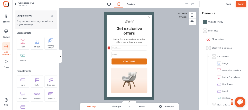
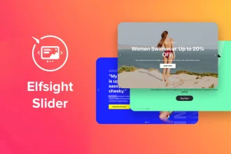
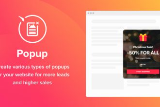
- A) Elfsight Popup widget (for attention + timing)
- B) Elfsight Subscription Form widget (for embedded, always-visible capture)
- C) Elfsight Form Builder widget (for smarter segmentation)
- 6) Step-by-step setup (fast, no-code)
- Step 1: Create your popup (lead magnet focused)
- Step 2: Set the trigger and targeting
- Step 3: Create your embedded form
- Step 4: Connect your email tool / automation
- Step 5: Add to WordPress
- 7) Copy-and-paste popup & form text templates
- Popup template (comparison pages)
- Popup template (best-of lists)
- Embedded form template (gentle, high trust)
- 8) Conversion optimization: triggers, timing, targeting, and A/B testing
- A) Best triggers for review sites
- B) Targeting rules that keep popups from feeling annoying
- C) A/B tests that move the needle
- 9) Privacy, consent, and deliverability basics
- 10) Cost & plan considerations (what to check before scaling)
- 11) FAQs
- What’s better for a review blog: a popup or an inline form?
- Will popups hurt SEO?
- What should I offer to get more signups?
- How many forms/popups should I create?
- Can I connect Elfsight forms to my email marketing tool?
- Key Takeaways
- References

Quick context for Sensecentral: On product review + comparison sites, your biggest traffic spikes often come from Google updates, seasonal deals, and viral product trends. The problem? A big chunk of that traffic leaves and never returns. The fix is simple: turn “one-time readers” into repeat visitors by capturing emails in a way that feels helpful—not pushy.
Affiliate disclosure: This post contains affiliate links. If you click and purchase, Sensecentral may earn a commission at no extra cost to you. We only recommend tools we believe can help product-focused publishers build trust and improve conversions.
Table of Contents
- Why an email list beats “hoping they come back”
- The winning strategy: Popup + embedded form (why both)
- Best places to add email capture on a review/comparison site
- What to offer (lead magnets that actually work for product blogs)
- Elfsight widgets that make this easy (Popup + Subscription Form + Form Builder)
- Step-by-step setup (fast, no-code)
- Copy-and-paste popup & form text templates
- Conversion optimization: triggers, timing, targeting, and A/B testing
- Privacy, consent, and deliverability basics
- Cost & plan considerations (what to check before scaling)
- FAQs
- Key Takeaways
- References
1) Why an email list beats “hoping they come back”
Review readers often arrive with high intent—they’re comparing options, checking pros/cons, and deciding what to buy. If they don’t purchase today, they’ll likely purchase later (or at the next discount). If you capture their email, you gain a direct way to:
- Send deal alerts when prices drop on products you review.
- Share updated comparisons (“We refreshed our Top 10 picks for 2026”).
- Drive repeat traffic without paying for ads every time.
- Build trust through consistent, helpful recommendations.
Also, email is one of the few channels you truly “own.” Search rankings and social reach can swing overnight. Your email list is a stable asset that grows in value over time.
2) The winning strategy: Popup + embedded form (why both)
Most blogs choose one: either a popup or a form. The highest-performing sites use both, because they capture different kinds of visitors:
- Popups convert “leavers” and “skimmers” who won’t scroll to your footer.
- Embedded forms convert readers who are engaged and already trust your content.
Think of it as a 2-step net:
| Capture Method | Best for | Where it shines on Sensecentral |
|---|---|---|
| Popup (exit-intent, scroll, time) | People about to leave or quickly scanning | Comparison pages, “Best X” lists, deal roundups |
| Embedded form (inline) | Engaged readers who want ongoing updates | Mid-article after key insights, near verdict sections |
The “combo” approach usually feels more natural too: you can make the embedded form low-friction (quiet invitation), and reserve the popup for the moment when the visitor is about to disappear.
3) Best places to add email capture on a review/comparison site
On Sensecentral-style content, you have 3 page types that matter. Here’s where the popup + form combo performs best:
A) “Best X” list posts (high traffic, broad intent)
- Inline form after your top 3 picks: “Want weekly ‘best picks’ + deal alerts?”
- Popup on exit-intent: “Before you go—get the 1-page shortlist.”
B) Comparison pages (highest buyer intent)
- Inline form near the verdict: “Get notified when either product drops in price.”
- Popup on scroll (60–75%): “Want the decision checklist in your inbox?”
C) Individual reviews (trust-building pages)
- Inline form after pros/cons: “Get the ‘best alternatives’ list.”
- Popup only for returning visitors: keep it gentle for first-timers.
Internal linking tip: If you have related guides, link them near the form. Example internal links you can adapt:
4) What to offer (lead magnets that actually work for product blogs)
Your offer should match what review readers truly want: confidence and timing. Here are lead magnets that consistently outperform generic “newsletter” invites:
High-performing lead magnet ideas
- Price-drop alerts: “Get notified when our top pick is discounted.”
- Shortlist PDF: “Top 3 picks for every budget (download).”
- Decision checklist: “The 10-point checklist before buying (avoid regret).”
- Comparison cheat sheet: “X vs Y—quick differences table.”
- Weekly deal email: “Best deals we found this week (no spam).”
Pro tip: The best offer is often “save money” + “save time.” Your popup and form copy should say exactly what they’ll get and how often.
5) Elfsight widgets that make this easy (Popup + Subscription Form + Form Builder)
If you want the popup + form combo without custom coding, Elfsight is built for exactly this kind of use case—drop-in widgets you can embed on WordPress and other platforms.
A) Elfsight Popup widget (for attention + timing)
Use a popup to capture visitors at the right moment (exit intent, scroll, time delay, click trigger, etc.). For review blogs, the most effective triggers are usually:
- Exit-intent on desktop (last-chance capture)
- Scroll trigger (after the reader consumes value)
- Time delay (for “Best X” list skimmers)
Recommended popup goal: one clear action—enter email to get the lead magnet or alerts.
B) Elfsight Subscription Form widget (for embedded, always-visible capture)
Place an embedded subscription form inside posts and comparison pages. This converts readers who are already convinced by your content. It’s perfect for:
- “Get updates when we refresh this comparison”
- “Weekly deals in your inbox”
- “Download the shortlist PDF”
C) Elfsight Form Builder widget (for smarter segmentation)
If you want more than just email (for example: “Which category are you interested in?”), Form Builder lets you add fields and route submissions to tools you already use (like email marketing platforms and automation tools).
6) Step-by-step setup (fast, no-code)
Below is a simple workflow that works on WordPress, Webflow, Shopify, and most website builders. (For WordPress, you’ll typically add the widget via a Custom HTML block or your theme’s embed area.)
Step 1: Create your popup (lead magnet focused)
- Open Elfsight and choose the Popup widget.
- Select a template that matches your goal (e.g., “Email subscription” style).
- Keep it minimal: headline, 1–2 lines of benefit, email field, CTA button.
Step 2: Set the trigger and targeting
- Comparison pages: trigger at 60–75% scroll.
- “Best X” lists: trigger after 20–40 seconds.
- Returning visitors: show a stronger offer (they already trust you).
Step 3: Create your embedded form
- Choose Subscription Form (simple) or Form Builder (advanced).
- Embed it inside your posts:
- After “Top picks”
- Before the verdict section
- After pros/cons
Step 4: Connect your email tool / automation
Connect the widget to your email marketing platform (or route submissions via automation) so emails land in the right list with tags like “Deals”, “Comparison Alerts”, or category interests.
Step 5: Add to WordPress
- Copy the Elfsight embed code.
- In WordPress, add a Custom HTML block where you want the form, then paste the code.
- For popups, you’ll typically add the embed code to a global area (theme/footer) or the pages where you want it active.
7) Copy-and-paste popup & form text templates
Popup template (comparison pages)
Headline: Still deciding?
Body: Get the 1-page X vs Y checklist + price-drop alerts when our top pick goes on sale.
CTA button: Send it to me
Microcopy: No spam. Unsubscribe anytime.
Popup template (best-of lists)
Headline: Want the top 3 picks for your budget?
Body: We’ll email you the shortlist + the best deals we find each week.
CTA: Get weekly deals
Embedded form template (gentle, high trust)
Heading: Get smarter buying updates
Body: We update comparisons often. Subscribe to get notified when this guide is refreshed—or when prices drop.
8) Conversion optimization: triggers, timing, targeting, and A/B testing
A) Best triggers for review sites
| Trigger | Use it when… | Recommended offer |
|---|---|---|
| Exit-intent | They’re about to leave | Checklist / shortlist / price-drop alerts |
| Scroll (60–75%) | They consumed value | “Get updates when we refresh this comparison” |
| Time delay | Skimmers on list posts | Weekly deals / top picks for budget |
B) Targeting rules that keep popups from feeling annoying
- Don’t show immediately on page load—let them read first.
- Set frequency limits (e.g., once per 7–14 days per visitor).
- Exclude buyers if you can (or show them a different offer).
- Different offers per category (tech vs home vs fitness) to boost relevance.
C) A/B tests that move the needle
- Offer test: “Price-drop alerts” vs “Shortlist PDF”
- CTA test: “Send it to me” vs “Get the checklist”
- Timing test: 25 seconds vs 40 seconds
- Form length test: email only vs email + category preference
Track these metrics: popup view → signup conversion rate, inline form conversion rate, and email click-through back to Sensecentral.
9) Privacy, consent, and deliverability basics
- Be clear about frequency: “Weekly” or “Only when deals happen.”
- Use double opt-in when possible (keeps list quality high).
- Add a privacy note near the form (even one line helps trust).
- Don’t over-collect data: start with email; add fields only if needed.
10) Cost & plan considerations (what to check before scaling)
Before you roll the popup + form combo across your entire site, check these:
- Monthly widget views: make sure your plan supports your traffic.
- Number of widgets: if you want multiple category-specific forms/popups, you’ll need enough widget slots.
- Integrations: confirm your preferred email tool/automation path is supported.
Tip: Start with one high-traffic comparison page and one “Best X” post. Once you confirm conversions, expand to the rest of the site.
11) FAQs
What’s better for a review blog: a popup or an inline form?
Both. Popups catch visitors who are about to leave, while inline forms convert engaged readers. The combo typically outperforms either one alone.
Will popups hurt SEO?
If you use sensible timing and avoid covering the entire screen immediately on mobile, you’ll generally be fine. Keep popups user-friendly: delayed triggers, frequency limits, and clear close buttons.
What should I offer to get more signups?
For product content, “price-drop alerts,” “shortlists,” and “decision checklists” usually beat generic newsletters.
How many forms/popups should I create?
Start with 2: one for comparisons and one for best-of lists. Then create category-specific versions once you see what converts.
Can I connect Elfsight forms to my email marketing tool?
Yes—use built-in integrations where available, or route submissions through automation tools depending on your workflow.
Key Takeaways
- Review traffic is high-intent—capture it before it disappears.
- Popup + embedded form is the highest-leverage combo for product sites.
- Make the offer product-relevant: price alerts, shortlists, checklists.
- Use smart triggers: exit-intent, scroll depth, and time delay (not instant popups).
- Segment later: start with email-only, then add categories when you scale.


