
- What “Layout Foundations” Actually Mean
- Before You Prompt: The 5 Inputs That Make AI Output Better
- Foundation Workflow: Generate Structure First, Then Sections
- Step 1: Generate the layout foundation (containers first)
- Step 2: Generate high-performing sections (one at a time)
- High-Performing Section Prompts (Copy/Paste Templates)
- 1) Hero section prompt (headline + subheadline + CTAs)
- 2) Benefits section prompt (3-column, scannable)
- 3) Social proof section prompt (testimonials + trust strip)
- 4) Pricing section prompt (clear tiers + comparison cues)
- 5) FAQ prompt (reduce objections)
- 6) “Layout foundation” section prompt (for a specific page block)
- Turn AI Sections Into a Consistent Layout System
- A) Standardize these 6 global rules
- B) Use AI where it’s strongest: copy, variations, and micro-UI
- C) Use “reference a website” responsibly
- Polish: Accessibility, Performance, and Conversion Checks
- Accessibility quick checks
- Performance quick checks (especially for affiliate sites)
- Conversion quick checks
- Common Mistakes (and Fixes)
- FAQs
- 1) Does Elementor AI replace a designer?
- 2) What’s the fastest way to get a full page draft?
- 3) Can Elementor AI generate responsive sections?
- 4) Will AI-generated layouts use Pro widgets?
- 5) Is Elementor AI good for affiliate landing pages?
- 6) Can I use Elementor AI to add custom CSS for minor effects?
- 7) How do I avoid “generic AI copy”?
- 8) What should I do after AI generates the first draft?
- Key Takeaways
- References
Affiliate Disclosure: This post contains affiliate links. If you purchase through these links, Sensecentral may earn a commission at no extra cost to you. We only recommend tools we believe add real value.
Want to try Elementor the fastest way? Use the links below (affiliate):
Try elementor website builder for wordpress
Try elementor cloud hosting for wordpress
Tip: If you’re building for clients or launching quickly, pairing the builder + cloud hosting can reduce setup time and plugin overhead.
Elementor AI is most powerful when you treat it like a structured workflow tool, not a “magic write/design button.”
Instead of prompting randomly, you’ll get significantly better results by generating a layout foundation first (structure, hierarchy, spacing, and reusable patterns),
then using AI to produce page sections that fit that foundation (hero, features, social proof, pricing, FAQs), and finally refining with global styles and performance best practices.
In this guide, you’ll learn a repeatable, production-ready method to generate page sections and layout foundations with Elementor AI—so you can ship faster while keeping control of design quality.
What “Layout Foundations” Actually Mean
A layout foundation is the underlying structure your page is built on. In practical terms, it includes:
- Information hierarchy: which message appears first, what supports it, what comes next.
- Reusable section patterns: consistent spacing, container widths, and typography scales.
- Grid/Container logic: how you arrange content for desktop/tablet/mobile responsiveness.
- Global design tokens: your fonts, colors, button styles, and section padding rules.
When you generate the foundation first, each AI-generated section “snaps into” a coherent system—so your page feels professionally designed rather than stitched together from random blocks.
Before You Prompt: The 5 Inputs That Make AI Output Better
Elementor AI improves dramatically when you feed it clear constraints. Before generating containers/sections, define these five inputs:
- Page goal: lead capture, product purchase, booking, newsletter signup, or content engagement.
- Primary offer: the one thing you want the visitor to do (e.g., “Start free trial”, “Book a call”).
- Audience & pain points: who it’s for and what problem it solves.
- Brand voice: punchy, friendly, premium, technical, minimalist, etc.
- Proof assets: testimonials, stats, logos, guarantees, feature list, or comparisons.
If you run product reviews and comparisons on Sensecentral, you can re-use your existing assets:
- Comparison table insights (what’s best for whom)
- Buyer objections you already address in reviews
- Performance guidance (Core Web Vitals, speed checks)
Internal reading (optional but useful):
• Core Web Vitals for WordPress: Practical Steps to Pass
• Landing Page Builders Comparison (Sensecentral)
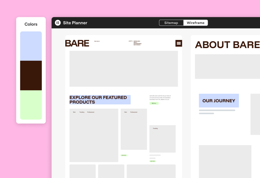
Foundation Workflow: Generate Structure First, Then Sections
Use this workflow to keep outputs consistent and fast:
| Stage | What You Generate with Elementor AI | Your Job (Human Control) | Outcome |
|---|---|---|---|
| 1) Plan | Brief, sitemap, wireframes (optional) | Confirm page order + CTA strategy | Clear direction |
| 2) Foundation | Container layout skeleton (sections without final copy) | Set global fonts/colors, spacing rules, container widths | Consistent structure |
| 3) Sections | Hero, features, proof, pricing, FAQs, contact blocks | Edit for accuracy, brand voice, SEO intent | High-quality page content |
| 4) Polish | Microcopy, image variants, minor CSS enhancements | Performance + accessibility + mobile checks | Launch-ready |
Step 1: Generate the layout foundation (containers first)
Open your page in Elementor and start with an empty canvas. Your goal here is not “perfect content.” Your goal is a strong layout skeleton.
In Elementor AI, you can generate container-based frameworks from a prompt (and even reference a website for inspiration).
Foundation Prompt Template (copy/paste):
Create a responsive landing page layout foundation using containers. Include: (1) hero with headline + subheadline + 2 CTA buttons, (2) trust strip with logos, (3) 3-column benefits section, (4) use-cases section with alternating image/text, (5) testimonial grid, (6) pricing section with 3 tiers, (7) FAQ accordion, (8) final CTA section. Style: modern, clean, lots of whitespace, rounded buttons. Use consistent spacing: section padding 80px desktop / 48px mobile. Container max width 1140px. Typography: bold H1, readable body. Make it mobile-first.
After AI generates the containers, do a quick “foundation pass”:
- Check structure: is the story logical from top to bottom?
- Check spacing: standardize section padding (don’t let each block pick random values).
- Check responsiveness: ensure columns stack cleanly on tablet/mobile.
- Replace Pro-only widgets if needed: if AI used Pro widgets and you’re on free, swap them.
Build faster with Elementor (affiliate):
Step 2: Generate high-performing sections (one at a time)
Once your foundation exists, generate sections intentionally. The trick is to prompt with:
- Section purpose (what job the section does)
- Content inputs (audience, offer, proof points)
- Layout constraints (container width, columns, mobile behavior)
- Style constraints (modern, minimal, bold, etc.)
Think of this as “AI fills the container,” while you control the container system.
High-Performing Section Prompts (Copy/Paste Templates)
Below are prompt templates that consistently produce usable results. Replace bracketed text with your offer and audience.
1) Hero section prompt (headline + subheadline + CTAs)
Generate a hero section for [business type] targeting [audience]. Goal: [conversion goal]. Include: headline (max 10 words), subheadline (1–2 sentences), 2 CTA buttons (primary + secondary), and 3 bullet value points. Tone: confident, helpful, not hypey. Keep copy specific and benefit-led.
2) Benefits section prompt (3-column, scannable)
Create a 3-column benefits section. Each column: short title (3–5 words), 1 sentence explanation, and a micro-proof line (e.g., “Trusted by…”, “Cuts setup time by…”). Keep it skimmable and aligned to [audience] who want [outcome].
3) Social proof section prompt (testimonials + trust strip)
Generate a social proof section with: a trust-strip headline, placeholder for 5 logos, and 3 testimonials. Testimonials should feel realistic, specific, and mention outcomes. Audience: [audience]. Product: [offer]. Keep tone natural.
4) Pricing section prompt (clear tiers + comparison cues)
Create a pricing section with 3 tiers (Starter, Pro, Business). Include: 4–6 bullet features per tier, highlight “Most Popular” tier, and add a short “Who it’s for” line under each tier. Keep it conversion-friendly and avoid exaggerated claims.
5) FAQ prompt (reduce objections)
Write an FAQ section with 8 questions that address common objections for [audience] considering [offer]. Keep answers short (2–4 sentences), practical, and action-oriented. Include one question about performance/speed and one about support/updates.
6) “Layout foundation” section prompt (for a specific page block)
Add a new container layout section: [section type]. Requirements: responsive containers, max width 1140px, use consistent spacing, include headings + content placeholders, and design variation options. Keep it modern and minimal with rounded corners and subtle shadows.
Turn AI Sections Into a Consistent Layout System
AI can generate sections quickly, but consistency comes from a simple system you apply across every page:
A) Standardize these 6 global rules
- Max width: pick one content width (e.g., 1140px or 1200px) and stick to it.
- Section padding: define default top/bottom spacing (desktop + mobile).
- Typography scale: set H1/H2/H3/body sizes once; avoid random per-section overrides.
- Buttons: one primary style + one secondary style; keep corner radius consistent.
- Color usage: 1 primary accent + 1 neutral set; avoid “rainbow pages.”
- Component patterns: consistent card style for features/testimonials/pricing tiles.
B) Use AI where it’s strongest: copy, variations, and micro-UI
Elementor AI shines when you need:
- Multiple headline variations tuned to different buyer intents
- Benefit bullets that are short and punchy (and easy to A/B test)
- Section rewrites to match a consistent brand voice
- Small CSS snippets (hover effects, subtle animations, spacing fixes)
Micro-CSS Prompt Template:
Write CSS for a subtle button hover effect: slightly lift (translateY), add soft shadow, and smooth transition. Keep it minimal and performance-friendly.
C) Use “reference a website” responsibly
If you reference another website for layout inspiration, treat it like a mood board:
- Reference layout patterns (sections, spacing, hierarchy), not exact branding.
- Replace visuals and copy with your own assets.
- Ensure your final design remains unique and aligned with your brand.
Polish: Accessibility, Performance, and Conversion Checks
Before publishing, do a final pass that improves outcomes without adding bloat:
Accessibility quick checks
- Ensure button text is specific (avoid “Click here”).
- Check contrast for text over images.
- Use proper heading order (H1 → H2 → H3).
- Add descriptive alt text to key images.
Performance quick checks (especially for affiliate sites)
- Compress images and avoid uploading huge hero images.
- Limit heavy animations; keep motion subtle.
- Use fewer plugins where possible (each plugin can add overhead).
If you want practical speed wins for WordPress, this Sensecentral guide is a good checklist:
Core Web Vitals for WordPress: Practical Steps to Pass
Conversion quick checks
- One primary CTA per section (don’t confuse visitors with too many choices).
- Place social proof near the first major CTA.
- Add an FAQ that addresses “price”, “setup time”, and “support”.
- Repeat the CTA after pricing and at the end of the page.
Common Mistakes (and Fixes)
- Mistake: generating full pages without a system.
Fix: create a layout foundation first, then generate sections. - Mistake: prompts with no constraints (“make it modern”).
Fix: specify spacing rules, widths, section order, and audience intent. - Mistake: accepting AI copy as final.
Fix: rewrite for accuracy, add proof, and match your brand voice. - Mistake: inconsistent typography across sections.
Fix: set global styles and reduce per-widget overrides. - Mistake: heavy visuals that slow the site.
Fix: keep image sizes optimized and animations minimal.
Want fewer tech headaches? Consider Elementor’s cloud hosting (affiliate):
FAQs
1) Does Elementor AI replace a designer?
It can accelerate the first draft dramatically, but design quality still comes from your layout system, brand consistency, and editing decisions. Use AI for speed; keep humans in control for judgment.
2) What’s the fastest way to get a full page draft?
Generate a container-based foundation first (hero → benefits → proof → pricing → FAQ → CTA), then generate section copy and variations. This prevents mismatched styles and spacing.
3) Can Elementor AI generate responsive sections?
Yes—if your prompt explicitly demands responsive behavior (stacking rules, spacing changes, mobile-first). Always do a tablet/mobile pass before publishing.
4) Will AI-generated layouts use Pro widgets?
It can. If you don’t have Pro, you may need to swap Pro widgets for free equivalents. When prompting, you can also ask for “free widgets only” to reduce rework.
5) Is Elementor AI good for affiliate landing pages?
Yes, especially for generating benefit-driven sections, comparison-friendly blocks, FAQs, and CTA variations. Your job is to keep claims accurate and add proof (screenshots, data, real use cases).
6) Can I use Elementor AI to add custom CSS for minor effects?
Yes—use it for small, targeted enhancements like hover effects, spacing fixes, or simple animations. Keep it minimal to avoid performance issues.
7) How do I avoid “generic AI copy”?
Provide your audience, product specifics, proof points, and brand voice. Then ask for 3–5 variations and combine the best lines into a final human-edited version.
8) What should I do after AI generates the first draft?
Run a polish checklist: heading order, contrast, mobile spacing, image optimization, and CTA clarity. Treat AI output as a draft, not a final deliverable.
Key Takeaways
- Generate the foundation first: containers, hierarchy, spacing rules, and section order.
- Prompt with constraints: goal, audience, offer, style, and responsive rules.
- Generate sections intentionally: hero → benefits → proof → pricing → FAQ → CTA.
- Standardize a layout system: global typography, colors, button styles, and padding.
- Polish for outcomes: performance, accessibility, and conversion clarity.
References
- Elementor AI (official overview)
- Create containers with AI (Elementor Help Center)
- Use AI to create containers based on an existing page
- AI Site Planner (sitemaps & wireframes)
- Elementor Hosting (official)
- Elementor Pricing (official)
- Elementor AI Terms
Ready to build faster with Elementor? (affiliate)
Try elementor website builder for wordpress
Try elementor cloud hosting for wordpress


