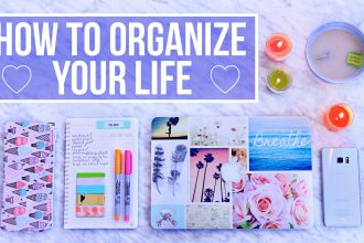
How to Use Stock Photos for Instagram Posts and Reels Covers
If you rely on stock photography, the goal is not simply to fill empty space. The goal is to make your Instagram posts and Reels covers feel intentional, trustworthy, and visually aligned with your brand. This guide is built for creators, product sellers, coaches, and brands using Instagram for reach and discovery who want to make static graphics and cover images look intentional, branded, and scroll-stopping.
- Why stock photos matter in Instagram posts and Reels covers
- Quick comparison table
- The best workflow for using stock photos well
- 1) Start with the message, not the photo library
- 2) Choose images with real relevance and clean composition
- 3) Customize every image before publishing
- 4) Match images to a repeatable visual system
- 5) Pair the image with proof, hierarchy, and clarity
- Common mistakes that make stock photos feel generic
- A practical pre-publish checklist
- Useful resources and further reading
- Key takeaways
- FAQs
- Do stock photos work on Instagram?
- What makes a good Reels cover?
- Should I use the same style for every post?
- References
On Instagram, the image has to work in the feed, on the profile grid, and as a thumbnail. That means clarity at small sizes matters as much as beauty. The strongest results usually come from a repeatable system: choose images for relevance, simplify the composition, customize the image, and place it where it helps the reader or buyer make a faster decision.
Why stock photos matter in Instagram posts and Reels covers
Stock photos work best when they play a supporting role. They create instant context, guide the eye, and help the audience feel the message before they read every word. That is especially useful when your headline is strong but your page still needs visual structure and emotional framing.
Used poorly, stock images weaken credibility. Readers notice obvious cliches, mismatched moods, fake-looking business scenes, and photos that have nothing to do with the offer. Used well, the same image source can look premium because you change the crop, refine the color tone, pair it with cleaner typography, and place it in a smarter layout.
A simple rule: if the image does not make the message clearer, easier to trust, or easier to scan, it should not be there.
Quick comparison table
| Use case | Best stock photo direction | Best customization move | What to avoid |
|---|---|---|---|
| Reels cover | high-contrast close-up image | add short, bold title in safe center area | placing text too close to the edges |
| Carousel cover | clean image with negative space | use strong headline + brand accent | tiny multi-line text |
| Single promo post | simple branded lifestyle image | pair with one offer or one message | trying to explain everything on one slide |
| Quote / insight post | subtle texture or soft photo background | lower opacity and prioritize readability | busy images behind small text |
The best workflow for using stock photos well
1) Start with the message, not the photo library
Decide what the image must do: stop the scroll, support a promise, create a visual break, reinforce a section headline, or improve perceived quality. Once that purpose is clear, image selection becomes much easier.
2) Choose images with real relevance and clean composition
Look for photos with one obvious subject, natural lighting, and enough negative space. In most cases, images with breathing room are easier to adapt because they leave space for text, logos, buttons, or layout cropping.
3) Customize every image before publishing
Never drop the raw file into production unchanged. Adjust crop, sharpen the focal point, reduce distracting elements, apply a subtle color grade, and add overlays only when they improve readability. Even small edits make the image feel less reused and more brand-specific.
4) Match images to a repeatable visual system
Build a simple internal standard: one or two aspect ratios, one headline style, one overlay rule, one image mood, and one brand color treatment. This makes your visuals look cohesive across pages and campaigns.
5) Pair the image with proof, hierarchy, and clarity
Stock photos are strongest when they sit beside real value: product detail, benefits, screenshots, a comparison table, a testimonial, a pricing block, or a call to action. The image opens attention; the proof closes the decision.
Common mistakes that make stock photos feel generic
- Using whatever looks popular: visual trends do not matter if the photo does not match the message.
- Skipping customization: unedited stock photos often look like default placeholders.
- Using too many different visual styles: mixed filters, mixed lighting, and mixed compositions make a brand feel inconsistent.
- Choosing photos with misleading context: the image should support credibility, not imply something untrue.
- Ignoring readability: if text sits on top of an image, contrast and spacing matter more than aesthetics.
When in doubt, reduce complexity. Cleaner, quieter, more focused images usually perform better than dramatic but cluttered visuals.
A practical pre-publish checklist
- Does the image directly support the page goal?
- Is the subject obvious within the first second?
- Have you changed the crop or framing to suit the layout?
- Does the color feel consistent with your brand palette?
- If text overlays the image, is readability strong on desktop and mobile?
- Is the image paired with a strong CTA, proof element, or next step?
- Have you checked the image license and commercial-use limitations?
Useful resources and further reading
Browse these high-value bundles for website creators, developers, designers, startups, content creators, and digital product sellers.
Further reading on SenseCentral
Use internal linking to keep readers engaged and move them from advice to action. The links below fit naturally with this topic and can improve on-site session depth.
Helpful external resources
These are strong supporting references for platform policies, image licensing, or design workflow guidance.
Key takeaways
- Choose stock photos based on the message first, not because the image looks attractive in isolation.
- Edit every image so it fits your brand system: crop, contrast, overlay, spacing, and typography should feel intentional.
- Use stock images to support clarity in Instagram posts and Reels covers, not to replace proof, product detail, or essential information.
- Keep image style consistent across one page, one campaign, or one content series so your visual identity becomes recognizable.
- Review license terms before commercial use, especially when you are using imagery in ads, client work, templates, or products for sale.
FAQs
Do stock photos work on Instagram?
Yes, especially when you transform them into branded assets rather than posting them raw.
What makes a good Reels cover?
Readable title, strong contrast, clean focal point, and a crop that still looks clear in a small profile grid thumbnail.
Should I use the same style for every post?
Use a repeatable visual system, not identical art. Consistency should come from typography, colors, crop style, and overlays.
References
- SenseCentral Home
- Best Stock Photo Bundle for Bloggers
- 100,000+ HD Stock Photos Bundle product page
- Marketing on Instagram
- Advertise on Instagram
- Unsplash License
- SenseCentral Bundle Collection
References included for reader convenience. Re-check platform rules and licenses before commercial publication or redistribution.