
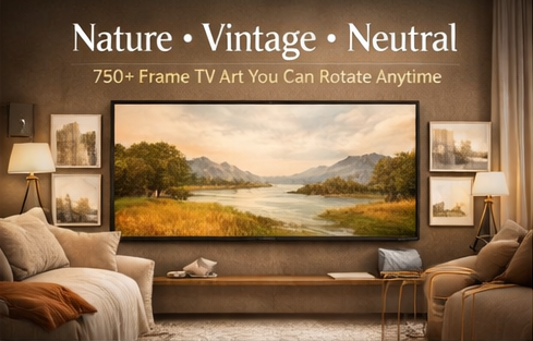

Not everyone wants loud visuals on the biggest screen in the room. If your taste leans warm, calm, and timeless—nature, vintage, and neutrals are the most “always looks good” combination for a Frame TV.
Nature & landscapes: depth and calm
Landscapes add “space” to a room—mountains, beaches, forests, sunsets. They’re also the easiest category to live with long-term.
Vintage/classic: instant gallery vibe
Vintage-inspired visuals feel curated, timeless, and sophisticated—especially in living rooms, libraries, and offices.
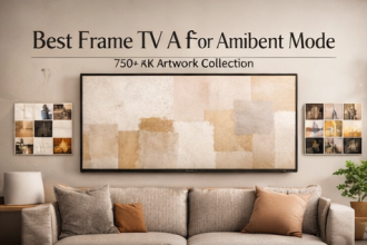
Neutral aesthetic sets: safe and premium
Neutral palettes (beige, monochrome, earthy tones) blend with almost any interior style. If you want a minimal, calm look, build your rotation around neutrals first.
Best value move: Get one variety bundle that includes neutrals, landscapes, vintage, plus minimal and abstract—so you can adapt anytime.
A simple curation plan
- Pick 15 neutrals as your “always-on” set.
- Add 10 landscapes for warmth and depth.
- Add 5–10 vintage/classic visuals for a gallery feel.
- Optional: add 5 seasonal mood pieces (cozy/calm/bright/dramatic).
FAQ
Do I receive physical prints?
No—this is digital download art.
Will it upload easily?
Yes—common image formats (JPG/PNG) are typically the easiest to upload.
Is commercial use allowed?
Usually not; personal use is standard unless the listing states otherwise.
Conclusion: If you want your TV to feel warm, timeless, and “interior designer approved,” nature + vintage + neutrals is the winning trio.


