Responsive Design Principles Every Designer Should Know
Responsive design is no longer just a web development concern. It is a design thinking discipline: layout, hierarchy, interaction, and performance all have to adapt gracefully as screens, orientations, and user preferences change.
Keyword focus: responsive design, responsive UI, fluid layouts, adaptive design principles
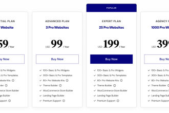
Browse these high-value bundles for website creators, developers, designers, startups, content creators, and digital product sellers.
Why this topic matters
Users move across phones, laptops, large desktops, foldables, and tablets. A layout that only works at one width silently loses trust everywhere else. Strong responsive design protects readability, keeps controls usable, and prevents “broken-feeling” transitions between devices.
Core principles
The best responsive systems are flexible at the component level—not just at the full-page level. Start with these design principles before choosing breakpoints.
Let content define the breakpoints
Breakpoints should appear where the content starts to look awkward, not where a generic device list says they should. This keeps the design focused on real layout tension instead of arbitrary widths.
Use flexible sizing, not rigid pixels
Relative units, fluid grids, and adaptable spacing create systems that scale more naturally. Hard-coded fixed widths usually create clipping, cramped cards, or awkward empty space on new devices.
Design components that can reflow
Cards, filters, nav patterns, media blocks, and forms should stack, wrap, or simplify when their container shrinks. Responsive design works best when components own their own behavior.
Protect readability across sizes
Typography, line length, spacing, and contrast need to remain comfortable at every viewport. Text that looks elegant on desktop can become exhausting on smaller screens if it is too dense or too small.
Treat accessibility as part of responsiveness
Responsive layouts should also adapt to zoom, larger text, reduced motion preferences, and keyboard navigation. A layout that only “works” at default settings is not truly resilient.
Practical checklist
Use this checklist before approving a responsive mockup or before publishing a redesign:
- Does the layout remain readable at narrow and wide widths?
- Do components wrap or stack cleanly when space gets tight?
- Are images, charts, and tables still understandable on small screens?
- Can users zoom without the layout breaking or clipping important UI?
- Do spacing and typography scale together instead of independently?
- Are interaction patterns still easy to use with touch and keyboard input?
Responsive design: weak vs stronger decisions
When reviewing a page, compare the design decisions below to spot whether the system is truly flexible or only “shrunk down.”
| Design area | Weak decision | Stronger responsive decision |
|---|---|---|
| Breakpoints | Device-specific breakpoints only | Content-led breakpoints based on layout stress |
| Typography | Fixed font sizes | Scalable type with comfortable line length |
| Media | Large unoptimized images everywhere | Flexible images that adapt by space and context |
| Navigation | Desktop nav simply compressed | Navigation pattern changes to match screen constraints |
| Tables/data | Tiny unreadable columns | Scrollable, stacked, or summarized alternatives |
Common mistakes to avoid
A lot of “responsive” interfaces still fail because they technically resize but do not meaningfully adapt.
Shrinking instead of redesigning
When teams simply scale everything down, the result is often tiny text, crowded spacing, and interface controls that remain visually dense and hard to use.
Ignoring component behavior
A responsive page made of inflexible cards, filters, and tables will still feel broken. Component responsiveness matters as much as page responsiveness.
Forgetting edge states
The default page may resize nicely while error banners, empty states, popovers, and tooltips break badly. Responsive QA must include system states, not just polished mockups.
FAQs
Is responsive design the same as mobile-first design?
How many breakpoints should a design have?
Should every responsive layout look identical on all screens?
What is the biggest responsive design mistake?
Key takeaways
- Design for flexible content, not fixed screen assumptions.
- Let components reflow instead of forcing page-level hacks.
- Accessibility and responsiveness should be reviewed together.
- A good responsive design feels intentional at every size—not merely resized.
Further reading
SenseCentral internal links
- SenseCentral homepage
- SenseCentral: scalable design workflow tag
- SenseCentral: Elementor template kits for creators tag
- SenseCentral: scale WordPress website tag
- How to build a high-converting landing page in WordPress
Useful external resources
- web.dev: Responsive web design basics
- web.dev: Learn Responsive Design
- web.dev: Accessible responsive design
- Material Design 3: Designing structure
- Apple HIG: Inclusion
References
- web.dev: Responsive web design basics
- web.dev: Accessible responsive design
- web.dev: Learn Responsive Design
- Material Design 3: Designing structure
- Apple HIG: Inclusion