

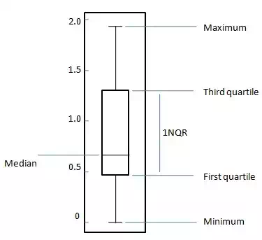
The box plot is a standardized way to display the distribution of data based on following five number summary.
1. Minimum
2. First Quartile
3. Median
4. Third Quartile
5. Maximum
For a uniformly distributed data set,in box plot diagram, the central rectangle spans the first quartile to the third quartile (or the interquartile range, IQR). A line inside the rectangle shows the median and “whiskers” above and below the box show the locations of the minimum and maximum values. Such box plot displays the full range of variation from min to max, the likely range of variation, the IQR, and the median.
Problem Statement:
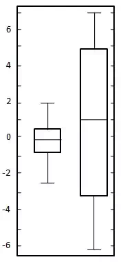
Create a box plot for the following two datasets.
| 0.22 |
| -0.87 |
| -2.39 |
| -1.79 |
| 0.37 |
| -1.54 |
| 1.28 |
| -0.31 |
| -0.74 |
| 1.72 |
| 0.38 |
| -0.17 |
| -0.62 |
| -1.10 |
| 0.30 |
| 0.15 |
| 2.30 |
| 0.19 |
| -0.50 |
| -0.09 |
| -5.13 |
| -2.19 |
| -2.43 |
| -3.83 |
| 0.50 |
| -3.25 |
| 4.32 |
| 1.63 |
| 5.18 |
| -0.43 |
| 7.11 |
| 4.87 |
| -3.10 |
| -5.81 |
| 3.76 |
| 6.31 |
| 2.58 |
| 0.07 |
| 5.76 |
| 3.50 |
Solution:
Here both datasets are uniformly balanced around zero so mean is around zero. In first data set variation ranges approximately from -2.5 to 2.5 whereas in second data set ranges approximately from -6 to 6. Draw the chart as shown below:


