Top 10 Ways to Improve Onboarding in Android Apps
Published by SenseCentral — product reviews, comparisons, and practical digital product guidance.

Post summary: Top 10 Ways to Improve Onboarding in Android Apps is written for Android app builders, product designers, developers, and educational app creators who want to build products that feel clearer, more useful, and easier to trust. A learning product or Android app does not become valuable only because it has many features. It becomes valuable when the user can understand the path, take action, receive feedback, and return with confidence.
SenseCentral reviews products, tools, platforms, and digital systems from a practical user-value angle. That same thinking is important when creating educational apps, online courses, digital downloads, and mobile products. A beginner does not judge a product by how much effort the creator invested. They judge it by whether the product helps them move forward without confusion. This article breaks the topic into ten practical sections so you can evaluate your own product, improve an existing app, or compare tools more intelligently before investing time and money.
The strongest products often win through clarity. They explain the next step, reduce unnecessary choices, use consistent design, and support the user at the moment of need. For learning products, this means better lesson order, practice, feedback, and progress tracking. For Android apps, it means better navigation, screen hierarchy, onboarding, performance, and trust signals. Whether you are building a course, selling templates, designing a mobile app, or improving an existing digital product, the goal is the same: make the useful action easier to complete.
Table of Contents
- Quick Comparison Table
- 1. Use a clear lesson path
- 2. Break content into visible milestones
- 3. Add examples beside explanations
- 4. Create practice moments after each concept
- 5. Reduce choices on early screens
- 6. Use consistent labels and icons
- 7. Offer contextual help at the right moment
- 8. Make feedback immediate and specific
- 9. Design for mobile attention spans
- 10. Review analytics and support questions
- Useful Resources
- Teachable Creator Platform
- Internal Links and Further Reading
- Key Takeaways
- FAQs
- References
Quick Comparison Table: Weak Product Pattern vs Better Product Habit
| Area | Weak Pattern | Better Approach | Why It Adds Value |
|---|---|---|---|
| Navigation | Too many hidden paths | Clear bottom navigation or simple tab structure | Users know where they are and what to do next |
| Layout | Equal visual weight everywhere | Strong hierarchy with one primary action | The screen becomes easier to scan |
| Onboarding | Long tutorial before value | Contextual help during real actions | New users learn while doing |
| Retention | Random notifications | Useful reminders tied to user goals | Engagement feels helpful, not noisy |
| Trust | Inconsistent colors and spacing | Reusable components and design rules | The app feels stable and professional |
1. Use a clear lesson path
In Android app design, use a clear lesson path is not only a design preference; it is a practical retention decision. A user usually decides whether an app feels useful within the first few screens. When the interface is crowded, labels are unclear, or the next action is hidden, the app starts to feel like work. A better approach is to make every screen answer three questions quickly: where am I, what can I do, and what happens next? This habit is especially important for educational apps because users are already spending mental energy on learning. The interface should support that effort instead of competing with it.
For SenseCentral readers comparing app builders, learning tools, course platforms, or digital products, this point matters because good UX is visible in tiny details. Clear spacing, predictable navigation, readable text, helpful empty states, and simple progress cues make an app feel more mature. Developers should test this section with a first-time user, not only with team members who already know the app. If a new user can complete the core action without explanation, the design is moving in the right direction.
Creator habit: Review this point at the end of every update cycle. Small improvements become powerful when they are repeated consistently across lessons, screens, onboarding, pricing pages, and support content.
2. Break content into visible milestones
In Android app design, break content into visible milestones is not only a design preference; it is a practical retention decision. A user usually decides whether an app feels useful within the first few screens. When the interface is crowded, labels are unclear, or the next action is hidden, the app starts to feel like work. A better approach is to make every screen answer three questions quickly: where am I, what can I do, and what happens next? This habit is especially important for educational apps because users are already spending mental energy on learning. The interface should support that effort instead of competing with it.
For SenseCentral readers comparing app builders, learning tools, course platforms, or digital products, this point matters because good UX is visible in tiny details. Clear spacing, predictable navigation, readable text, helpful empty states, and simple progress cues make an app feel more mature. Developers should test this section with a first-time user, not only with team members who already know the app. If a new user can complete the core action without explanation, the design is moving in the right direction.
Creator habit: Review this point at the end of every update cycle. Small improvements become powerful when they are repeated consistently across lessons, screens, onboarding, pricing pages, and support content.
3. Add examples beside explanations
In Android app design, add examples beside explanations is not only a design preference; it is a practical retention decision. A user usually decides whether an app feels useful within the first few screens. When the interface is crowded, labels are unclear, or the next action is hidden, the app starts to feel like work. A better approach is to make every screen answer three questions quickly: where am I, what can I do, and what happens next? This habit is especially important for educational apps because users are already spending mental energy on learning. The interface should support that effort instead of competing with it.
For SenseCentral readers comparing app builders, learning tools, course platforms, or digital products, this point matters because good UX is visible in tiny details. Clear spacing, predictable navigation, readable text, helpful empty states, and simple progress cues make an app feel more mature. Developers should test this section with a first-time user, not only with team members who already know the app. If a new user can complete the core action without explanation, the design is moving in the right direction.
Creator habit: Review this point at the end of every update cycle. Small improvements become powerful when they are repeated consistently across lessons, screens, onboarding, pricing pages, and support content.
4. Create practice moments after each concept
In Android app design, create practice moments after each concept is not only a design preference; it is a practical retention decision. A user usually decides whether an app feels useful within the first few screens. When the interface is crowded, labels are unclear, or the next action is hidden, the app starts to feel like work. A better approach is to make every screen answer three questions quickly: where am I, what can I do, and what happens next? This habit is especially important for educational apps because users are already spending mental energy on learning. The interface should support that effort instead of competing with it.
For SenseCentral readers comparing app builders, learning tools, course platforms, or digital products, this point matters because good UX is visible in tiny details. Clear spacing, predictable navigation, readable text, helpful empty states, and simple progress cues make an app feel more mature. Developers should test this section with a first-time user, not only with team members who already know the app. If a new user can complete the core action without explanation, the design is moving in the right direction.
Creator habit: Review this point at the end of every update cycle. Small improvements become powerful when they are repeated consistently across lessons, screens, onboarding, pricing pages, and support content.
5. Reduce choices on early screens
In Android app design, reduce choices on early screens is not only a design preference; it is a practical retention decision. A user usually decides whether an app feels useful within the first few screens. When the interface is crowded, labels are unclear, or the next action is hidden, the app starts to feel like work. A better approach is to make every screen answer three questions quickly: where am I, what can I do, and what happens next? This habit is especially important for educational apps because users are already spending mental energy on learning. The interface should support that effort instead of competing with it.
For SenseCentral readers comparing app builders, learning tools, course platforms, or digital products, this point matters because good UX is visible in tiny details. Clear spacing, predictable navigation, readable text, helpful empty states, and simple progress cues make an app feel more mature. Developers should test this section with a first-time user, not only with team members who already know the app. If a new user can complete the core action without explanation, the design is moving in the right direction.
Creator habit: Review this point at the end of every update cycle. Small improvements become powerful when they are repeated consistently across lessons, screens, onboarding, pricing pages, and support content.
6. Use consistent labels and icons
In Android app design, use consistent labels and icons is not only a design preference; it is a practical retention decision. A user usually decides whether an app feels useful within the first few screens. When the interface is crowded, labels are unclear, or the next action is hidden, the app starts to feel like work. A better approach is to make every screen answer three questions quickly: where am I, what can I do, and what happens next? This habit is especially important for educational apps because users are already spending mental energy on learning. The interface should support that effort instead of competing with it.
For SenseCentral readers comparing app builders, learning tools, course platforms, or digital products, this point matters because good UX is visible in tiny details. Clear spacing, predictable navigation, readable text, helpful empty states, and simple progress cues make an app feel more mature. Developers should test this section with a first-time user, not only with team members who already know the app. If a new user can complete the core action without explanation, the design is moving in the right direction.
Creator habit: Review this point at the end of every update cycle. Small improvements become powerful when they are repeated consistently across lessons, screens, onboarding, pricing pages, and support content.
7. Offer contextual help at the right moment
In Android app design, offer contextual help at the right moment is not only a design preference; it is a practical retention decision. A user usually decides whether an app feels useful within the first few screens. When the interface is crowded, labels are unclear, or the next action is hidden, the app starts to feel like work. A better approach is to make every screen answer three questions quickly: where am I, what can I do, and what happens next? This habit is especially important for educational apps because users are already spending mental energy on learning. The interface should support that effort instead of competing with it.
For SenseCentral readers comparing app builders, learning tools, course platforms, or digital products, this point matters because good UX is visible in tiny details. Clear spacing, predictable navigation, readable text, helpful empty states, and simple progress cues make an app feel more mature. Developers should test this section with a first-time user, not only with team members who already know the app. If a new user can complete the core action without explanation, the design is moving in the right direction.
Creator habit: Review this point at the end of every update cycle. Small improvements become powerful when they are repeated consistently across lessons, screens, onboarding, pricing pages, and support content.
8. Make feedback immediate and specific
In Android app design, make feedback immediate and specific is not only a design preference; it is a practical retention decision. A user usually decides whether an app feels useful within the first few screens. When the interface is crowded, labels are unclear, or the next action is hidden, the app starts to feel like work. A better approach is to make every screen answer three questions quickly: where am I, what can I do, and what happens next? This habit is especially important for educational apps because users are already spending mental energy on learning. The interface should support that effort instead of competing with it.
For SenseCentral readers comparing app builders, learning tools, course platforms, or digital products, this point matters because good UX is visible in tiny details. Clear spacing, predictable navigation, readable text, helpful empty states, and simple progress cues make an app feel more mature. Developers should test this section with a first-time user, not only with team members who already know the app. If a new user can complete the core action without explanation, the design is moving in the right direction.
Creator habit: Review this point at the end of every update cycle. Small improvements become powerful when they are repeated consistently across lessons, screens, onboarding, pricing pages, and support content.
9. Design for mobile attention spans
In Android app design, design for mobile attention spans is not only a design preference; it is a practical retention decision. A user usually decides whether an app feels useful within the first few screens. When the interface is crowded, labels are unclear, or the next action is hidden, the app starts to feel like work. A better approach is to make every screen answer three questions quickly: where am I, what can I do, and what happens next? This habit is especially important for educational apps because users are already spending mental energy on learning. The interface should support that effort instead of competing with it.
For SenseCentral readers comparing app builders, learning tools, course platforms, or digital products, this point matters because good UX is visible in tiny details. Clear spacing, predictable navigation, readable text, helpful empty states, and simple progress cues make an app feel more mature. Developers should test this section with a first-time user, not only with team members who already know the app. If a new user can complete the core action without explanation, the design is moving in the right direction.
Creator habit: Review this point at the end of every update cycle. Small improvements become powerful when they are repeated consistently across lessons, screens, onboarding, pricing pages, and support content.
10. Review analytics and support questions
In Android app design, review analytics and support questions is not only a design preference; it is a practical retention decision. A user usually decides whether an app feels useful within the first few screens. When the interface is crowded, labels are unclear, or the next action is hidden, the app starts to feel like work. A better approach is to make every screen answer three questions quickly: where am I, what can I do, and what happens next? This habit is especially important for educational apps because users are already spending mental energy on learning. The interface should support that effort instead of competing with it.
For SenseCentral readers comparing app builders, learning tools, course platforms, or digital products, this point matters because good UX is visible in tiny details. Clear spacing, predictable navigation, readable text, helpful empty states, and simple progress cues make an app feel more mature. Developers should test this section with a first-time user, not only with team members who already know the app. If a new user can complete the core action without explanation, the design is moving in the right direction.
Creator habit: Review this point at the end of every update cycle. Small improvements become powerful when they are repeated consistently across lessons, screens, onboarding, pricing pages, and support content.
Useful Resources for Creators, Educators, and Product Builders
Explore Our Powerful Digital Products: Browse these high-value bundles for website creators, developers, designers, startups, content creators, and digital product sellers. If you are building learning products, Android apps, course materials, templates, or content systems, these resources can help you move faster.
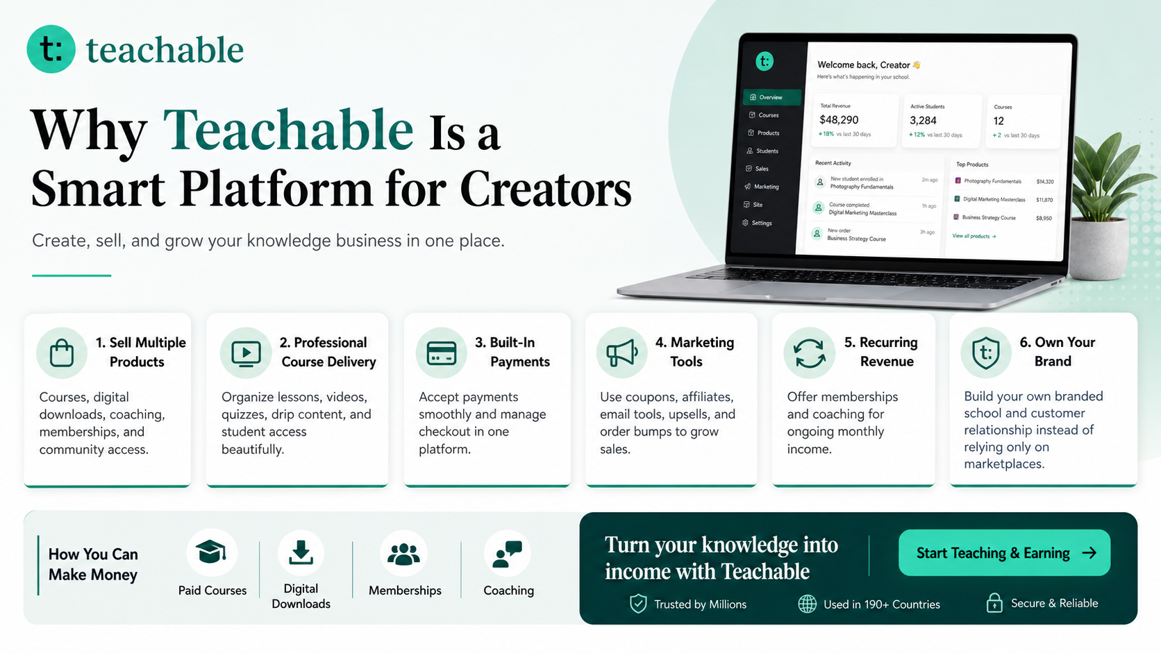
Build and Sell Your Own Learning Product with Teachable
Teachable is an online platform that lets creators build, market, and sell courses, digital downloads, coaching, and memberships. It helps educators and entrepreneurs turn their knowledge into a branded digital business without needing complex coding.
How to Make Money with Teachable: A Complete Creator’s Guide
Internal Links and Further Reading from SenseCentral
- SenseCentral homepage
- Android app design ideas on SenseCentral
- Educational app resources on SenseCentral
- Digital products and creator tools on SenseCentral
- How to Make Money with Teachable: A Complete Creator’s Guide
Key Takeaways
- A cleaner Android interface can improve first impressions, trust, and retention.
- Navigation, hierarchy, onboarding, and feedback should be tested with real first-time users.
- Educational apps need to reduce interface friction because users are already using attention to learn.
- Modern UX is not only visual polish; it is structure, clarity, performance, and predictability.
- Long-term product growth comes from regular small improvements, not only big redesigns.
Suggested Keyword Tags
Android app UX, mobile app design, app retention, Material Design, app navigation, onboarding UX, layout hierarchy, mobile interface, educational apps, app store optimization, developer habits, SenseCentral
FAQs
What is the fastest way to improve Android app UX?
Start by simplifying the first user journey. Make the primary action obvious, reduce the number of choices on each screen, improve labels, and test whether a new user can complete the first meaningful task without help.
Should every Android app follow Material Design?
Not every app needs to look identical, but Material Design gives useful patterns for navigation, components, spacing, motion, and interaction. It is a strong foundation for consistency and familiarity.
How can educational Android apps improve retention?
Retention improves when users understand the next step, receive useful feedback, see meaningful progress, and can practice without confusion. Notifications can help, but they should not replace a clear product experience.
What makes an app feel modern?
Modern apps usually feel focused, fast, readable, consistent, and calm. They use clean hierarchy, accessible contrast, useful microcopy, meaningful empty states, and predictable interaction patterns.
How often should developers improve UX?
UX improvement should be continuous. A small weekly review of analytics, support questions, ratings, and real user sessions can reveal practical fixes that improve trust and retention over time.