
- Table of Contents
- Chart 1: CO₂ in the Air (The “Keeling Curve” idea)
- Chart 2: Global Temperature Going Up
- Chart 3: Sea Level Rising
- Chart 4: Arctic Sea Ice Shrinking
- Chart 5: The Ocean Storing More Heat (Ocean Heat Content)
- Chart 6: Glaciers Losing Ice
- Chart 7: Oceans Becoming More Acidic (pH Going Down)
- Chart 8: Emissions Still Near Record Highs
- Chart 9: Heavy Rain is Getting Heavier (Many places)
- Chart 10: The “Energy Imbalance” (Earth Keeping Extra Heat)
- So… What Can We Do?
- 1) The big lever: reduce greenhouse gas emissions
- 2) Adaptation: prepare for what’s already happening
- 3) The “kid-level” checklist (simple but real)
- Key Takeaways
- FAQ
- 1) Is climate change the same as global warming?
- 2) How do we know humans are the main cause?
- 3) Why do some places get colder or snowy if the planet is warming?
- 4) Are the charts “adjusted” or “manipulated”?
- 5) What’s the fastest way to slow warming?
- 6) Can one person’s actions matter?
- References & Data Sources
Climate change can sound like a huge, scary mystery. But scientists don’t “guess” what’s happening—they measure it. And the easiest way to understand measurements is with charts.
Think of charts like a report card for Earth. If the same kinds of “bad grades” keep showing up (hotter temperatures, rising seas, shrinking ice), it’s a strong sign something is changing.
In this post, you’ll see 10 important climate charts and get them explained in plain language—like you’re 12. Each chart includes a trusted link so you can check the original source yourself.
Table of Contents
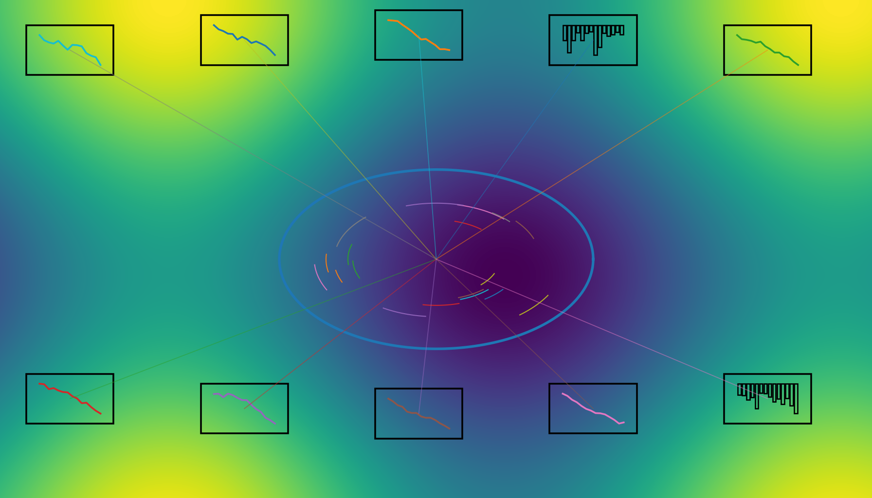
Chart 1: CO₂ in the Air (The “Keeling Curve” idea)
What it shows: Carbon dioxide (CO₂) in the atmosphere has been going up for decades. You’ll also see a little “up and down” each year—like a sawtooth.
Explain like you’re 12: Imagine Earth is a room. CO₂ is like smoke. If you keep adding smoke faster than the room can clear it, the room gets smokier. The tiny up-and-down wiggles happen because plants “breathe” CO₂ in and out during seasons—but the overall line keeps climbing.
Why it matters: CO₂ traps heat, like a blanket. A thicker blanket makes Earth warmer over time.
See the chart:
- NASA Earth Indicator: Carbon Dioxide
- NOAA Climate.gov: Atmospheric CO₂
- NASA: Evidence of Climate Change
Chart 2: Global Temperature Going Up
What it shows: Earth’s average surface temperature has been rising, especially in recent decades.
Explain like you’re 12: If you check your body temperature every day and it slowly rises year after year, that’s a big clue something’s wrong. Earth is like that—scientists take “temperature checks” using weather stations, ships, and ocean buoys. The chart shows the planet is running a fever.
Important note: Some years are hotter or cooler due to natural patterns (like El Niño), but the trend is upward.
See the chart:
- NOAA Climate.gov: Global Temperature
- NASA Earth Indicator: Global Temperature
- NOAA NCEI: Climate at a Glance (Global Time Series)
Chart 3: Sea Level Rising
What it shows: Global sea level is rising over time.
Explain like you’re 12: Picture a bathtub. If you add ice cubes sitting on a little tray above the tub (land ice) and they melt, that’s extra water in the tub. Also, when water warms up, it expands slightly—like when a balloon grows when warmed. Together, these make sea level rise.
Why it matters: Higher seas make coastal flooding worse, especially during storms and high tides.
See the chart:
- NASA/US sites: Vital Signs – Sea Level
- NASA Earth Indicator: Sea Level
- NOAA Climate.gov: Global Sea Level
Chart 4: Arctic Sea Ice Shrinking
What it shows: Arctic sea ice (especially in September, when it’s usually smallest) has been shrinking over the satellite era.
Explain like you’re 12: Ice is like a big white mirror. It reflects sunlight back into space. When ice melts, darker ocean water appears—and dark things absorb more sunlight. That makes the area warm faster, which melts more ice. This feedback is one reason the Arctic is changing so quickly.
See the chart:
- NASA Earth Indicator: Arctic Sea Ice Minimum Extent
- NSIDC: Charctic Interactive Sea Ice Graph
- NSIDC: Sea Ice Today
Chart 5: The Ocean Storing More Heat (Ocean Heat Content)
What it shows: The ocean is absorbing a huge amount of extra heat, and the amount stored has been rising.
Explain like you’re 12: The ocean is Earth’s biggest “heat sponge.” If the planet is getting extra heat, the ocean soaks up most of it. That’s why this chart is powerful: even if the air temperature wiggles up and down each year, the ocean heat chart shows the long-term “heat savings account” growing.
Why it matters: Warmer oceans can affect sea level (expansion), coral reefs, and weather patterns.
See the chart:
- NASA Earth Indicator: Ocean Warming
- NOAA Climate.gov: Ocean Heat Content
- NOAA NCEI: Global Ocean Heat Content
Chart 6: Glaciers Losing Ice
What it shows: Glaciers around the world are generally losing mass (more melting than snowfall replacement).
Explain like you’re 12: Think of a glacier as a giant snowbank that’s lasted hundreds or thousands of years. If every summer it melts more than it grows back in winter, it shrinks. Scientists measure this like weighing the glacier over time—called “mass balance.”
Why it matters: Melting glaciers contribute to sea level rise and reduce fresh water storage for some regions.
See trusted background & indicators:
- NASA: Evidence (includes ice melt indicators)
- IPCC AR6 Working Group I (physical science basis)
- WMO (global climate monitoring)
Tip: Many glacier mass-balance datasets are summarized in scientific assessments; if you want an easy “one place” overview, the IPCC reports and WMO climate summaries are good starting points.
Chart 7: Oceans Becoming More Acidic (pH Going Down)
What it shows: As CO₂ rises in the air, some dissolves into the ocean, which lowers pH (meaning it becomes more acidic).
Explain like you’re 12: Imagine you add a little lemon juice to water. The water becomes more acidic. The ocean is huge, so changes sound small, but pH is a tricky scale (it’s logarithmic), so a “small” drop can be meaningful for ocean life—especially creatures that build shells and reefs.
See the chart:
- NOAA: Ocean Acidification (explainer + key numbers)
- Smithsonian Ocean: Ocean Acidification Graph
- NOAA: Ocean Acidification Data
Chart 8: Emissions Still Near Record Highs
What it shows: Global CO₂ emissions from fossil fuels have been extremely high, and recent years have been near record levels.
Explain like you’re 12: If CO₂ is the smoke, emissions are the smoke being added right now. Even if you start cleaning the room, if someone keeps lighting more candles, the smoke can still build up. The faster we reduce emissions, the faster the CO₂ “blanket” stops thickening.
See the chart:
- Global Carbon Budget (news): 2025 fossil CO₂ emissions
- Global Carbon Project: Global Carbon Budget
- Our World in Data: Annual CO₂ emissions (countries)
Chart 9: Heavy Rain is Getting Heavier (Many places)
What it shows: In many regions, the heaviest rainfall events are becoming more intense.
Explain like you’re 12: Warmer air can hold more water vapor—kind of like a bigger sponge. When conditions trigger rain, that extra water can come down in bigger bursts. This doesn’t mean it rains more every single day everywhere, but it can mean stronger downpours when it does rain.
See a clear visual example:
- NOAA Climate.gov image: Changes in the heaviest 1% of rainy days (U.S. map)
- IPCC AR6 (Chapter 11): Extremes and changes in heavy precipitation
Chart 10: The “Energy Imbalance” (Earth Keeping Extra Heat)
What it shows: Earth is currently taking in more energy from the Sun than it sends back to space. That extra energy ends up warming the air, land, and especially the ocean.
Explain like you’re 12: Imagine your phone charging faster than it’s losing battery. The battery percentage goes up. Earth is like that: more energy comes in than goes out, so “stored heat” increases. That’s why ocean heat content (Chart 5) is such a big deal—it’s a direct sign Earth is “charging up” with heat.
See trusted summaries that connect the dots:
- IPCC AR6 Synthesis Report: Summary for Policymakers
- IPCC AR6 WG1 SPM (PDF)
- WMO: State of the Global Climate 2024
So… What Can We Do?
Charts can feel overwhelming. But here’s the empowering part: if humans are changing the climate, humans can also reduce the change.
1) The big lever: reduce greenhouse gas emissions
This means using cleaner energy, wasting less energy, and switching to technologies that don’t add as much CO₂ to the air.
- Learn the basics of climate solutions: IPCC AR6 Synthesis Report hub
- See how countries and sectors contribute: Our World in Data: CO₂ & GHG emissions
2) Adaptation: prepare for what’s already happening
Even if emissions drop fast, some impacts are already “locked in” because CO₂ stays in the atmosphere for a long time.
- NOAA climate tools & info: NOAA Climate
- Global climate highlights & monitoring: Copernicus Climate Highlights
3) The “kid-level” checklist (simple but real)
- Use less energy (turn off, efficient devices, better insulation).
- Travel smarter when possible (walk, bike, public transit, carpool).
- Waste less food (food waste = wasted energy and emissions).
- Support climate-friendly policies and companies (your money and vote are signals).
Key Takeaways
- CO₂ is rising and it acts like a heat-trapping blanket.
- Global temperature is rising—Earth is running a long-term fever.
- Sea level is rising because oceans warm (expand) and land ice melts.
- Arctic sea ice is shrinking, which speeds up warming in the Arctic.
- The ocean is storing most extra heat, which is a strong sign the planet is gaining energy.
- Ocean acidification is real because CO₂ dissolves into seawater and lowers pH.
- Emissions are still very high, which keeps adding to the CO₂ blanket.
- Extreme rainfall patterns are changing in many regions as warmer air holds more moisture.
- Multiple independent datasets agree—this is not based on one chart or one organization.
FAQ
1) Is climate change the same as global warming?
Global warming is the long-term rise in Earth’s average temperature. Climate change includes warming plus changes it triggers—like sea level rise, shifting rainfall, and more heat extremes.
2) How do we know humans are the main cause?
Scientists compare observed changes with what would happen from natural factors alone (like volcanoes and solar changes). Major assessments conclude the evidence shows human influence is driving modern warming.
Start here: IPCC AR6 Working Group I.
3) Why do some places get colder or snowy if the planet is warming?
Weather is short-term; climate is long-term. Even in a warmer world, you can still have cold days and snowstorms. What changes is the overall trend and the chances of extremes.
4) Are the charts “adjusted” or “manipulated”?
Different organizations use different methods, but the big picture matches across independent datasets (NASA, NOAA, IPCC summaries). Many sources publish methods and raw data openly.
5) What’s the fastest way to slow warming?
Reduce greenhouse gas emissions—especially CO₂ from fossil fuels—while also cutting methane where possible. That slows how quickly the heat-trapping blanket thickens.
6) Can one person’s actions matter?
Yes—especially when actions scale through families, communities, businesses, and voting/policy. Personal steps help, but system-level changes create the biggest impact.
References & Data Sources
- IPCC AR6 WG1: Summary for Policymakers (PDF)
- IPCC AR6 Synthesis: Summary for Policymakers (Web)
- NASA: Earth Indicators (CO₂, temp, sea level, ice, ocean heat)
- NOAA Climate.gov: Understanding Climate (charts & explainers)
- NSIDC: Sea Ice (Charctic tool)
- Global Carbon Budget: 2025 emissions update
- Our World in Data: CO₂ & Greenhouse Gas Emissions
- WMO: State of the Global Climate 2024
Disclosure: This post is educational and summarizes public scientific datasets. For decisions affecting safety, health, or policy, consult official guidance and local experts.


