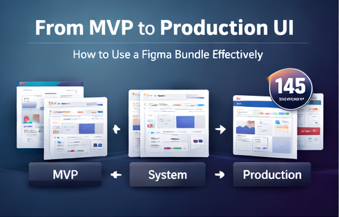
Templates can either make you faster—or make your product look generic. The difference is how you use them.
This guide explains a practical, repeatable method to take a multi-niche UI library like the 145 UI Kit Bundle Mega Pack (mobile UI kits, admin dashboards, landing/website templates, 3D icon packs) and turn it into production-quality UI for real products.
Table of Contents
- Phase 1: MVP (speed)
- Phase 2: Build your UI system (consistency)
- Phase 3: Production polish (credibility)
- FAQ
Phase 1: MVP (speed)
Your goal here is not perfection—it’s validation.
- Select the closest niche kit: choose mobile UI and dashboard layouts aligned with your category (AI, fintech, HR, e-commerce, etc.).
- Define “Core Screens”: onboarding, home, list, detail, profile/settings.
- Launch a matching landing page: use a template for SaaS/agency/AI tools/SEO tools/coaching/digital products as needed.
Phase 2: Build your UI system (consistency)
Now you convert “templates” into “your design language.”
Step A: Create design tokens
- Primary + neutral colors
- Typography scale (H1/H2/body/caption)
- Spacing rules (8px grid, etc.)
- Corner radius, shadows, borders
Step B: Extract components
From the bundle layouts, extract a component set: buttons, chips, cards, tables, forms, navigation, and modals. Standardize variants and states.
Step C: Align surfaces
Use shared patterns across app + dashboard + landing page. A coherent product suite increases trust and reduces confusion.
Phase 3: Production polish (credibility)
1) Add real states
Include loading skeletons, empty states, error states, and permission states. This is where many “template products” break.
2) Use content realism
Replace placeholder text with realistic content lengths and real-world constraints (long names, large numbers, varying images).
3) Accessibility and hierarchy
Check contrast, ensure clear focus states, and tighten typography hierarchy. Minimal tweaks here can make UIs feel “enterprise-grade.”
4) Upgrade visuals with icons
Use 3D icon packs sparingly—primarily in marketing hero areas and feature sections—to elevate perceived value without cluttering product UI.
FAQ
Is the bundle digital?
Yes, it’s a digital product delivered via instant download after payment confirmation.
Can I use it for client projects?
Yes. Use for projects and client work; do not redistribute the original files as-is.
Outcome: with the right process, a 145-resource bundle becomes a production-ready UI accelerator—not a generic template collection.