
- Table of Contents
- What You’ll Build (and why this structure converts)
- Two ways to use Elementor: plugin vs. Elementor Cloud
- Prep checklist before you touch the builder
- Step-by-step: Build your landing page in Elementor
- Install Elementor and set up a clean foundation
- Create a new page and choose a landing page layout
- Build the hero section (headline, subhead, CTA)
- Add benefits and a clear “why choose us” block
- Insert proof: testimonials, case snippets, and trust badges
- Build the offer section and repeat the CTA
- Add objection handling (FAQ + risk reversal)
- Finish with a final CTA + minimal footer
- Conversion copy + design principles (simple, high impact)
- 1) One page = one goal
- 2) Above the fold: outcome + CTA + proof
- 3) Benefits first, features second
- 4) Reduce cognitive load
- 5) Match message to traffic
- Templates, sections, and blocks to speed up your workflow
- Forms, thank-you pages, and tracking conversions
- Forms: keep them short
- Use a thank-you page (not just a “success message”)
- Tracking checklist (beginner-friendly)
- Speed and mobile optimization
- Elementor vs other WordPress approaches
- Launch checklist + Key Takeaways
- FAQ
- References
WordPress • Conversion • Landing Pages • Elementor
This guide shows you a practical, repeatable workflow to build landing pages that look premium, load fast,
and convert. You’ll get a proven structure, Elementor setup options, conversion best practices, and a launch checklist.
We only recommend tools we believe offer real value for WordPress users.
marketers, creators, agencies, and small businesses who want a flexible WordPress landing page workflow without writing code.
Table of Contents
- What You’ll Build (and why this structure converts)
- Two ways to use Elementor: plugin vs. Elementor Cloud
- Prep checklist before you touch the builder
- Step-by-step: Build your landing page in Elementor
- Conversion copy + design principles (simple, high impact)
- Templates, sections, and blocks to speed up your workflow
- Forms, thank-you pages, and tracking conversions
- Speed and mobile optimization
- Elementor vs other WordPress approaches
- Launch checklist + Key Takeaways
- FAQ
- References
What You’ll Build (and why this structure converts)
A landing page is not a “pretty page.” It’s a focused conversion asset built for one primary goal:
a purchase, a lead form submission, a trial signup, a call booking, or an email capture.
The most common reason landing pages fail is that they behave like homepages—too many links,
too many messages, and no clear conversion path.
In this tutorial, you’ll build a high-converting landing page with a proven flow:
| Section | Purpose | Conversion Tip |
|---|---|---|
| Hero (Above the Fold) | Clarify who it’s for + what outcome you deliver | One headline + one CTA. Add social proof nearby. |
| Benefits + Differentiators | Answer “why you” and reduce comparison anxiety | Benefits first, features second. |
| Proof | Reduce risk: testimonials, logos, results, case snippets | Proof beats promises. Use specifics where possible. |
| Offer + CTA Repeated | Make the next step effortless | Repeat the CTA every 1–2 scrolls for long pages. |
| FAQ + Risk Reversal | Handle objections before users ask | Address pricing, timelines, deliverables, support. |
| Final CTA | Catch ready-to-buy users at the bottom | Short, confident, and consistent with the hero. |
If you want more WordPress growth guides, explore our internal resources:
WordPress tutorials •
Hosting comparisons •
Marketing playbooks.
Two ways to use Elementor: plugin vs. Elementor Cloud
Option A: Elementor plugin + your own hosting
This is ideal if you already have a WordPress site (or a preferred host) and you simply want a powerful page builder.
You install Elementor from the WordPress plugin directory, design visually, and publish.
- Best if you already have hosting and a WordPress setup
- Flexible: choose your own theme, host, and performance stack
- Great for site owners who want full control
Option B: Elementor Cloud hosting
Elementor Cloud is an all-in-one approach designed to reduce setup friction.
It combines managed hosting with a WordPress environment and Elementor’s builder in a single subscription experience.
If you want to launch fast and keep the stack simpler, Cloud is worth considering.
- Best for fast launches and fewer moving parts
- Unified platform experience for building + hosting
- Useful for landing pages, portfolios, and small business sites
Cloud can accelerate launch. If you’re integrating landing pages into an existing WordPress site, the plugin route is usually simplest.
Prep checklist before you touch the builder
High-converting landing pages are built on clarity, not design tricks. Before Elementor, do this:
| Prep Item | What to decide | Example |
|---|---|---|
| One primary goal | What is the one action you want? | Book a call / Start trial / Download guide |
| Traffic source | Who is coming and why? | Google Ads, Instagram, email newsletter |
| Offer | What do users get immediately? | Free audit, discount, checklist, demo |
| Proof | How will you reduce risk? | Testimonials, metrics, reviews, case studies |
| Objections | What might stop them? | Price, time, trust, complexity, support |
If you don’t have proof yet, start with “process proof” (what you do), “authority proof” (experience, credentials),
and “risk reversal” (clear refund policy or a low-friction first step).
Step-by-step: Build your landing page in Elementor
Install Elementor and set up a clean foundation
In WordPress, go to Plugins → Add New and install Elementor Website Builder.
For a landing page, keep distractions low: minimize header links, remove sidebar widgets, and avoid a cluttered footer.
- If your theme adds heavy headers/footers, use a “blank canvas” or landing-page layout option.
- Set your global typography and colors early so the page remains consistent.
Create a new page and choose a landing page layout
Go to Pages → Add New, name it (e.g., “Free Consultation” or “Product Demo”), and click Edit with Elementor.
Choose a layout that removes unnecessary navigation (you want one primary conversion path).
Naming tip: keep it aligned with the offer and the URL slug (e.g., /free-audit/ or /book-demo/).
Build the hero section (headline, subhead, CTA)
Your hero section must answer three questions instantly: What is this? Who is it for? What do I do next?
- Headline: Outcome-driven and specific.
- Subhead: One sentence clarifying what you do and how fast they see value.
- CTA button: One primary action. Avoid “Submit.” Use “Get the Checklist” or “Start Free Trial.”
- Proof near CTA: Star ratings, customer count, logos, or a short testimonial.
Build a landing page that converts in a single afternoon.
Use Elementor to design, test, and publish without code—optimized for mobile and speed.
Add benefits and a clear “why choose us” block
After the hero, your visitor is silently asking: “Why should I trust this?” Use 3–6 benefit cards.
Each card should be a mini outcome. Avoid generic claims like “high quality.”
- Use icon + bold benefit title + one-sentence explanation.
- Keep all cards the same height for a clean visual rhythm.
- Use real numbers if possible (time saved, results, user count, etc.).
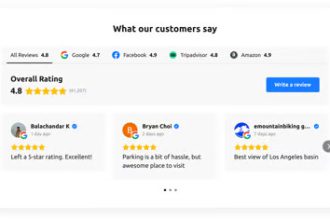
Insert proof: testimonials, case snippets, and trust badges
Proof removes risk. Add testimonials with names, photos (if permitted), and measurable outcomes.
If you don’t have testimonials yet, show:
- Before/after screenshots
- Mini case studies (“What we changed” + “What improved”)
- Trust signals (secure checkout, money-back policy, support hours)
Build the offer section and repeat the CTA
Your offer section should be crystal clear: deliverables, timeline, what happens next, and what the user receives immediately.
Then place your CTA again.
If you’re promoting Elementor itself as your recommended toolchain for landing pages, this is a good place to add a contextual CTA:
Add objection handling (FAQ + risk reversal)
Objections are predictable. Add an FAQ section that addresses pricing, setup time, required tools, support, and what success looks like.
If appropriate, add a risk reversal (refund policy, trial, or a small first step).
Finish with a final CTA + minimal footer
Close strong. Repeat the CTA with a short reminder of the outcome and a final reassurance line.
Keep the footer minimal: privacy policy, terms, and one support link. Avoid sending users to 10 different pages.
Need a contact page? Link it once: Contact SenseCentral.
Conversion copy + design principles (simple, high impact)
1) One page = one goal
Your landing page is not the place to showcase everything you offer. If you want multiple actions
(buy + subscribe + contact + follow), create separate pages.
2) Above the fold: outcome + CTA + proof
Place your primary CTA above the fold. Add proof close to it so the user doesn’t need to “believe” your claims.
This is often the highest leverage improvement you can make.
3) Benefits first, features second
Benefits answer “what changes for me.” Features answer “how it works.” Lead with benefits, then support with features.
4) Reduce cognitive load
- Use one primary button style and one primary CTA phrase.
- Limit fonts (ideally 1–2) and keep spacing consistent.
- Use short paragraphs and scannable bullet lists.
5) Match message to traffic
Align your headline with the promise in your ad/email/social post. If your ad says “Free Speed Audit,”
your landing page headline should repeat that offer (not a generic brand slogan).
Small message matches often outperform big design changes.
Templates, sections, and blocks to speed up your workflow
Elementor’s real advantage is speed-to-publish. You can start from a landing page template, swap the content,
and then refine typography, spacing, and responsive behavior.
A quick template workflow that stays “on brand”
- Choose a clean landing template (avoid overly animated, heavy layouts).
- Set global colors and typography first.
- Replace hero content and CTA copy immediately.
- Update proof (testimonials/logos) next.
- Only then adjust styling details (shadows, borders, motion effects).
hero blocks, testimonial rows, pricing blocks, and FAQ modules. This makes future page builds dramatically faster.
Forms, thank-you pages, and tracking conversions
Forms: keep them short
Every extra form field can reduce conversions. Ask only what you need for the next step.
If your offer is a “free checklist,” you likely only need an email address.
- Short forms: higher conversion for top-of-funnel offers
- Long forms: better lead quality for high-ticket offers (but lower volume)
Use a thank-you page (not just a “success message”)
A dedicated thank-you page lets you:
- Track conversions cleanly (ads platforms and analytics tools often rely on a distinct page view)
- Offer the next step (book a call, watch a demo, download the bonus)
- Confirm expectations (what happens next and when)
Tracking checklist (beginner-friendly)
| What to track | Why it matters | Simple way to implement |
|---|---|---|
| CTA clicks | See if users want the offer | Use analytics event tracking for button clicks |
| Form submissions | Primary conversion metric | Track thank-you page views or submission events |
| Scroll depth | Know where users drop off | Enable scroll tracking in analytics |
| Page speed metrics | Speed impacts conversions | Use Lighthouse / Core Web Vitals tools |
Speed and mobile optimization
Conversion is not just copy—it’s also performance. A beautiful landing page that loads slowly will leak conversions.
Keep your page lightweight and mobile-first.
Mobile-first rules that prevent conversion loss
- Check spacing and font sizes on small screens (no tiny text).
- Keep CTA visible early and repeat it after key sections.
- Compress images and avoid unnecessary background videos.
- Use consistent button sizes (thumb-friendly) and clear contrast.
Speed checklist (non-technical but effective)
- Images: Use modern formats where possible and compress before upload.
- Fonts: Limit font families and weights.
- Animations: Use sparingly (animations can look premium but cost performance).
- Third-party scripts: Every chat widget, tracker, and popup can slow the page.
- Reuse sections: Clean, consistent layout often converts better than “flashy” designs.
Elementor vs other WordPress approaches
Elementor is not the only way to build landing pages in WordPress, but it is one of the fastest for non-developers.
Here’s a practical comparison:
| Approach | Best for | Trade-offs |
|---|---|---|
| Elementor | Fast visual building, reusable sections, marketing pages | Too many widgets/effects can slow pages if overused |
| Gutenberg (Block Editor) | Lightweight pages, simple layouts, performance-first | Design flexibility can be more limited without additional block plugins |
| Theme-based landing templates | Quick-start designs with minimal setup | Harder to customize deeply without builder tools |
| Custom-coded landing page | Maximum performance and control | Requires developer time and ongoing maintenance |
If you need a conversion-focused workflow (templates, sections, responsive controls, and rapid iteration),
Elementor is a strong option for most WordPress users.
Launch checklist + Key Takeaways
Launch checklist (copy/paste)
| Item | Pass Criteria |
|---|---|
| Single goal | One primary CTA, minimal distracting links |
| Above-the-fold clarity | Headline + subhead + CTA visible without scrolling |
| Proof included | At least 1–3 strong proof elements (testimonial/logos/results) |
| Mobile checked | Readable text, clean spacing, CTA easy to tap |
| Speed checked | Images optimized, minimal heavy scripts |
| Tracking enabled | Conversion tracking works (thank-you page or events) |
Key Takeaways
- Conversion is clarity: one page, one goal, one primary CTA.
- Above-the-fold matters: outcome + CTA + proof must appear immediately.
- Proof reduces friction: testimonials, metrics, and examples beat claims.
- Build fast, refine later: templates + saved sections accelerate iteration.
- Mobile + speed are conversion features: treat them as part of the offer.
FAQ
Do I need Elementor Pro to build a landing page?
You can build landing pages with the free version, but paid plans can unlock additional marketing-focused features
(for example, advanced widgets and workflows). Choose based on what your landing page needs: forms, popups, templates,
theme-level customization, and integrations.
Should my landing page include a header menu?
Usually no. A landing page should remove distractions. If you must include navigation (for compliance or trust),
keep it minimal—one or two links maximum (e.g., “Privacy Policy” and “Contact”).
What is the best landing page length?
It depends on the offer. Low-friction offers (free checklist) can be short. High-ticket offers (services, demos)
often benefit from longer pages that build trust: proof, process, FAQs, and outcomes.
How many CTAs should I use?
Use one primary CTA phrase and repeat it across the page (especially on longer pages).
The goal is consistency, not variety.
Elementor Cloud vs using my own host—what should I choose?
If you already have WordPress hosting you like, use the plugin. If you want a simplified, “publish faster” stack
with fewer moving parts, Elementor Cloud is often a straightforward option.
References
Here are a few helpful sources for deeper reading (external links):
- Elementor: Landing Page Builder
- Elementor: Hosting / Cloud
- WordPress.org: Elementor Plugin Listing
- Landing Page Best Practices (Conversion)
- CTA Design & Placement Best Practices
- Core Web Vitals (Performance)
- Google Lighthouse Overview
Explore more on SenseCentral
Continue learning with our guides:
WordPress Tutorials •
Website Builder Comparisons •
Hosting Reviews.


