
- Table of Contents
- What You Can Recreate (and What Not to Copy)
- The Legal Checklist: Inspiration vs Copying
- Elementor Layout Tools That Make This Easy
- The 7-Step Workflow to Recreate Any Section (Legally)
- Step 1: Capture the idea (without copying assets)
- Step 2: Break the section into a “layout blueprint”
- Step 3: Rebuild structure first with Elementor Containers
- Step 4: Add your own typography + brand styling
- Step 5: Replace assets with licensed or original content
- Step 6: Make it responsive (desktop → tablet → mobile)
- Step 7: Save it as a reusable template
- Common Sections and How to Rebuild Them in Elementor
- Example A: A modern hero section (headline + benefits + CTA)
- Example B: Feature grid with icons (3–6 cards)
- Example C: Pricing table with comparison emphasis
- Example D: FAQ section that increases conversions
- How to Save, Reuse, and Scale Your Layouts
- FAQ
- Is it legal to recreate a website section I like?
- Can I copy a section if I change the colors?
- Can I import a template kit and call it done?
- Do I need Elementor Pro for this workflow?
- What’s the easiest way to avoid legal issues?
- Key Takeaways
- References
Affiliate disclosure: This post contains affiliate links. If you purchase through them, SenseCentral may earn a commission at no extra cost to you.
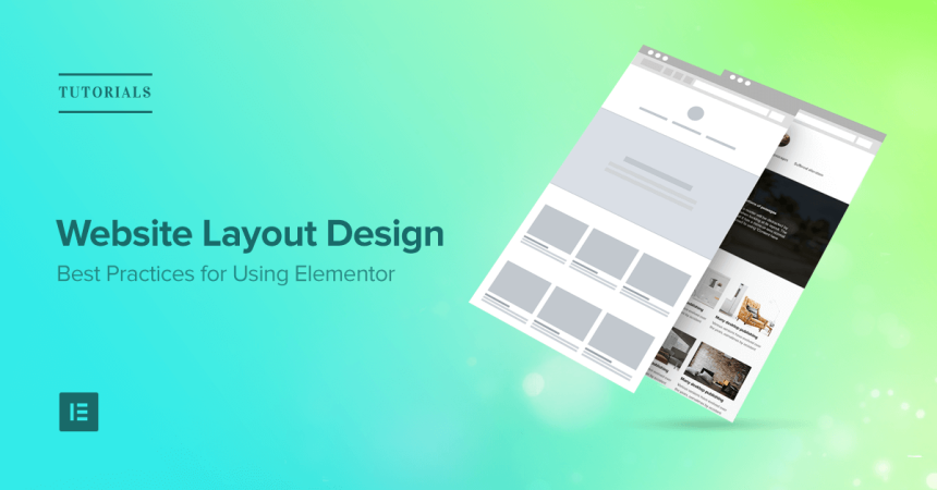
Have you ever landed on a website and thought, “That hero section is perfect,” or “I want that pricing table layout for my own site”? You can absolutely recreate website sections you admire—legally—as long as you approach it the right way: treat great design as inspiration, not something to copy pixel-for-pixel or clone assets/code.
In this guide, you’ll learn a practical, repeatable workflow to rebuild any layout style using Elementor—without scraping, copying copyrighted assets, or replicating a brand identity in a confusing way. You’ll also learn how to save your work as reusable layouts so you can move faster on every future page.
Table of Contents
What You Can Recreate (and What Not to Copy)
Most website sections follow familiar layout patterns: hero banners, feature grids, testimonials, pricing tables, FAQs, and CTAs. These are design patterns. Patterns are widely used and generally safe to recreate in your own style.
You can recreate:
- Layout structure (e.g., two-column hero with image + headline + buttons)
- Spacing rhythm (e.g., generous padding, balanced margins, consistent vertical sections)
- Section components (cards, icons, button groups, toggles, accordions)
- Animation “feel” (subtle fade-in, hover lift, scroll reveal—implemented your way)
Avoid copying:
- Brand identifiers (logos, mascots, proprietary illustrations, distinct brand shapes)
- Exact copywriting, slogans, or unique phrasing
- Original photos, product images, icons, and custom illustrations (unless licensed)
- Exact code, CSS, or templates from the other site (don’t clone/scrape)
Think of it this way: rebuild the “recipe,” not the “meal.”
New to improving your site performance after redesigning sections? Start here:
SenseCentral home |
WordPress guides |
Website builder reviews
The Legal Checklist: Inspiration vs Copying
“Legally” can sound intimidating, but the practical checklist is straightforward. The goal is to ensure your final design is distinct and not confusingly similar to the original brand.
| Action | Safe approach | Risky approach |
|---|---|---|
| Using a layout pattern | Rebuild structure with your spacing, fonts, colors | Pixel-perfect duplication |
| Images/icons | Use licensed assets (stock/photos/icon libraries) | Download assets from the other site |
| Copywriting | Rewrite in your voice for your audience | Copy their headlines and claims |
| Brand “look & feel” | Use your palette, typography, and brand elements | Mimic brand colors/logos/unique style markers |
Practical rule: if a normal visitor could confuse your page with the original brand or think it’s affiliated when it isn’t, you’re too close.
Pro tip: keep a “difference checklist” before publishing:
- Changed typography (font family, size scale, weights)
- Changed color palette (primary, accent, backgrounds)
- Changed imagery (your own assets or licensed replacements)
- Changed copywriting (structure + wording)
- Changed spacing and component styling (corner radius, shadows, borders)
Elementor Layout Tools That Make This Easy
Elementor is well-suited for recreating layouts because it gives you speed (drag-and-drop), precision (containers, flexbox controls), and reuse (templates and global styling).
Key Elementor layout tools you’ll rely on:
- Containers (Flexbox) to structure modern responsive sections cleanly
- Global styles (fonts, colors) to keep designs consistent
- Templates to save sections and reuse across pages
- Theme Builder to control headers/footers and site-wide layouts
- Widgets for testimonials, sliders, accordions, forms, pricing, and CTAs
Want the fastest way to rebuild sections without touching code?
The 7-Step Workflow to Recreate Any Section (Legally)
Step 1: Capture the idea (without copying assets)
Start by collecting references. Use screenshots for your own planning. Avoid downloading their images or SVGs—just capture what you need to understand the structure:
- Overall layout: columns, alignment, spacing
- Typography hierarchy: heading size, subheading style, button placement
- Component pattern: cards, icons, badges, tabs, accordions
- Responsive behavior: how it stacks on mobile
Step 2: Break the section into a “layout blueprint”
Before you open Elementor, write a blueprint in plain language:
- Container 1: full-width background, 2 columns, vertical center
- Left column: H1 + paragraph + button row + trust badges
- Right column: image mockup with subtle shadow
- Spacing: 80px top/bottom padding (desktop), 40px (mobile)
This blueprint prevents you from “eyeballing” and accidentally recreating the exact same section. You’re rebuilding the structure, not cloning it.
Step 3: Rebuild structure first with Elementor Containers
Open your page in Elementor and build the skeleton:
- Add a parent container for the section
- Set content width (boxed or full-width) and add padding
- Create inner containers for columns (e.g., 60/40 split)
- Set alignment (center vertically for hero sections)
Best practice: leave colors and fancy effects for later. If the structure is right, styling becomes simple.
Step 4: Add your own typography + brand styling
This is where you ensure the section becomes unmistakably yours:
- Choose your font pairing and heading scale
- Use your brand palette (primary CTA, accent color, background tints)
- Adjust corner radii, borders, shadows, and icon style
If you don’t have a defined style guide, set Elementor Global Fonts and Global Colors first. It keeps every section consistent.
Step 5: Replace assets with licensed or original content
Never reuse their imagery. Instead:
- Use your own screenshots, product images, or custom mockups
- Use properly licensed stock photos
- Use an icon library with a compatible license
This one step dramatically reduces legal risk and also increases credibility—because your site won’t feel like a copy.
Step 6: Make it responsive (desktop → tablet → mobile)
Great sections often fail on mobile if not tuned. In Elementor:
- Switch column order if needed (image below text)
- Adjust container gaps and padding for smaller screens
- Reduce heading size and tighten line heights
- Set buttons to full width on mobile if it improves tap comfort
Step 7: Save it as a reusable template
Once your section looks right, save it so you never rebuild it again:
- Save as a Section Template (e.g., “Hero – Split CTA v2”)
- Create variations (light background, dark background, image-left)
- Use consistent naming so your library stays organized
Common Sections and How to Rebuild Them in Elementor
Example A: A modern hero section (headline + benefits + CTA)
Blueprint: two columns, left text stack, right image mockup, button row with secondary link, trust row below.
Elementor widgets: Heading, Text Editor, Button, Icon List, Image, Divider.
Make it yours: change layout proportions, add your own trust indicators (client logos, review count, guarantees), and use brand typography.
Example B: Feature grid with icons (3–6 cards)
Blueprint: section heading + short intro + grid of equal-height cards (3 columns desktop, 2 tablet, 1 mobile).
Elementor widgets: Icon Box, Heading, Container background, Border/Shadow.
Make it yours: use a consistent icon style, adjust corner radius, and choose a distinct card layout (top icon vs left icon).
Example C: Pricing table with comparison emphasis
Pricing layouts are everywhere, but your style can be unique. Add a “Most Popular” badge, a highlighted border, and different spacing/padding to differentiate.
| Section type | Fastest Elementor approach | Easy uniqueness upgrades |
|---|---|---|
| Hero | Containers + Heading + Buttons | Add trust row, custom badge, alternate column ratio |
| Feature grid | Icon Boxes in a grid container | Use distinct card styling + hover interaction |
| Testimonials | Testimonial widget or custom cards | Add rating stars, outcomes, and audience segment labels |
| FAQ | Accordion widget | Add category grouping + linkable questions |
Example D: FAQ section that increases conversions
When you recreate a FAQ layout you like, focus on clarity and trust:
- Group questions by theme (pricing, setup, performance, support)
- Keep answers short and actionable
- Add a CTA at the bottom (especially for service pages)
How to Save, Reuse, and Scale Your Layouts
The real advantage of recreating sections with Elementor is not the first build—it’s the library you create over time.
Build a “SenseCentral Layout Library” strategy:
- Create a set of “core” sections: hero, features, social proof, pricing, FAQ, final CTA
- Save each as a reusable template (multiple variants)
- Standardize your button styles and spacing
- Use global typography so every page feels consistent
Once you do this, every new landing page becomes assembly, not design from scratch.
If you want an easier setup experience and a streamlined build workflow:
FAQ
Is it legal to recreate a website section I like?
Recreating a layout pattern is generally fine when you build it yourself and make it distinct (your typography, colors, spacing, copy, and assets). What you should avoid is copying proprietary images, unique branding elements, or cloning their code and content.
Can I copy a section if I change the colors?
Changing colors alone is not a strong enough differentiator if the section remains otherwise identical. Aim for multiple layers of originality: typography, spacing, components, imagery, and copywriting.
Can I import a template kit and call it done?
Template kits can accelerate your workflow, but you should still customize branding, copy, and visuals so your final site is unique and aligned with your audience.
Do I need Elementor Pro for this workflow?
You can build many layouts with the free version, but advanced site-building workflows often benefit from premium widgets, templates, and deeper control—especially if you’re building multiple pages and want to standardize your design system.
What’s the easiest way to avoid legal issues?
Never copy images or text from the original site. Rebuild the structure from scratch, use your own content, and ensure your final design is clearly your brand—not something that could be confused with theirs.
Key Takeaways
- Recreate patterns, not pixels: rebuild the structure you admire with your own brand style.
- Do not copy assets or text: use licensed/original images and rewrite all copy.
- Use Elementor containers: nail structure first, then styling, then responsive tuning.
- Save sections as templates: build a reusable layout library and ship pages faster.
- Keep it distinct: typography, colors, spacing, and content should clearly differ from the source.
References
Next step: Pick one section you love, follow the 7-step workflow above, and save it as a reusable template. Within a week, you’ll have a personal library of high-converting layouts you can deploy on demand.


