

- 1) What is an exit-intent popup (and why it converts)
- 2) The high-converting popup formula (before you touch settings)
- 3) 6 exit-intent popup templates you can copy (with examples)
- Template #1: “Discount to save the sale” (e-commerce / product pages)
- Template #2: “Content upgrade” (blogs / affiliate reviews)
- Template #3: “Lead magnet for services” (agencies / freelancers / SaaS)
- Template #4: “Objection buster” (high-consideration products)
- Template #5: “Save for later” (affiliate / content-heavy sites)
- Template #6: “One-question feedback” (reduce bounce, learn why)
- 4) Exit-intent popup settings that actually matter (frequency, pages, devices)
- 5) What to do on mobile (since classic exit-intent is desktop-first)
- 6) No-code setup: build it with Elfsight (step-by-step)
- Step-by-step (recommended workflow)
- How to add the popup to WordPress
- How to add it to Webflow / Shopify (quick overview)
- 7) Targeting rules that increase conversions without annoying people
- Rule #1: Target by page intent
- Rule #2: Cap frequency aggressively
- Rule #3: Use a “two-step” popup when possible
- Rule #4: Match the popup to traffic source
- 8) Common mistakes (and fixes)
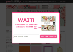
- Mistake #1: “Join our newsletter” (no clear benefit)
- Mistake #2: Showing the same popup to everyone
- Mistake #3: Too many fields
- Mistake #4: No testing or iteration
- Mistake #5: Forgetting mobile behavior
- Key Takeaways
- 9) FAQs
- Do exit-intent popups work on mobile?
- What is a good conversion rate for an exit-intent popup?
- How often should I show an exit-intent popup?
- Should I offer discounts on exit-intent?
- Can I use exit-intent popups on WordPress without coding?
- 10) References
A practical, step-by-step guide for WordPress, Webflow, and Shopify — with copy-ready templates, targeting rules, and the exact settings that prevent “popup fatigue.”
This post contains affiliate links. If you use them, Sensecentral may earn a commission at no extra cost to you. We only recommend tools we believe are genuinely useful.
Exit-intent popups have one job: save a leaving visitor. Not by begging — but by offering a smart, relevant “last chance” that feels helpful.
Done right, exit-intent can lift email signups, recover abandoned carts, and increase demo bookings.
Done wrong, it becomes noise (and trains people to close everything you show them).
In this guide, you’ll get:
6 proven popup templates
a settings checklist
targeting rules
frequency caps
mobile-friendly alternatives
— and a no-code setup path using Elfsight.
1) What is an exit-intent popup (and why it converts)
An exit-intent popup is a popup that appears when a visitor shows signals they’re about to leave your page.
On desktop, that’s typically detected when the cursor moves toward the browser’s top area (close/back/tab bar).
The idea is simple: you get one final chance to offer value before the visitor disappears.
Your popup converts when it matches the visitor’s intent (e.g., “still deciding?” → offer comparison checklist, coupon, demo, or helpful guide).
Best use-cases
- Email capture: Newsletter, content upgrade, free checklist, lead magnet.
- Abandoned cart recovery: Small discount, free shipping, bonus gift, or “save cart” link.
- Demo / consultation booking: “Want a quick recommendation?”
- Feedback & objections: “What stopped you?” (1-click survey)
- Affiliate / review sites: Offer a comparison download, price-alert opt-in, or “top picks” digest.
When NOT to use exit-intent
- Your site already has aggressive interstitials (you’ll overload attention).
- You can’t offer real value (a generic “Subscribe!” won’t move the needle).
- You show it too frequently (popup fatigue = lower trust).
2) The high-converting popup formula (before you touch settings)
Popups fail because people start with the tool and end with the offer.
Do it in the opposite order:
- Choose ONE goal (email signup, cart recovery, demo booking, etc.).
- Match the offer to the page (a discount on product pages, a checklist on blog posts, a demo on pricing).
- Reduce friction (fewer fields, clearer CTA, less visual clutter).
- Respect the visitor (frequency caps + page targeting + device rules).
| Popup element | What “high-converting” looks like | What kills conversions |
|---|---|---|
| Headline | Specific benefit (“Get the 7-point checklist”) | Generic (“Subscribe to our newsletter”) |
| Offer | Immediate value (coupon, guide, free tool) | Vague promise (“Stay updated”) |
| CTA button | Action-based (“Send me the checklist”) | Neutral (“Submit”, “OK”) |
| Form fields | 1–2 fields max for cold traffic | Asking too much too soon |
| Design | Clear hierarchy + contrast + whitespace | Too many colors, tiny text, clutter |
3) 6 exit-intent popup templates you can copy (with examples)
Below are six templates that work across niches. Pick the one that matches your page intent, then customize the copy.
(Pro tip: keep your popup text short — most of the conversion comes from the offer clarity and CTA.)
Template #1: “Discount to save the sale” (e-commerce / product pages)
When to use: Product pages, cart, checkout, pricing pages.
Copy example:
- Headline: “Wait—here’s 10% off to complete your order.”
- Subtext: “Use code SAVE10 in the next 15 minutes.”
- CTA: “Apply Discount”
- Secondary link: “No thanks, I’ll pay full price.”
Template #2: “Content upgrade” (blogs / affiliate reviews)
When to use: Long guides, comparisons, tutorials.
Copy example:
- Headline: “Want the printable comparison checklist?”
- Subtext: “Get the exact specs + buying questions (PDF).”
- CTA: “Send Me the PDF”
Internal link idea for Sensecentral: link to your best comparison posts or tools hub.
Example placeholders (update as needed):
Sensecentral Home •
More Reviews •
Best Product Lists
Template #3: “Lead magnet for services” (agencies / freelancers / SaaS)
When to use: Service pages, pricing pages, case studies.
- Headline: “Get a free 5-minute website conversion audit.”
- Subtext: “We’ll send 3 quick wins you can apply this week.”
- CTA: “Get My Audit”
Template #4: “Objection buster” (high-consideration products)
When to use: Pricing pages, comparison pages, product pages.
- Headline: “Still deciding?”
- Subtext: “See how we compare + what plan fits you best.”
- CTA: “Show Me the Comparison”
Template #5: “Save for later” (affiliate / content-heavy sites)
When to use: Roundups and long comparisons where visitors need time.
- Headline: “Want to save this list?”
- Subtext: “We’ll email you our top picks + update alerts.”
- CTA: “Email Me the List”
Template #6: “One-question feedback” (reduce bounce, learn why)
When to use: High-bounce pages, new landing pages, early-stage offers.
- Headline: “Quick question before you go…”
- Subtext: “What were you looking for today?”
- Options: “Price”, “Best option”, “How it works”, “Other”
- Cart/product page → Discount or Save for later
- Blog/how-to → Content upgrade
- Pricing/service page → Lead magnet or Objection buster
- High bounce → One-question feedback
4) Exit-intent popup settings that actually matter (frequency, pages, devices)
Your popup’s settings determine whether it feels “helpful” or “interruptive.”
The highest-converting setups usually share three principles:
- Right trigger (exit-intent for desktop + alternatives on mobile)
- Right audience (pages + user intent)
- Right frequency (show less often than you think)
A practical settings cheat sheet
| Goal | Best trigger | Frequency cap (starting point) | Where to show | Offer suggestion |
|---|---|---|---|---|
| Email signup (blog) | Exit-intent (desktop) + Scroll/Time (mobile) | Once per 7–14 days per user | High-intent articles, comparisons | Checklist / PDF / mini-course |
| Cart recovery | Exit-intent + On Click (e.g., “Apply coupon”) | Once per session (max) | Cart + checkout only | Small discount, free shipping |
| Demo booking | Exit-intent + Scroll-to-element | Once per 14–30 days | Pricing + feature pages | 15-min call, interactive demo |
| Feedback | Exit-intent + Time on page | Once per 30 days | High-bounce pages | 1-click poll |
That’s how you train visitors to ignore you.
5) What to do on mobile (since classic exit-intent is desktop-first)
Traditional exit-intent relies on cursor movement — which mobile devices don’t have.
That’s why many “exit-intent” triggers are effectively desktop-only.
On mobile, your best approach is to use intent-like behaviors:
- Scroll depth (e.g., show after 60–75% scroll)
- Time on page (e.g., 20–45 seconds on content pages)
- Scroll to element (e.g., when they reach pricing table or FAQ)
- On click (two-step popups: click a “Get coupon” button)
and reserve full-screen overlays for critical flows only (like checkout recovery).
6) No-code setup: build it with Elfsight (step-by-step)
If you want a fast, no-code way to build a polished popup with templates and behavior triggers,
Elfsight Popup is a strong option — especially if you work across platforms (WordPress, Shopify, Webflow, Wix, and more).
Step-by-step (recommended workflow)
- Pick a template that matches your goal (discount, newsletter, exit-intent, announcement).
- Customize content: headline → value → CTA. Keep it short.
- Set trigger: choose On Exit Intent for desktop, plus a mobile alternative (Scroll/Time).
- Set display rules: frequency (caps), pages (targeting), devices (desktop/mobile).
- Connect your email tool (if collecting leads) or redirect to a thank-you page.
- Embed the generated code into your site.
How to add the popup to WordPress
- In WordPress, open the page/post where you want the popup to load.
- Add a Custom HTML block (or use your theme’s header/footer injection area).
- Paste the Elfsight embed code and update the page.
How to add it to Webflow / Shopify (quick overview)
- Webflow: paste the embed code into an Embed element, or site-wide in project settings.
- Shopify: paste in theme.liquid or use a Custom Liquid section depending on your theme setup.
Helpful external resources:
Elfsight Popup widget overview •
Elfsight trigger settings guide •
Elfsight affiliate program
7) Targeting rules that increase conversions without annoying people
Targeting is where most sites leave money on the table.
Instead of “show everywhere,” use these rules:
Rule #1: Target by page intent
- Pricing / cart: discount, free shipping, bonus
- How-to guides: checklist, PDF, email course
- Comparisons: “top picks” digest, update alerts
Rule #2: Cap frequency aggressively
Start strict. You can always loosen later.
A good default for content sites is once per 7–14 days per visitor.
Rule #3: Use a “two-step” popup when possible
Two-step means a visitor clicks something first (e.g., “Get Coupon”), then sees the popup.
It often converts better because the click is a micro-commitment.
Rule #4: Match the popup to traffic source
- Visitors from Google (cold) → value-first lead magnet
- Visitors from email (warm) → product offer / next step
- Visitors from social → shorter copy, stronger visuals
8) Common mistakes (and fixes)
Mistake #1: “Join our newsletter” (no clear benefit)
Fix: Give a specific reason. “Get the printable checklist” beats “Subscribe.”
Mistake #2: Showing the same popup to everyone
Fix: At minimum, vary by page type (blog vs product vs pricing).
Mistake #3: Too many fields
Fix: Start with email only. Ask for more later after trust is built.
Mistake #4: No testing or iteration
Fix: Change one variable at a time (offer OR headline OR trigger), measure for 7–14 days.
Mistake #5: Forgetting mobile behavior
Fix: Use scroll/time triggers on mobile and keep the layout compact.
Key Takeaways
- Exit-intent works best when the offer matches the page (discount for cart, checklist for guides).
- High conversions come from clarity + low friction — not flashy design.
- Frequency caps and page targeting prevent popup fatigue (and protect trust).
- On mobile, replace classic exit-intent with scroll/time/click-based triggers.
- Elfsight is a fast no-code option with templates and multiple trigger types.
9) FAQs
Do exit-intent popups work on mobile?
Classic exit-intent is primarily a desktop behavior (cursor-based).
On mobile, use scroll depth, time on page, scroll-to-element, or click triggers to mimic intent without being intrusive.
What is a good conversion rate for an exit-intent popup?
It varies by niche, traffic quality, and offer. Instead of chasing a universal benchmark,
focus on improving week over week by testing one change at a time (offer → headline → CTA → trigger → targeting).
How often should I show an exit-intent popup?
Start conservative: once per session for cart recovery, and once every 7–14 days for content/email capture.
If you see complaints or rising bounce rates, reduce frequency immediately.
Should I offer discounts on exit-intent?
Discounts can work for e-commerce — but avoid training visitors to “wait for the popup.”
Consider alternatives like free shipping, bundles, bonuses, or “save cart” instead of always discounting.
Can I use exit-intent popups on WordPress without coding?
Yes. Tools like Elfsight generate an embed code you can paste into a Custom HTML block or site-wide injection area.


