- Table of Contents
- Why this topic matters
- Great product pages remove doubt
- A stronger product page structure
- Product page elements that directly support conversions
- Common product page weaknesses
- Useful Resources for Website Creators
- FAQs
- How long should a product description be?
- Do reviews belong near the top?
- What matters most on mobile product pages?
- Key Takeaways
- Further Reading
- References
Affiliate disclosure: this post includes helpful resource links. Some links may be affiliate links where relevant.
How to Design Better eCommerce Product Pages
A product page is where browsing becomes decision-making. If the page creates confusion, missing information, or trust gaps, even interested shoppers may leave. Strong product pages make buying feel easier by organizing information in the right order and reducing the risk the shopper feels.
Table of Contents
Why this topic matters
A product page is where browsing becomes decision-making. If the page creates confusion, missing information, or trust gaps, even interested shoppers may leave. Strong product pages make buying feel easier by organizing information in the right order and reducing the risk the shopper feels. Strong web pages reduce confusion, help visitors scan faster, and make the next step feel natural. That matters for reader retention, lead generation, and buyer trust.
Great product pages remove doubt
Shoppers want clarity before they commit. They need to know what the product is, what makes it worth the price, whether it fits their needs, and what happens after purchase. A strong product page therefore combines persuasive storytelling with practical buying information, all in a predictable, easy-to-scan layout.
What strong pages usually have in common
- Clear hierarchy and readable spacing
- Relevant proof near decision points
- Obvious next steps with low friction
- Consistent structure across desktop and mobile
A stronger product page structure
- Top decision block: Show product title, price, rating, key options, primary media, and a clear add-to-cart or buy-now action above the initial decision zone.
- Quick value summary: Use short bullets for major benefits instead of hiding the most useful points in long paragraphs.
- Trust and logistics: Place shipping, returns, warranty, support, and payment reassurance where doubt naturally appears.
- Rich detail section: Add dimensions, compatibility, materials, care, specs, or use-case guidance so the buyer can self-qualify.
- Proof and comparison: Use reviews, UGC, FAQs, and related product comparisons to support final decisions.
Quick implementation note
Before redesigning the entire site, test these improvements on one high-traffic page first. Small wins on a homepage, landing page, service page, or product page often reveal what should be rolled out site-wide.
Product page elements that directly support conversions
| Element | What it does | Best practice |
|---|---|---|
| Primary media | Builds confidence | Show clear images, context, and zoom-worthy detail. |
| Benefit bullets | Speeds comprehension | Keep them specific and buyer-focused. |
| Variant selector | Reduces confusion | Make stock, price, and selected state obvious. |
| FAQ / policy area | Handles objections | Answer shipping, returns, sizing, and compatibility clearly. |
Common product page weaknesses
- Burying shipping, returns, or compatibility details too far down the page.
- Using generic descriptions that explain features but not buyer value.
- Weak or limited product images that do not answer real purchase questions.
- Crowding the buying area with too many badges, widgets, or competing offers.
Useful Resources for Website Creators
If you build websites, landing pages, product pages, templates, or digital assets regularly, ready-to-use resources can save serious time during design and content production.
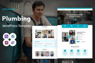
Explore Our Powerful Digital Product Bundles — Browse these high-value bundles for website creators, developers, designers, startups, content creators, and digital product sellers.
Further internal reading on Sense Central
- How to build a high-converting landing page in WordPress
- WordPress website design resources
- Cloudflare CDN for WordPress
- WordPress speed optimization
Useful external resources
- Baymard: Product Page UX research
- Baymard: Current state of product page UX
- Baymard: Product lists and filtering UX
FAQs
How long should a product description be?
Long enough to answer real buying questions, but structured with bullets, subheads, and visual breaks so it stays easy to scan.
Do reviews belong near the top?
A summary often helps near the top, while deeper review content can sit further down the page.
What matters most on mobile product pages?
Fast loading, clear media, readable price and variants, and a strong add-to-cart experience.
Key Takeaways
- Lead with the information buyers need most: product identity, visuals, price, variants, and action.
- Reduce uncertainty with trust cues, FAQs, shipping details, and returns information.
- Use strong media and concise descriptions to answer questions quickly.
- Make comparison and selection easier, especially on mobile.
Further Reading
For deeper site strategy, pair this article with performance, page structure, and platform-specific resources. Combining design, usability, and speed creates stronger long-term results than treating them separately.
Read next on Sense Central
- How to build a high-converting landing page in WordPress
- WordPress website design resources
- Cloudflare CDN for WordPress
- WordPress speed optimization
Research-backed external reading
- Baymard: Product Page UX research
- Baymard: Current state of product page UX
- Baymard: Product lists and filtering UX