
- Table of Contents
- What is an announcement bar (and why it works for affiliate sites)?
- Best announcement bar use-cases for deals + comparison updates
- 1) Limited-time deals (flash sales, coupons, price drops)
- 2) “Updated today” comparison notices
- 3) New model added / winner changed
- 4) Seasonal buying moments
- 5) Lead capture (newsletter, WhatsApp updates, deal alerts)
- Message strategy: what to say (with copy templates)
- How to add an announcement bar using Elfsight (step-by-step)
- Step 1) Choose a template (or start from scratch)
- Step 2) Add your message + CTA link
- Step 3) Choose placement + behavior
- Step 4) Set where it shows (targeting)
- Step 5) Copy the embed code
- WordPress install options (fastest methods)
- Option A) Paste into a Custom HTML block (Gutenberg)
- Option B) Insert into site header/footer (site-wide)
- How to track clicks + leads (UTMs + GA4)
- Method 1) Add UTM parameters to your bar links (simple + powerful)
- Method 2) Track CTA clicks as a GA4 event (advanced)
- Method 3) Track “lead” actions (newsletter / contact)
- Design & UX best practices (mobile-first)
- Examples: bar ideas specifically for product comparison pages
- Elfsight vs alternatives (quick comparison)
- FAQ
- Should I show the announcement bar on every page?
- Does an announcement bar hurt SEO?
- What’s the best placement: top or bottom?
- How often should I change the message?
- Can I track announcement bar performance?
- References
Running an affiliate review and product comparison site (like Sensecentral) means you’re constantly updating: prices change, new models drop, and “best overall” picks flip overnight. The problem? Your readers won’t notice the updates unless they happen to land on the right page at the right time.
That’s where an announcement bar (also called a notification bar or deal bar) becomes your quiet conversion machine: a slim, attention-grabbing strip that highlights your most important updates—without interrupting the reading experience.
Affiliate disclosure: Sensecentral may earn a commission if you buy through links in this post (at no extra cost to you). We recommend tools we genuinely believe help website owners improve UX and conversions.
Table of Contents
What is an announcement bar (and why it works for affiliate sites)?
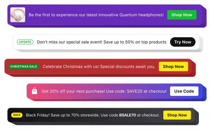
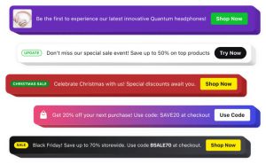
An announcement bar is a thin banner placed at the top (or bottom) of your website to spotlight the most important message right now—like:
- Deal alerts: “Limited-time price drop” or “coupon active”
- Comparison updates: “We updated our ranking today”
- New releases: “New model added to our comparison”
- Trust signals: “Updated with hands-on testing notes”
For product review sites, this works especially well because your readers have high intent. They’re already comparing options—your job is to guide them to the most relevant page and reduce decision friction.
In simple terms: an announcement bar helps you push the right visitor to the right page at the right moment.
Pro tip: Use the bar to highlight “freshness.” Visitors love updated comparisons—especially for tech products where pricing and models change fast.
Best announcement bar use-cases for deals + comparison updates
Here are the highest-performing ways to use an announcement bar on an affiliate comparison site:
1) Limited-time deals (flash sales, coupons, price drops)
- Promote a single top deal (“Best deal today”) rather than 10 offers.
- Link to a deals roundup page or your best comparison page.
- Use urgency carefully—real urgency only (avoid fake countdowns).
2) “Updated today” comparison notices
- Great for rankings: “Updated: Best budget laptops (Jan 2026).”
- Drives repeat visitors back to money pages.
- Builds trust: you’re actively maintaining content.
3) New model added / winner changed
- Example: “New #1 pick after latest release—see why.”
- Perfect for fast-moving categories like phones, laptops, earbuds, smartwatches.
4) Seasonal buying moments
- Big events: New Year sales, back-to-school, festive deals.
- Micro-moments: “Best gifts under $50,” “Top picks under ₹5,000,” etc.
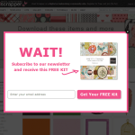
5) Lead capture (newsletter, WhatsApp updates, deal alerts)
- Use the bar to push a “Get weekly deals” signup page.
- Or link to a “Deal alerts” page with a simple email form.
Message strategy: what to say (with copy templates)
Your bar has one job: earn the click without annoying readers. Keep it short, benefit-driven, and specific.
High-converting announcement bar formulas
| Goal | Copy template | Best link target |
|---|---|---|
| Deal / price drop | “🔥 Today’s best deal: [Product] dropped to [Price] — grab it now” | Your “best” comparison page or deals roundup |
| Comparison update | “✅ Updated: [Category] comparison (Jan 2026) — new winner inside” | Your updated comparison article |
| New product added | “New release added: [Model] vs [Model] — see the differences” | Head-to-head comparison page |
| Lead capture | “Get weekly deals + comparisons → join our free newsletter” | Signup page / embedded form |
Best practices for bar copy
- One message at a time: don’t cram 3 promos into one bar.
- Use a clear CTA: “See updated comparison,” “View deal,” “Check winner.”
- Set expectations: “Updated today” or “Updated this week” builds trust.
- Avoid vague hype: “Big sale!!!” converts worse than specifics.
How to add an announcement bar using Elfsight (step-by-step)
If you want a fast, no-code setup with professional templates, Elfsight is one of the easiest options. Their Announcement Bar widget is built specifically for messages like deals, updates, and important notices—and it works across major website builders (including WordPress).
Step 1) Choose a template (or start from scratch)
Pick a clean template that matches your goal:
- Deal promo bar (simple headline + CTA)
- “Updated today” bar (timestamp + link)
- New product announcement bar (short + bold)
Step 2) Add your message + CTA link
Use short text and a single CTA button. Link to a page that directly supports the bar message:
- Deals bar → your deals roundup or best comparison page
- Update bar → the updated comparison page
- New release bar → your head-to-head post
Sensecentral internal link ideas (safe links you can use right now):
- Sensecentral homepage
- Search “deals” on Sensecentral
- Search “best” on Sensecentral
- Search “comparison” on Sensecentral
Step 3) Choose placement + behavior
For affiliate sites, the most effective default is:
- Top bar (highest visibility)
- Sticky on desktop (optional on mobile)
- Close button enabled (reduces annoyance)
Step 4) Set where it shows (targeting)
Instead of showing the same bar on every page forever, rotate based on intent:
- On comparison posts → show “Updated ranking” message
- On single product reviews → show “See our full comparison” message
- On homepage → show “Top deal today” message
Step 5) Copy the embed code
After customization, Elfsight gives you an embed snippet. You’ll paste this into WordPress (next section).
WordPress install options (fastest methods)
Here are the simplest ways to add your Elfsight announcement bar to WordPress:
Option A) Paste into a Custom HTML block (Gutenberg)
- Open your page (or a reusable template part / header area).
- Add a Custom HTML block.
- Paste the Elfsight embed code.
- Update / Publish.
Option B) Insert into site header/footer (site-wide)
If you want the bar across most pages, you can add the embed code globally via:
- A header/footer injection plugin, or
- Your theme’s header/footer (advanced)
Recommended for Sensecentral: Start with site-wide placement for 7 days, then refine with targeting after you see which pages convert best.
How to track clicks + leads (UTMs + GA4)
“Tracking leads” for an announcement bar usually means tracking one (or both) of these:
- Bar clicks → visitors clicking your CTA
- Conversions → email signups, affiliate clicks, contact submissions, etc.
Method 1) Add UTM parameters to your bar links (simple + powerful)
UTMs help you see clicks in Google Analytics (and other analytics tools). Here’s a clean UTM structure for announcement bars:
https://sensecentral.com/your-best-page/?utm_source=announcement_bar&utm_medium=sitewide&utm_campaign=deals_update&utm_content=top_stickyRecommended UTM naming rules:
utm_source= announcement_barutm_medium= sitewide / category / comparison_pageutm_campaign= deals / updated_comparison / new_releaseutm_content= top_sticky / bottom_mobile / variant_a
Method 2) Track CTA clicks as a GA4 event (advanced)
If you use Google Tag Manager, you can fire an event when the bar button is clicked. Use a unique CSS class for the button link when possible, for example:
<a class="sc-announcement-cta" href="...">See Updated Comparison</a>Then in GTM, create a click trigger that matches the CSS selector and send an event like:
event: announcement_bar_click
parameters: { placement: "top", campaign: "deals_update" }
Method 3) Track “lead” actions (newsletter / contact)
If your bar pushes to an email signup page, track the signup conversion as your main KPI—not just clicks. A high click rate without conversions may mean your landing page needs improvement.
Design & UX best practices (mobile-first)
A great announcement bar feels helpful, not spammy. Use these best practices to keep conversions high and bounce rates low:
Announcement bar checklist
| Element | Best practice |
|---|---|
| Length | 1 sentence max + 1 CTA |
| CTA | Use action verbs: “See updates,” “View deal,” “Compare now” |
| Mobile | Keep it taller than 44px, but avoid blocking content |
| Close button | Always include one for UX friendliness |
| Targeting | Show relevant bars on relevant pages |
Common mistakes to avoid
- Too many promos: rotating 5 messages often reduces trust.
- Weak landing pages: your bar can’t fix a confusing comparison page.
- Always-on urgency: use urgency only when it’s real.
- Ignoring mobile: most affiliate traffic is mobile—test there first.
Examples: bar ideas specifically for product comparison pages
Here are practical bar ideas you can use on Sensecentral-style pages. Replace bracketed text with your category/page.
Deal-focused bars
- “🔥 Today’s best deal: [Top Pick] is [X%] off — see our deal breakdown”
- “⚡ Price drop alert: [Model] just hit its lowest price — compare options”
- “🎁 Limited coupon: Save on [Category] — updated comparison inside”
Update-focused bars
- “✅ Updated today: Best [Category] comparison — new #1 pick”
- “🆕 Added: [New Model] vs [Old Model] — see what changed”
- “📌 New testing notes added — see the updated ranking”
Lead + loyalty bars
- “Get weekly deals + comparisons → join the Sensecentral newsletter”
- “Want faster updates? Bookmark our latest comparisons page”
Elfsight vs alternatives (quick comparison)
| Option | Best for | Pros | Cons |
|---|---|---|---|
| Elfsight Announcement Bar Try Elfsight | Fast, no-code deal + update bars | Templates, quick embed, good customization | View limits depend on plan |
| WordPress plugins | Simple site-wide bars | Often free, native WP | Design/targeting may be limited |
| Custom code | Maximum control | No vendor limits, fully custom | Time-consuming, needs dev/testing |
FAQ
Should I show the announcement bar on every page?
Start broad for one week, then refine. For affiliate sites, the best results usually come from targeted bars (comparison pages get comparison updates; review pages get “see full comparison”).
Does an announcement bar hurt SEO?
Not inherently. Just ensure it doesn’t block content on mobile, loads cleanly, and doesn’t create intrusive interstitial behavior.
What’s the best placement: top or bottom?
Top typically gets more clicks. Bottom can feel less intrusive. Test both and track results with UTMs.
How often should I change the message?
Whenever the “most important” thing changes: new deal, new winner, new update. If you update comparisons weekly, rotate the bar weekly.
Can I track announcement bar performance?
Yes—use UTM links for quick tracking, and GA4 events for deeper analysis (especially if you run multiple bar variants).
References
- Elfsight Announcement Bar widget
- Elfsight Help Center: View limit explained
- Elfsight Help Center: Pricing overview
- Google Analytics (GA4) documentation
- Google Tag Manager
Final note: If you run product comparisons, your biggest advantage is freshness. A well-placed announcement bar makes your updates visible instantly—and turns “silent edits” into real clicks and conversions.

